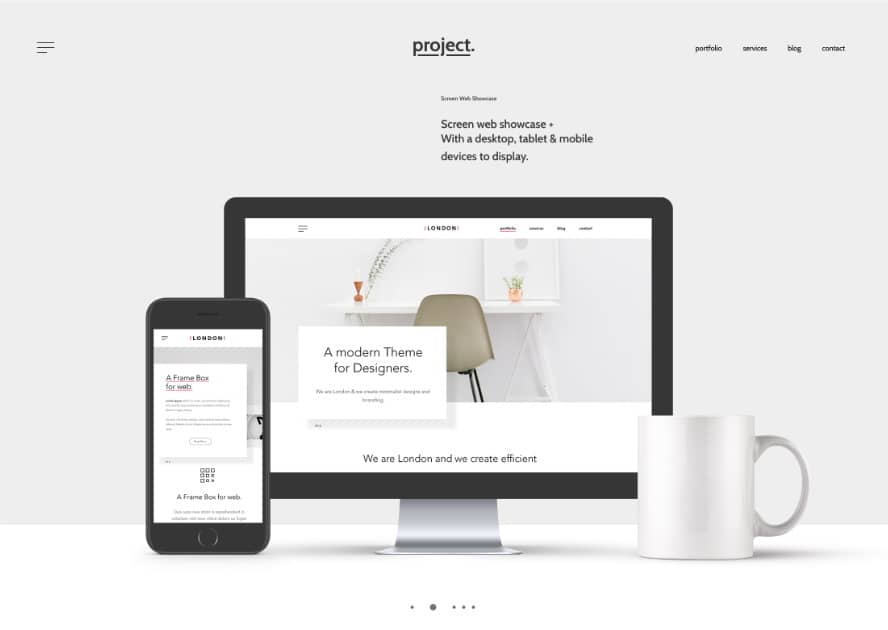
Esthetics is a major part of web design. If your website is not visually appealing, all of the functionality and cool features in the world are not going to help you keep web users around. People tend to avoid things they find unattractive, and websites are not exempt from that rule.
Regardless of whether you're running an e-commerce business or a portfolio website, it needs to catch the user's eye. Gone are the days of poor web design being the standard of the internet. Your landing and product pages need to capture the attention of visitors. In fact, the web design experience should become a permanent part of your content marketing strategy.
Thankfully nowadays, pretty websites are much easier to achieve than ever before. Implementing hover effects with FooGallery or using other plugins can simplify the process of beautifying your WordPress website.
If you're unsure of where to start, check out this article, which will guide you through some of the main aspects of esthetically pleasing websites.
Color
The use of color can make or break the esthetics of your website. Particularly in e-commerce, colors can set the mood and make the buyer feel like they fit in better. Having the wrong colors on your website will scare people away. The right colors can give them a sense of belonging and make them want to stick around. So how do you pick the right colors?
- Pull a small set of colors from your photo.
- Employ gradients and texture to make each color stand out.
- Ask around your target demographics if they like those colors.
Experiment with different combinations until you come across something that speaks to you. Color is part science and part gut feeling. You might decide upon a certain color and then later decide that it just doesn’t fit the bill, so try out a few different themes until you're satisfied with the result.
Navigation
Visually pleasing websites go hand in hand with intuitive navigation. If your site is difficult to navigate, visitors will quickly abandon it. Even if they are interested in your content, they won't wade through walls of text and confusing menus to get to it.
On the flip side, a website that is too "busy" can also be a turnoff for visitors. To avoid distracting viewers, keep the design simple and uncluttered.
While you want your site to be appealing to viewers, you don't want to sacrifice usability for esthetics. Visitors will leave if your design is clunky or difficult to access.
Mobile-Friendly Design
Mobile-friendly websites are important for two reasons: mobile traffic is on the rise, and Google prioritizes mobile-friendly sites in its search results.
Let's take a look at some numbers: In 2016, more Google searches were done on mobile than on desktop computers and tablets. Additionally, about 60% of all web traffic originates from mobile devices.
Taking the numbers above into account should make you realize the importance of mobile-friendly design. Optimizing your pages for computers with complete disregard for smartphones is a sin comparable to using outdated design models from the 90s.
Content
Good content is not enough to keep users coming back to your website. Having pretty content is equally important, so don't be afraid to use images in it and play around with your pages' structure. People love images more than text, which means that a user is more likely to read an article when it has an image.
When you have images in your content, your website will be more appealing to the eye. You'll also find it more interesting to read. Don't overdo it though. Make sure your images enhance your content and don't detract from it.
Make Use of the Visual Hierarchy
The visual hierarchy is the order of importance of elements on your website - it shows your users where to look first. It's important to make use of the visual hierarchy when you're creating your content. A good visual hierarchy will make your content more appealing to your readers.
The Bottom Line
As you can see, when it comes to keeping users interested in your online activity, having a pretty website is equally important as having a functional website. Of course, the functionality should be prioritized, but esthetics should be your next major focus if you want to grow your traffic and keep people coming back to your site.
If you're unsure about what people like in your design and what they're not too fond of, you can always reach out to them for advice in the form of a (non-intrusive!) questionnaire. Everything matters, from color choices to your use of graphics, so don't be afraid to experiment a little!


