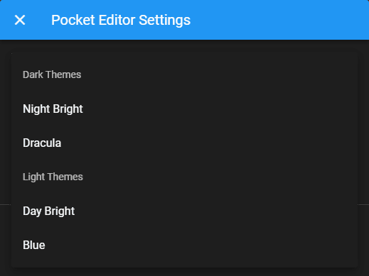
The optgroup tag in HTML is used to group related options in your select elements in the webpage. For example, if the user has to select a theme for an editor, it would be great if the themes were grouped by Dark and Light themes right? In Vuetify it isn't so intuitive to implement such a feature and differs a little bit from what you would expect to implement it. Instead of having an object whose keys are the labels of every optgroup and the items are the options in the Select, in Vuetify all of the elements should be inside the same array. To simulate an optgroup, you will need to add a new object that has the header key set (its value will be used as text of the optgroup) as specified in the official documentation.
For example:
<template>
    <v-select
        item-text="name"
        item-value="themeFile"
        v-model="theme"
        :items="themes"
    ></v-select>
</template>
<script>
    export default {
        props: ["dialog"],
        data() {
            return {
                theme: null,
                themes: [
                    // Add Optgroup option (Dark Themes)
                    { header: "Dark Themes" },
                    { name: "Night Bright", themeFile: "night-bright.css" },
                    { name: "Dracula", themeFile: "dracula.css" },
                    // Add Optgroup option (Light Themes)
                    { header: "Light Themes" },
                    { name: "Day Bright", themeFile: "day-bright.css" },
                    { name: "Blue", themeFile: "blue.css" }
                ]
            };
        }
    };
</script>
Happy coding ❤️!