
A datepicker is a neutral, necessary and very used component that allows the user to select a date easily without having to know the format that the input expects, the user just need to provide the date following a simple UI. For React, there are a lot of datepicker components, so to make it easy for you we have collected 10 of the most imponent components of this utility.
Enjoy our top from 10 of the best Datepicker components that you can use in your React Application.
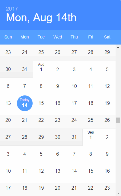
10. React Datepicker CS
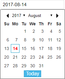
React datepicker is an useful and very simple component that displays a simplified datepicker. Its initialization is very simple too as it receives only 5 properties:
- range {Array} - You can customize the range of year
- onChange {Function} - When user set a date
- locale {String} - Defaults to
en, you can also usezh - disabled {Boolean} - Defaults to
false, you can pass intrueto disable component - value {String} - Set a default date
import React from 'react';

// Import Datepicker
import ReactDatePicker from 'react-date-picker-cs';

export default class App extends React.Component {
    constructor(props, context) {
        super(props, context);

        // Initial state with date
        this.state = {
            selectedDate: '2017-08-13'
        };

        // This binding is necessary to make `this` work in the callback
        this.handleLog = this.handleLog.bind(this);
    }

    handleLog(date) {
		this.setState({
			selectedDate: date
		});
	}

    render() {
        return (
            <div>
                <ReactDatePicker
                    onChange={this.handleLog}
                    range={[2013, 2020]}
                    value={this.state.selectedDate}
                    disabled={true}
                />
            </div>
        );
    }
}
9. RC Datepicker

RC Datepicker is a decent and pretty date picker that can be used with React. DatePicker and DatePickerInput use Moment.js, therefore they support any locale inside moment/locale. To select a locale you need to require it before requiring the datepicker or moment anywhere in your app: this way it will be automatically selected as current locale.
import React from 'react';

// Import Datepicker
import { DatePicker, DatePickerInput } from 'rc-datepicker';

// Import the default style
import 'rc-datepicker/lib/style.css';

export default class App extends React.Component {
    constructor(props, context) {
        super(props, context);

        // Initial state with date
        this.state = {
            // or Date or Moment.js
            selectedDate: '2017-08-13'
        };

        // This binding is necessary to make `this` work in the callback
        this.onChange = this.onChange.bind(this);
    }

    onChange(date) {
		this.setState({
			selectedDate: date
		});
	}

    render() {
        return (
            <div>
                <DatePickerInput
                    onChange={this.onChange}
                    value={this.state.selectedDate}
                    className='my-custom-datepicker-component'
                />

                {/* this renders only a fixed datepicker */}
                <DatePicker onChange={this.onChange} value={this.state.selectedDate} />
            </div>
        );
    }
}
8. React Bootstrap Datepicker
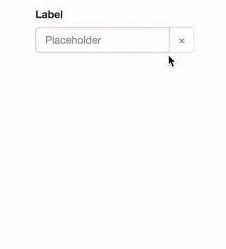
This Datepicker is compatible with React 0.14.x and 0.15.x. It's based and requires the Bootstrap React framework as a dependency (that may be automatically installed), if not install the Bootstrap React Library too.
As every Bootstrap based library, you need to import some Bootstrap theme either from a local CSS copy or from a CDN:
<link href="https://maxcdn.bootstrapcdn.com/bootswatch/3.3.7/cerulean/bootstrap.min.css" rel="stylesheet" integrity="sha384-zF4BRsG/fLiTGfR9QL82DrilZxrwgY/+du4p/c7J72zZj+FLYq4zY00RylP9ZjiT" crossorigin="anonymous">And then initialize the datepicker in React:
import React from 'react';

// Import Datepicker
import DatePicker from "react-bootstrap-date-picker";

// Import Bootstrap components
import FormGroup from 'react-bootstrap/lib/FormGroup';
import ControlLabel from 'react-bootstrap/lib/ControlLabel';
import HelpBlock from 'react-bootstrap/lib/HelpBlock';

export default class App extends React.Component {
    constructor(props, context) {
        super(props, context);

        // Initial state with date
        this.state = {
            selectedDate: new Date().toISOString()
        };

        // This binding is necessary to make `this` work in the callback
        this.onChange = this.onChange.bind(this);
    }

    onChange(value, formattedValue) {
		this.setState({
            value: value, // ISO String, ex: "2016-11-19T12:00:00.000Z"
            formattedValue: formattedValue // Formatted String, ex: "11/19/2016"
        });
	}

    componentDidUpdate() {
        // Access ISO String and formatted values from the DOM.
        var hiddenInputElement = document.getElementById("example-datepicker");
        console.log(hiddenInputElement.value); // ISO String, ex: "2016-11-19T12:00:00.000Z"
        console.log(hiddenInputElement.getAttribute('data-formattedvalue')) // Formatted String, ex: "11/19/2016"
    }

    render() {
        return (
            <div>
                <FormGroup>
                    <ControlLabel>Label</ControlLabel>
                    <DatePicker id="example-datepicker" value={this.state.selectedDate} onChange={this.onChange} />
                    <HelpBlock>Help</HelpBlock>
                </FormGroup>
            </div>
        );
    }
}
7. React Calendar

React Calendar is not just a calendar component, but a modular toolkit for building everything related to calendars in React, such as Datepickers. It is in early alpha stage, so the documentation and more features will arrive. However it can be used yet:
import React from 'react';

// Import Datepicker
import moment from 'moment';

// Import Calendar
import { Calendar } from 'react-calendar';

export default class App extends React.Component {
    constructor(props, context) {
        super(props, context);

        this.state = {
            date: moment().startOf('year')
        }
    }

    render() {
        return (
            <div>
                {/* Base calendar component */}
                <Calendar
                    weekNumbers={true}
                    size={2}
                    startDate={this.state.date}
                    date={this.state.date}
                    endDate={this.state.date.clone().endOf('year')}
                    mods={
                        [
                            {
                                date: moment(),
                                classNames: ['current'],
                                component: ['day', 'month', 'week']
                            }
                        ]
                    }

                />
            </div>
        );
    }
}
There is no style by default, but an example theme using bootstrap is included in less/bootstrap-theme.less.
6. React Input Calendar

React Input is a simple component to pick a date inside an input. All styles written in CSS and are in style/index.css. All you need to do is to import the component:
import Calendar from 'react-input-calendar'

<Calendar format='DD/MM/YYYY' date='4-12-2014' />
And read more about the properties that the component supports.
5. Input Moment
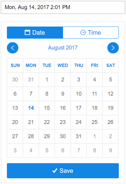
Input Moments is a React based datetime picker powered by momentjs, the design is from a freelancer and icons from ionicons.
4. React Datepicker
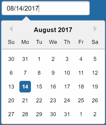
React Datepicker is a very simple and reusable datepicker component for React. You’ll need to install React and Moment.js separately since those dependencies aren’t included in the package. Below is a simple example on how to use the Datepicker in a React view. You will also need to require the css file from this package (or provide your own):
import React from 'react';
import DatePicker from 'react-datepicker';
import moment from 'moment';

import 'react-datepicker/dist/react-datepicker.css';

// CSS Modules, react-datepicker-cssmodules.css
// import 'react-datepicker/dist/react-datepicker-cssmodules.css';

class Example extends React.Component {
    constructor(props) {
        super(props)
        this.state = {
            startDate: moment()
        };
        this.handleChange = this.handleChange.bind(this);
    }

    handleChange(date) {
        this.setState({
            startDate: date
        });
    }

    render() {
        return <DatePicker
            selected={this.state.startDate}
            onChange={this.handleChange}
        />;
    }
}
3. React Day Picker

React Day Picker is a flexible date picker. It has no dependencies, is fully customizable, offers ARIA support, is localizable and weights less than 8KB.
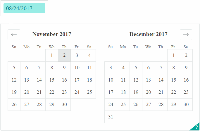
2. React Infinite Calendar
Infinite scrolling date-picker is a component for React, with localization, range selection, themes, keyboard support, and more. The main features of the component are:
- Infinite scroll – Just keep scrollin', just keep scrollin'
- Flexible – Min/max date, disabled dates, disabled days, etc.
- Extensible – Add date range-selection, multiple date selection, or create your own HOC!
- Localization and translation – En français, s'il vous plaît!
- Customizeable – Customize and theme to your heart's content.
- Year selection – For rapidly jumping from year to year
- Keyboard support
- Events and callbacks – beforeSelect, onSelect, onScroll, etc.
- Mobile-friendly – Silky smooth scrolling on mobile
1. React Dates
React Dates is an easily internationalizable, mobile-friendly datepicker library for the web. The SingleDatePicker is a fully controlled component that allows users to select a single date. You can control the selected date using the date and onDateChange props as shown below. The SingleDatePicker also manages internal state for partial dates entered by typing (although onDateChange will not trigger until a date has been entered completely in that case). It's initialization is pretty simple:
import React from 'react';

// Import Moment and React Dates
import moment from 'moment';
import {  SingleDatePicker } from 'react-dates';
import 'react-dates/lib/css/_datepicker.css';

export default class App extends React.Component {
    constructor(props, context) {
        super(props, context);

        this.state = {
           date: moment()
        }
    }

    render() {
        return (
            <div>
                <SingleDatePicker
                    date={this.state.date} // momentPropTypes.momentObj or null
                    onDateChange={date => this.setState({ date })} // PropTypes.func.isRequired
                    focused={this.state.focused} // PropTypes.bool
                    onFocusChange={({ focused }) => this.setState({ focused })} // PropTypes.func.isRequired
                />
            </div>
        );
    }
}
If you know another awesome datepicker component for react and it's open source, please share it with the community in the comment box.