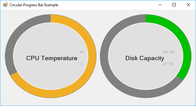
The traditional progress bar component of Winforms is pretty useful to show your user the progress of some task, the available space of something etc. However after some years, the user may be bored of looking the same component always. If you are looking for inspiration and innovation, after some research i found out an awesome component that accomplishes the same goal of the progress bar and even better. I am talking about the Circular Progress Bar .NET component, a very lightweight component that should be an inplace replacement of the default 'ProgressBar' for WinForm with a cool animation.
In this article, we'll show you how to install and use this component in your WinForms C# project using Visual Studio.
1. Install Circular Progress Bar via NuGet
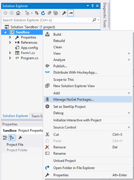
You will need to install the Circular Progress Bar library in your project using the NuGet package manager. Open your Winforms C# project and open the NuGet package manager in the solution explorer:
Go to the Browse tab and search for Circular Progress Bar:
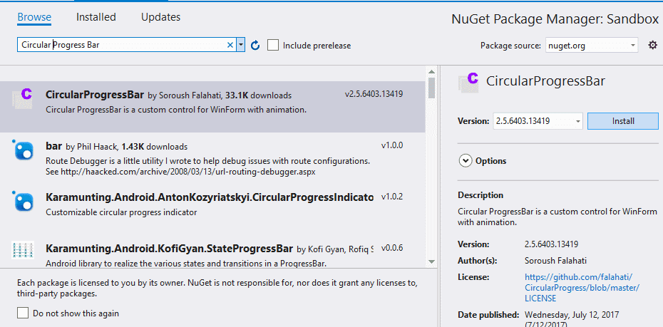
From the list, select the CircularProgressBar package by Soroush Falahati and install it simply clicking on the Install button. Once the installation finishes, you will have now in your project the binary to use this component. For more information about this component, please visit the official repository at Github here.
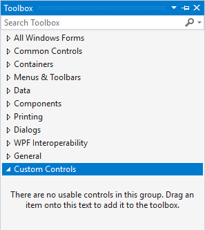
2. Add Circular Progress Bar to toolbox
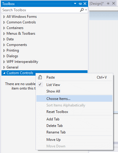
With this library you will be able to drag and drop the Progress Bar control into your forms in the same way you do with the traditional controls. To be organized, we recommend you to create a custom Toolbox Tab to store inside the exclusive controls of this library. Do right click on an empty space of the Toolbox and from the Dropdown menu select Add Tab, this will allow you to create an empty Tab and to give a custom name, in this case we'll name it Custom Controls:
Then do right click on the custom tab that you've created (Custom Controls) and select Choose Items from the menu:
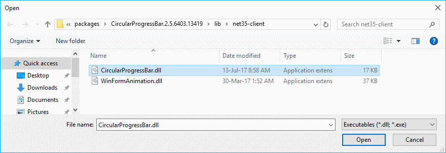
In the new window, go to the .NET Framework Components tab and click on Browse. In the file select dialog, search for the path of your project and the packages directory, here you will find at least 2 folders, the CircularProgressBar and the WinForm animation packages, you will need to import only the CircularProgressBar.dll file in the CircularProgressBar, however the WinFormAnimation.dll of the other package needs to be as well in the same directory, otherwise you won't be able to import it, if the file isn't there, copy them together in the same directory and import CircularProgressBar.dll:
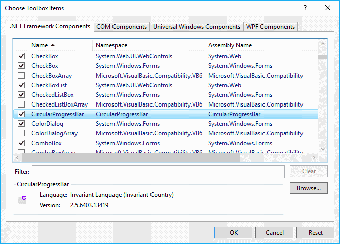
After selecting the dll, the previous dialog of items for the toolbox will appear again with a new item, the CircularProgressBar:
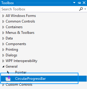
Finally click on Ok and you will find the new component on the toolbox:
To add it in your form, simply drag and drop it on the form as you do with any normal component.
3. Configuring Circular Progress Bars
After dragging the progress bar component to the form, you will be able to customize it changing its properties either in the designer or dinamically with code. A Circular Progress Bar has the following properties:
CircularProgressBar.Maximum: Shows and changes the maximum acceptable value for the progress bar.CircularProgressBar.Minimum: Shows and changes the minimum acceptable value for the progress bar.CircularProgressBar.Value: Shows and changes the current value of the progress bar.CircularProgressBar.Style: Shows and changes the style of the progress bar. OnlyContinuesandMarqueeis now supported.Blocksbehaves as same asContinues.CircularProgressBar.BackColor: Background color of control, transparent is not supportedCircularProgressBar.Text: Primary textCircularProgressBar.TextMargin: Margin of the primary textCircularProgressBar.Font: Font of the primary textCircularProgressBar.SuperscriptText: Superscript textCircularProgressBar.SuperscriptMargin: Margin of the superscript textCircularProgressBar.SuperscriptColor: Font color of the superscript textCircularProgressBar.SubscriptText: Subscript textCircularProgressBar.SubscriptMargin: Margin of the subscript textCircularProgressBar.SubscriptColor: Font color of the subscript textCircularProgressBar.SecondaryFont: Font of subscript as superscript textCircularProgressBar.AnimationFunction: Contains the function that controls the animation. UseWinFormAnimation.Functionsnamespace for some of the basic implementations.CircularProgressBar.AnimationSpeed: Speed of the animation. Applies to the main progress animation.CircularProgressBar.StartAngle: Start angle of the progress bar. 270 being top of the control.CircularProgressBar.InnerColor: Color of the inner circle.CircularProgressBar.InnerWidth: Width of the inner circle. -1 means full fill.CircularProgressBar.InnerMargin: Margin of the inner circle.CircularProgressBar.ProgressWidth: Width of the main progress bar circle. -1 means full fill.CircularProgressBar.ProgressColor: Color of the main progress bar circle.CircularProgressBar.OuterColor: Color of the outer circle.CircularProgressBar.OuterWidth: Width of the outer circle. -1 means full fill.CircularProgressBar.OuterMargin: Margin of the outer circle.
Happy coding !