The truth is, mobile has won. Plain and simple. Fair and strong.
Approximately 60-70% of B2B and B2C emails are opened on smartphones, rather than on desktops. If your campaigns aren’t optimized for mobile, engagement, and conversions, they are slipping through your fingers.
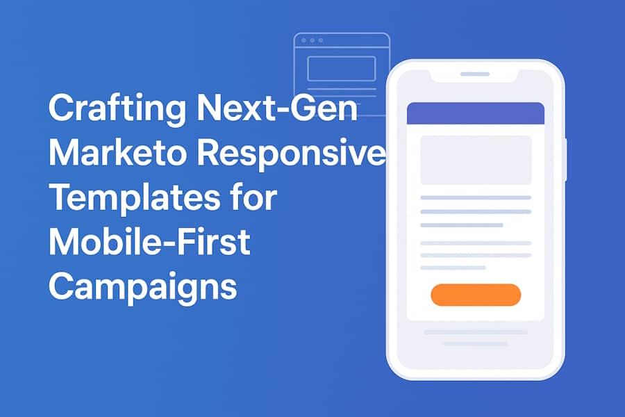
Enter next-gen Marketo responsive email templates. Not just “stack nicely on mobile” templates. These are frameworks that adapt dynamically to devices, contexts, and audience behavior.
They help marketers go beyond basic layouts. Deliver brand impact. Drive conversions. And maintain consistency across desktop, tablet, and hybrid environments.
So, if you’re ready to craft next-gen Marketo email templates, here is what you need to know.
Table of Contents
| ● Why Mobile-First Matters in Email Marketing |
| ● Marketo’s Template Architecture and Responsive Foundations |
| ● Designing Next-Gen Responsive Templates |
| ● Implementing and Coding Responsive Templates in Marketo |
| ● Best Practices and Pro Optimization for Effective Results |
| ● Common Pitfalls You May Face and How to Overcome Them |
Why Mobile-First Matters in Email Marketing
Trends are showing mobile dominance. The numbers don’t lie. 60–70% of B2B and B2C emails are opened on mobile phones. Clicks and conversions follow the same trend.
Poor mobile rendering kills KPIs:
- Tiny CTA buttons users can’t tap.
- Cropped or misaligned images.
- Truncated or unreadable text.
Mobile experience isn’t a luxury anymore. It’s a necessity.
The costs of not paying due diligence to mobile optimization can be gruesome. Neglect mobile optimization and you risk:
- High bounce and delete rates.
- Negative brand perception. Sloppy layouts scream unprofessional.
- Lost conversions. Direct hit to revenue and ROI.
So, what does “next-gen” really mean?
Next-gen templates aren’t just stacked columns. They are:
- Adaptive layouts that reflow for every screen width.
- Conditional blocks that show or hide based on user data.
- Context-aware design: touch-friendly buttons, scalable fonts, dynamic images.
It’s progressive enhancement in action, richer, interactive experiences for mobile users without sacrificing compatibility.
Now, let’s see what Marketo email templates bring to the table that establish the foundations of a responsive design.
Marketo’s Template Architecture and Responsive Foundations
Here are three characteristics that add significance to Marketo’s template architecture and its responsive design.
1. Template types in Marketo
Marketo offers three main types:
- Email Template Layouts: Skeletons for consistent campaign frameworks.
- Email Templates: Full, ready-to-use campaigns.
- Editable Templates: Update content without breaking the core design.
Choosing the right type keeps mobile-first design intact while staying flexible.
2. Responsive techniques in templates
Next-gen responsiveness relies on:
- Media queries for adaptive designs.
- Fluid tables and percentage widths for multi-screen support.
- Hybrid approaches for legacy clients (Outlook, Gmail, Apple Mail).
- Inline CSS remains essential, as many clients strip external styles.
3. Dynamic regions and merge fields
Marketo templates shine with personalization:
- Merge fields/tokens insert names, companies, or custom data.
- Conditional visibility blocks show content only to specific segments (VIPs, regions, product preferences).
Flexible templates. Relevant emails. Higher engagement.
Now, let’s discuss the step-by-step process for designing next-generation responsive templates.
Designing Next-Gen Responsive Templates
Here is a 4-step process to help you design next-gen responsive templates.
1. Layout principles for mobile-first design
Mobile-first isn’t a buzzword anymore. It’s the baseline. t’s about designing for the thumb before the click. Prioritize what matters most, like the hero title, headline, CTA, and supporting info. Stack single-column on mobile, expand multi-column on desktop. Make every tap effortless: touch-friendly buttons, legible fonts, generous spacing.
Respect the margins. Keep blocks modular. Say more with less because clarity wins on small screens.
2. Brand consistency across devices
Keep identity intact. Logos, colors, and typography should scale responsively. Also, use SVGs or scalable images for crisp visuals on high-DPI screens.
3. Dynamic and conditional content
Templates that *think* before they send. They react to user data in real time. VIP discounts for loyal customers, product recommendations shaped by past behavior, and geo-targeted messages that speak the language of location. Every block adapts, every line adjusts.
4. Micro-interactions and progressive enhancements
You need CSS transitions to add hover effects for the desktop. GIFs or subtle animations, with mobile-safe fallbacks. And older clients should see functional, readable layouts.
Everyone wins at the end this way.
Now, let’s see how you can effectively implement and code responsive templates in Marketo.
Implementing and Coding Responsive Templates in Marketo
Here are four key steps that help you in implementing and coding responsive templates in Marketo to generate effective results.
1. Establish a base template framework
Mobile-first HTML skeleton, such as header, footer, and container blocks. Fluid grids and modular sections for adaptability. And editable regions for quick content swaps.
2. Add conditional logic and personalization
Use Marketo Velocity scripting or merge tokens. Provide fallbacks to avoid blank sections. And add conditional blocks to target specific segments seamlessly.
3. Testing, previewing, and QA
Leverage Marketo preview and tools like Litmus, Email on Acid. Check image scaling, responsiveness, and links. Test low-end Androids, older iOS versions, and desktop clients.
4. Versioning and maintenance
Track template versions without breaking live campaigns. Modular components for rapid updates. Document changes for team alignment.
Need some more advanced tips? We have got you covered.
Best Practices and Pro Optimization for Effective Results
Here are some pro tips our experts suggest to keep a tab on while implementing Marketo’s responsive email templates.
- Keep it lean and performant – Minimize heavy CSS, large images, and nested tables. And apply lazy loading or placeholders for mobile optimization.
- Focus on accessibility and usability – Add alt text for images, ensure high contrast, and use readable fonts. The tappable buttons should be sized for thumbs.
- Progressive enhancement and graceful degradation should be a priority – Show basic content for older clients. And dynamic/interactive content for modern clients.
- Analytics-driven iteration should be precise – Track mobile vs. desktop opens, clicks, and conversions. Use A/B test layouts, CTAs, and content blocks. And optimize continuously for mobile-first audiences.
The sky won’t always be clear for you. You may face some thunderstorms at times. Let’s take a look at the rough side.
Common Pitfalls You May Face and How to Overcome Them
Here are some common challenges and their solutions.
|
Challenges |
Solutions |
|
Broken layouts on legacy clients |
Avoid unsupported CSS, provide fallbacks |
|
Merge tokens are causing errors |
Use defaults or conditional wrapping |
|
Over-complex dynamic logic |
Keep conditions simple and templates light |
|
Skipping device testing |
Low-end or older devices matter; even small errors kill engagement |
Wrapping up
That brings us to the business end of this article, where it’s fair to say that next-gen responsive templates are no longer optional. Design, code, and dynamic logic combined deliver mobile-first experiences that engage, convert, and scale.
So, what will be your next move? Will you utilize Marketo's responsive email template services? Will you audit your existing templates? Fix the mobile gaps? And migrate to responsive, next-gen designs? Because your audience won’t wait for the desktop.
The ball is in your court now. It’s time to create an action plan.