
The world of web development is ever-evolving, and one of the breakthroughs that have significantly improved user experience and website performance is the use of responsive images. In essence, responsive images are those that adapt and change their dimensions based on the size of the screen or viewport on which they are displayed. This concept is instrumental in creating visually appealing and high-performing websites for diverse screen sizes and resolutions.
The primary advantage of responsive images is that they enhance the overall website performance by reducing the bandwidth needed to load an image. Instead of loading a large image that could potentially slow down your site, responsive images allow for the delivery of an appropriately sized image to each device. This adaptability not only improves page load times but also enhances the user experience, particularly for mobile users who often contend with slower connection speeds.
Responsive images, however, can be tricky to implement. Specific techniques are required to make an image responsive. Among these techniques, one of the most effective and commonly used is Cascading Style Sheets (CSS).
How Do You Use CSS for Responsive Images?
Cascading Style Sheets, commonly known as CSS, is a style sheet language used in web development to describe the look and formatting of a document written in HTML or XML. CSS controls the visual presentation of the web content, including layout, colors, and fonts.
With CSS, you can easily control the dimensions of images, ensuring they scale and resize depending on the viewer's screen size. CSS also provides techniques to crop and align images responsively, enhancing the overall visual appeal of your website. Let's delve into some practical examples of how to make images responsive with CSS.
Practical Examples: How to Make Images Responsive with CSS
Using CSS Properties for Image Resizing
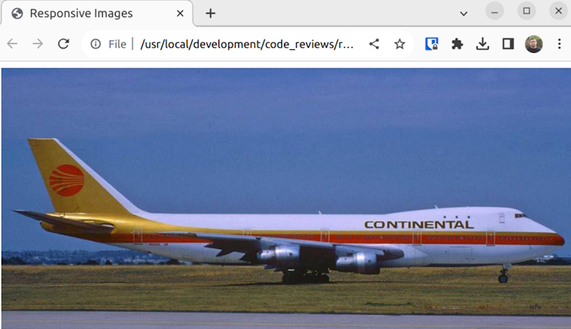
One of the most straightforward ways to make images responsive with CSS is by using CSS properties to control image resizing. The max-width property, for instance, can be set to 100%. This setting ensures that the image will never be wider than its container, allowing it to shrink and expand as the container size changes.
Here's how you can use the max-width property to control image resizing:
You can download the sample file here.
img {
    max-width: 100%;
    height: auto;
}
This CSS code will ensure that all images within your web pages are never wider than their containing element. The height: auto; line makes sure the image height changes proportionally to the width, maintaining the image's aspect ratio.
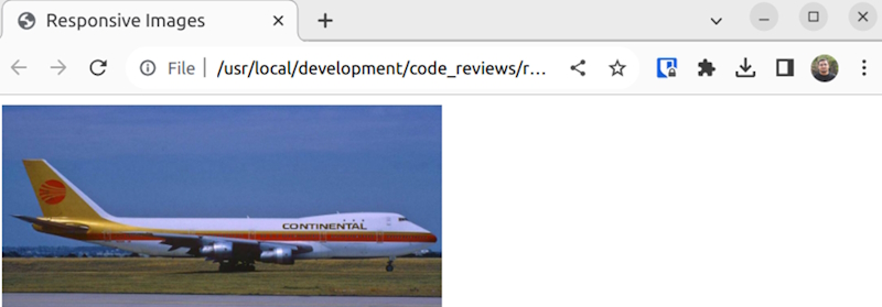
Using Media Queries to Adjust Images for Different Viewports
Another powerful tool in CSS for making images responsive is media queries. Media queries allow you to apply different CSS rules depending on the characteristics of the device rendering the content, such as its viewport size. By using media queries, you can ensure that your images display optimally on all devices, regardless of screen size.
Here's an example of using media queries to adjust image properties depending on the viewport size:
/* Default style for larger screens */
img {
    width: 50%;
    height: auto;
}
/* Style for screens smaller than 600px */
@media screen and (max-width: 600px) {
    img {
        width: 100%;
        height: auto;
    }
}
In this example, on screens smaller than 600px, images will take up the full width of their container. On larger screens, images will only take up 50% of the container width.
Using CSS to Crop and Align Images Responsively
CSS also provides tools to crop and align images responsively. For instance, the object-fit property controls how an image should be resized to fit its container while preserving its aspect ratio. This can be particularly useful when dealing with images of various sizes and dimensions.
CSS's object-fit property can be a powerful tool for cropping and aligning images. Here's an example:
img {
    width: 100%;
    height: 200px;
    object-fit: cover;
}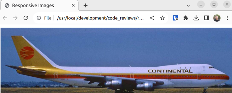
In this case, images will always take up the full width of their container and will be 200px tall. The object-fit: cover; line makes the image cover the whole designated content box. If the aspect ratio of the image doesn't match the aspect ratio of its box, the image will be cropped to fit, but it will still cover the entire box.
Best Practices for Responsive Images with CSS
Prioritize Performance
One of the main contributors to slow load times is large, unoptimized images. As such, it's crucial to prioritize performance when working with responsive images.
It’s essential to only load the images that are necessary. For instance, if an image is only visible at a larger viewport, there's no need to load it on a smaller device. CSS media queries can be a great tool for controlling when an image should be loaded based on the viewport size.
The quality of your images can also impact performance. While high-quality images may look better, they also tend to be larger in size. Reducing the quality of your images slightly can result in smaller file sizes without a noticeable difference in visual quality.
Maintain Aspect Ratios
Maintaining the aspect ratio of your images is another critical aspect of using responsive images. Aspect ratio refers to the proportional relationship between an image's width and height. When an image's aspect ratio is not maintained, it can appear stretched or squashed, detracting from the overall visual appeal of your website.
CSS offers several properties that can help maintain the aspect ratio of your images. The object-fit property, for example, can be used to specify how an image should be resized to fit its container while maintaining its aspect ratio. Similarly, the padding-bottom technique can be used to maintain the aspect ratio of an image by setting the padding bottom to the same percentage as the image's aspect ratio.
When working with responsive images, it's also important to keep in mind that different devices may require different aspect ratios. For example, an image that looks good on a desktop might not look as good on a smaller mobile device. Using CSS media queries, you can specify different aspect ratios for different devices.
Use the Right Format
Using the right image format is another crucial factor in optimizing responsive images. Different image formats have different strengths and weaknesses, and understanding these can help you choose the best format for your needs.
For example, JPEG is a great format for photographs as it offers good quality with relatively small file sizes. However, it doesn't support transparency, and so isn't the best choice for images that need a transparent background. PNG, on the other hand, supports transparency and offers high-quality images, but the file sizes can be quite large.
WebP is a more recent image format that offers superior compression and quality characteristics compared to JPEG and PNG. It also supports transparency, making it a versatile choice for many different types of images. However, it's worth noting that not all browsers support WebP, so it's important to provide fallbacks for these cases.
Test on Multiple Devices
Given the wide array of devices that people use to browse the web, it's important to test your responsive images on multiple devices. This will ensure that your images look good and perform well on all devices, from large desktop monitors to small smartphone screens.
There are several tools available that can help with this. For example, Google Chrome's DevTools offers a device mode that allows you to simulate different devices and viewports. This can give you a good idea of how your images will look on different devices without needing to have the physical devices on hand.
For example, if you are building a tournament or office pool website, tools like OfficePoolStop can help create a smoother user experience with mobile-friendly pool pages, picks, standings, and printable bracket features.
Use Lazy Loading
Lazy loading is a technique that can dramatically improve the performance of your website by only loading images when they're needed. Instead of loading all images when a page is loaded, images are only loaded when they come into the viewport. This can significantly reduce the initial load time of your page, resulting in a better user experience.
Implementing lazy loading can be as simple as adding the loading="lazy" attribute to your image tags. However, it's worth noting that not all browsers support this attribute yet. For those that don't, there are several JavaScript libraries available that can provide lazy loading functionality.
Lazy loading isn't a silver bullet, though. It's important to still follow the other best practices I've mentioned in this article, such as optimizing your images and testing on multiple devices. But when used in conjunction with these other techniques, lazy loading can be a powerful tool for improving the performance of your website.
In conclusion, optimizing responsive images is a crucial aspect of web performance. By prioritizing performance, maintaining aspect ratios, using the right format, testing on multiple devices, and employing lazy loading, you can create a website that not only looks good but performs well too. I hope that the practices I've shared in this article will help you unlock the power of responsive images and elevate your web performance to new heights.