Product design fights a losing war against entropy. You start with a clean system. Then features pile up. Eventually, you need an icon missing from your original set. You grab a close match from an open-source library. Then another.
Six months later, your interface is a mess of mixed stroke weights, varying corner radii, and conflicting perspectives.
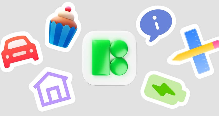
The challenge isn't finding an icon. It's finding an icon that fits. Icons8 tackles this not by acting as a marketplace for disparate designers, but by operating as a single-source factory. With over 1.4 million icons across 45+ styles, the goal is simple: provide a repository large enough that you never have to break visual consistency.
Workflow Scenarios
To see where this library fits in the stack, look at how teams use this volume of assets compared to smaller, curated sets.
Scenario 1: The Cross-Platform System Migration
Take a product team porting a web app to native mobile. The web version uses a generic outlined style. But to feel "native," the iOS app needs to follow Apple's Human Interface Guidelines, while Android must adhere to Material Design.
Drawing these assets from scratch takes weeks.
Instead, the design lead navigates to Icons8. For the iOS build, they select the "iOS 17" style. It offers over 30,000 icons in Outlined, Filled, and Glyph variations, matching the specific weight and rounded corners native to Apple devices. Simultaneously, they switch the library view to "Material Outlined" (5,573 icons) for the Android team.
Because Icons8 maintains these packs internally, the metaphor for "Settings" or "User Profile" remains conceptually similar but stylistically distinct for each platform. The team uses the Figma plugin to drag these assets directly into mockups. The visual language shifts appropriately between operating systems without a single hour of custom vector work.
Scenario 2: High-Fidelity Prototyping for Marketing
A marketing designer needs a landing page that feels modern and tactile. Standard line icons won't cut it. They need depth.
The designer browses the "3D Fluency" and "Liquid Glass" styles. These aren't simple vectors; they are rendered images with lighting and texture. They find a set of 3D icons, but the default colors clash with the brand’s palette.
Using the in-browser editor, they skip the Photoshop workflow. They select the icon, apply a recolor filter directly in the search interface to preview the hex codes, and adjust the background padding. They download high-resolution PNGs (up to 1600px on the paid plan) and drop them into the slide deck. The result is a consistent, high-end 3D look that usually requires a dedicated illustrator.
A Developer’s Morning with Pichon
Developer workflows aren't about browsing. They're about speed. Here is a typical session using Pichon, the Icons8 Mac application.
A frontend developer is fleshing out a sidebar navigation. They need standard icons: dashboard, analytics, users, and settings. They open Pichon from the menu bar. The "Windows 11" style is already selected to match the desktop application they are building.
They search "dashboard." Results appear instantly. They drag the icon directly from the app into their IDE. It drops in as an SVG code snippet because they configured the export settings previously.
Ten minutes later, they need a logo for a third-party integration. They switch to "Logos" (a free category) and search for the framework. While browsing, they spot a collection of react icons matching their current style pack. They need the "filled" version to indicate an active state. They toggle the field in the app, the icons update, and they drag the new SVG over.
The developer never opened a browser tab. They never dealt with a zip file. They never asked a designer to export an asset.
Beyond Static Assets: The Editor and Collections
The in-browser editor is an overlooked feature that acts as a lightweight design tool. Clicking an icon doesn't just present a download button. It opens an interface where you can modify the structure of the icon itself.
You can add a text overlay (using fonts like Roboto), apply a stroke to a filled icon, or enclose the icon in a container. For teams without a dedicated designer, this makes creating compound assets-like a "warning" icon inside a red circle-possible without external software.
For organization, use "Collections."
Rather than downloading icons one by one, drag them into a group. Once a collection is complete, you can perform bulk actions. If a client decides they hate blue and want purple, bulk recolor the entire set in one click. You can also generate a font file from the collection or export the whole set as a CSS sprite for web optimization.
Limitations and When to Look Elsewhere
The library is vast, but it isn't the right solution for every project.
The "Simplified" SVG Issue
Icons8 merges paths to reduce file size and complexity by default. For 99% of developers, this helps. But if you are a motion designer planning to animate specific parts of an icon-like making clock hands spin independently-you must uncheck the "Simplified" box before downloading. If you forget, you’ll get a flattened vector that is difficult to animate.
The Paywall for Vectors
The free tier is generous with volume but restrictive on format. You can download PNGs up to 100px for free (with a link back). For modern responsive web design, 100px raster images rarely work. PNGs lack the scalability of vectors. If you need SVGs for a production web app, you need a subscription.
Distinctive Branding
These icons are designed to be consistent and universal. Sometimes that feels "safe." If your brand identity relies on a highly unique, hand-drawn, or gritty aesthetic, the clean precision of standard styles like Material or Windows 11 might feel too generic.
Comparison with Alternatives
Vs. Open Source (Feather, Heroicons)
Open-source sets like Feather offer great code quality and zero cost. But they are usually limited to 200-300 essential icons. As soon as you need something specific-like a "biotech" or "cricket" icon-you hit a wall. Icons8 wins on volume. You are unlikely to "run out" of icons in a specific style.
Vs. The Noun Project
The Noun Project creates a massive library by aggregating submissions from thousands of designers. While the count is high, styles vary wildly. You might find five "dog" icons, but one has thick lines, one is sketchy, and one is geometric. Icons8 prioritizes strict adherence to style guides, making it superior for interface design where consistency is paramount.
Practical Tips for Power Users
Use the "Request" Feature
If you find a gap in the library, use the request feature. It’s not a black hole; it operates on a voting system. If a request gets 8 likes from the community, it goes into production. This is a viable way to get niche assets created for free if you can wait a bit.
Use Lottie for Micro-interactions
Don't ignore the animated formats. The library includes 4,500+ animated icons available as Lottie JSON files. These are small enough for mobile apps but provide smooth, vector-based movement. Replacing a static "success" checkmark with a Lottie animation is a low-effort way to increase perceived production value.
Check the "Designers" Filter
In the search interface, filter by "In-house" vs. "Independent authors." If strict consistency is your goal, stick to the in-house assets. This ensures that stroke weights and corner radii are mathematically identical across your entire set.
Icons8 functions less like a gallery and more like a utility. It trades the artistic flair of boutique icon sets for the reliability of a massive, standardized infrastructure. For teams scaling a product, that trade-off is often the key to maintaining sanity.


