Although most of the snack libraries are someway deprecated in favor of the new Design Support Library which includes a Snackbar. It is due to this that development of many libraries are no longer actively being maintained, however they work pretty nice (and there are other projects that are still being maintained)! If you are looking for a recommendation of which third party library you should use to implement custom snackbars in Android, you are in the right place.
In this top, we'll share with you 10 of the most imponent libraries to build custom/default snackbar messages to display in your native android application.
10. Snackalert
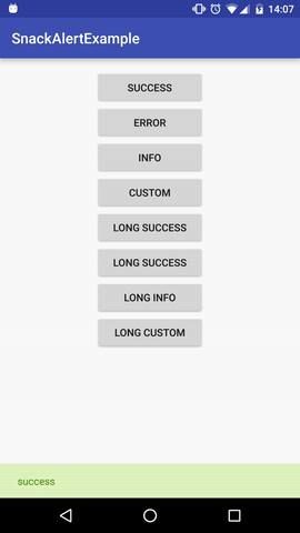
Snackalert is a pretty simple library that allows you to show in your context colored snackbar's. It can be used easily:
SnackAlert.success(view, "success");

SnackAlert.error(view, "error");

SnackAlert.info(view, "info");

SnackAlert.custom(view, "custom", Color.RED, Color.BLUE);

SnackAlert.longSuccess(view, "long success");

SnackAlert.longError(view, "long error");

SnackAlert.longInfo(view, "long info");

SnackAlert.longCustom(view, "long custom", Color.RED, Color.BLUE);
9. MySnack

MySnack is a very user friendly library for Snackbar, you can easily customize this according to your needs. MySnack provides adding textcolor, background color, fontsize, display duration, listener and many more things by just adding a single line of code. Add library to your app level build file and add the jitpack repository. After installing, the library will allow you to display snacks with customizable properties:
 new MySnack.SnackBuilder(this)
    .setText("Are you sure?")
    .setTextColor("#ffffff")   //optional
    .setTextSize(20)           //optional
    .setBgColor("#2196F3")      //optional
    .setDurationInSeconds(10)  //will display for 10 seconds
    .setActionBtnColor("#f44336") //optional
    .setIcon(Icon.WARNING)
    //or  .setIcon(R.drawable.ic_info_black_24dp)
    .setActionListener("Ok", new View.OnClickListener() {  //optional
        @Override
        public void onClick(View view) {
            Toast.makeText(getApplicationContext(),"done",Toast.LENGTH_LONG).show();
        }
    })
    .build();
8. FluentSnackbar

FluentSnackbar is a tiny library that uses Android Design Support Library and lets you create and show snackbars in a fluent manner. Besides it contains a queue feature.
// you can also use any View instead of Activity
FluentSnackbar mFluentSnackbar = FluentSnackbar.create(this);

mFluentSnackbar.create("Text")
    .maxLines(2) // default is 1 line
    .backgroundColorRes(R.color.purple_500) // default is #323232
    .textColorRes(R.color.blue_grey_500) // default is Color.WHITE
    .duration(Snackbar.LENGTH_SHORT) // default is Snackbar.LENGTH_LONG
    .actionText("Action text") // default is "Action"
    .actionTextColorRes(R.color.colorAccent)
    .important()
    .action(new View.OnClickListener() {
        @Override
        public void onClick(View v) {
            Toast.makeText(MainActivity.this, "Action clicked", Toast.LENGTH_SHORT).show();
        }
    })
    .show();
If you want to show several messages following one by one you can use important() method. Such snackbars cannot be dismissed by another snackbars and will be shown throughout their duration. So you can create a queue of snackbars. Just call important() and then show() for each FluentSnackbar.Builder.
7. SnackBar by MrEngineer13

This library allows you to display toast-like alert pattern for Android inspired by the Google Material Design Spec. This library features:
- Set message text and optionally duration
- Shows only one message at a time
- Can have action item (e.g. undo, refresh, etc.)
- Set text color of action items
- Swipe down to dismiss all notifications as per documentation
- Backwards compatible to 2.3.x
New Features since 1.0.0:
- Set custom background color
- Set custom height
- Set custom typeface
The following snippet allows you to display a snackbar:
new SnackBar.Builder(this)
    .withOnClickListener(this)
    .withMessage("This library is awesome!") // OR
    .withMessageId(messageId)
    .withTypeFace(myAwesomeTypeFace)

    .withActionMessage("Action") // OR
    .withActionMessageId(actionMsgId)

    .withTextColorId(textColorId)
    .withBackGroundColorId(bgColorId)
    .withVisibilityChangeListener(this)
    .withStyle(style)
    .withDuration(duration)
    .show();
6. Snackbar by nispok
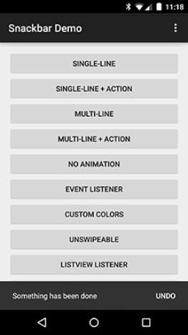
This library implements Snackbars from Google's Material Design documentation. Works on API levels >= 8. You can import the library from source as a module or grab via Gradle and you can display a snackbar like this:
Snackbar.with(getApplicationContext()) // context
    .text("Single-line snackbar") // text to display
    .show(this); // activity where it is displayed
5. LGSnackbar

LGSnackbar is an easy to use and customisable wrapper of the native Android Snackbar which stays visible across multiple activities. It provides different themes to start with, and allows you to easily manage common scenarios like success, warning, error, info.
4. Flashbar
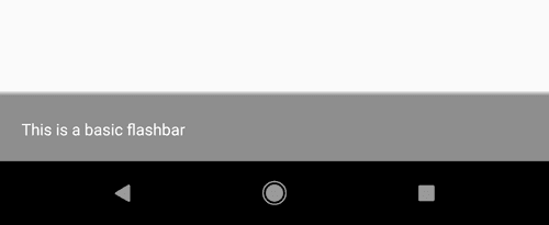
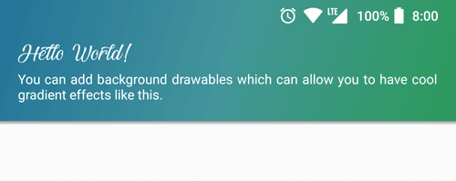
A highly customizable, powerful and easy-to-use alerting library for Android. This library allows you to show messages or alerts in your app quickly and easily. It can be used as an alternative to Snackbar or Toast and offers a plethora of useful features and customization options for you to play with. It has been written 100% in Kotlin.
Flashbar.Builder(this)
        .gravity(Flashbar.Gravity.TOP)
        .title("Hello World!")
        .message("You can have gradients by setting background drawable.")
        .backgroundDrawable(R.drawable.bg_gradient)
        .build()
3. ChocoBar

The usual Snackbar with more chocolate and colours. You can even add buttons and add some functionality to the button and make the ChocoBar stay until the user swipes it away, or make it disappear after a timeout.
Each method always returns a Snackbar object, so you can customize the Snackbar and much more. To display a green ChocoBar:
ChocoBar.builder().setActivity(MainActivity.this)
		  .setText("GREEN")
		  .setDuration(ChocoBar.LENGTH_SHORT)
		  .green()  // in built green ChocoBar
		  .show();
2. snackprogressbar

Enhanced Snackbar with ProgressBar for Android. It features:
- Two types of ProgressBar (TYPE_HORIZONTAL and TYPE_CIRULAR) are available (see image below). It can also be used as a normal SnackBar.
- Supports multi-lines of message.
- Supports long action text by moving it to next line as per Material Design.
- Supports swipe to dimiss behaviour even without providing CoordinatorLayout. (Or you can remove this behaviour for CoordinatorLayout)
- Additional views can be added to animate with the SnackProgressBar.
- Provides OverlayLayout to prevent user input.
- Provides a queue system.
- Icon can be added.
- Supports bundle in SnackProgressBar to carry information.
- Supports changing element color and text size.
1. Snacky

Snacky is a small library to help you adding a Snackbar to your layout with ease. It was created because of my own needs and is inspired by Toasty. Snacky uses an easy builder pattern to build a Snackbar and gives you some template designs like ERROR, WARNING, INFO and SUCCESS as well as some customization options. As of version 1.1.4 Snacky is is only compatible with androidX and not longer with support library apps! See ExampleActivity.java for a list of examples as shown in Screenshots.
If you know another awesome open source alternative for implementing snack bars inside native android applications, please share the library with the community in the comment box.


