Are you trying to create an inline grid with your own CSS rules using the inline-block display mode? Probably you are frustrated and asking to yourself "Why the hell is there a space between my elements!?". Even though your CSS may be very simple, you will always have a space between your HTML elements with the display: inline-block style. Consider the following snippet:
<div class="header">
<div class="head-item">1</div>
<div class="head-item">2</div>
<div class="head-item">3</div>
<div class="head-item">4</div>
<div class="head-item">5</div>
</div>
<style>
.head-item {
width: 50px;
height: 50px;
text-align: center;
display: inline-block;
border: 1px solid gray;
}
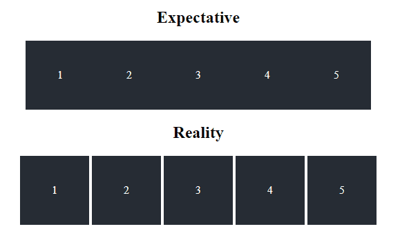
</style>Already imagined what it should look like? Well, with a normal CSS imagination our expectation is:
However, you will get instead the following result:
In case you didn't notice it neither, there's a white space (in the second row highlighted in blue with an image editor) between every div with the head-item class. According to our style, we have simple blocks of 50x50 whose text is centered and its border is gray. Then, what is the problem? The markup, even executed inside an environment without other CSS rules will always display a Gap between every div with inline-block. This is by itself not a bug but the expected behaviour of an element using display: inline-block.
To solve this problem easily if the goal is to create an inline group of divs would be to set the float property of the class to left:
.head-item {
    float: left;
    width: 50px;
    height: 50px;
    text-align: center;
    border: 1px solid gray;
}
This would immediately produce our desired grid. However, this may not be useful in your cases and may not work with other styles. In this article we'll share with you possible solutions that you may apply in your project against this problem.
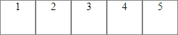
1. Remove whitespaces between HTML tags
The first and most known solution to solve this issue is triming every space between the HTML elements that have the display: inline-block property, for example if we remove the spaces of our initial markup, we would have now:
<div class="header"><div class="head-item">1</div><div class="head-item">2</div><div class="head-item">3</div><div class="head-item">4</div><div class="head-item">5</div></div>The previous markdown (same but without spaces between the html tags) would succesful display our desired result of divs on a row without whitespaces:
As you can see, we didn't need to add extra styles but just remove the whitespaces between the elements. If you want to use this solution, probably if you don't want problem with other programmers about how messy is your code, then you may want to do this by using your server language e.g with PHP:
<?php

$html = $text = <<<EOT
<div class="header">
    <div class="head-item">1</div>
    <div class="head-item">2</div>
    <div class="head-item">3</div>
    <div class="head-item">4</div>
    <div class="head-item">5</div>
</div>
EOT;

$html = preg_replace('/(\>)\s*(\<)/m', '$1$2', $html);

echo $html;
2. Remove whitespaces between HTML tags using comments
This solution is theoretically the same as the first one, however you won't need to have your markdown in a single line, instead open a comment from the point where your element ends and close the comment where the next element starts.
<div class="header">
  <div class="head-item">1</div><!--
  --><div class="head-item">2</div><!--
  --><div class="head-item">3</div><!--
  --><div class="head-item">4</div><!--
  --><div class="head-item">5</div>
</div>
3. Using a negative margin
The third solution is quite simpler, however it may lead to undesired results as well. As we have a Gap between the divs, you can remove it by using a negative margin property on your element:
<div class="header">
    <div class="head-item">1</div>
    <div class="head-item">2</div>
    <div class="head-item">3</div>
    <div class="head-item">4</div>
    <div class="head-item">5</div>
</div>
<style>
.head-item {
    width: 50px;
    height: 50px;
    text-align: center;
    display: inline-block;
    border: 1px solid gray;
}

.head-item:not(:first-child) {
  margin-left: -4px;
}
</style>
4. Monkeypatch the parent font size to 0
The last method includes a curious modification and probably not the best option for your project. This solution is related to the font size of the container of your inline block elements, in this case you need to set the font-size of your container to 0 (a whitespace with font-size 0 is equal to a 0 width element) and specify the font-size of the child elements. In our case with the example markup, we would need to modify the header and head-item class with the following values:
<div class="header">
    <div class="head-item">1</div>
    <div class="head-item">2</div>
    <div class="head-item">3</div>
    <div class="head-item">4</div>
    <div class="head-item">5</div>
</div>
<style>
.header {
  /* Set container font-size */
  font-size: 0;
}

.head-item {
    width: 50px;
    height: 50px;
    text-align: center;
    display: inline-block;
    border: 1px solid gray;
    /* Force font-size of child elements */
    font-size: 16px;
}
</style>
This would fix as well our problem. Which method to use is totally up to you inline-block is really useful in some scenarios, however is important to know as well how to deal with that annoying gap or learn how to live with it.
Happy coding !