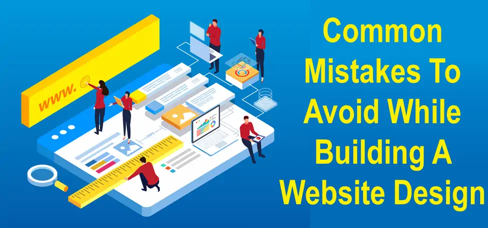
When was the last time you redesigned your website? A year ago? Or you never have a thought to it since you launched your website? Does your present website have an up-to-date design that can target the potential audience? Does it work seamlessly over mobile and other devices? Are all the features and functionalities easy to navigate on the customer end?
Your website is the most important tool that can either strengthen or destroy the brand name of your business. If you don’t have an alluring website, nobody will land on your website; rather they’ll turn to your competitors.
Why website design matters?
When it comes to building a website design that can attract a maximum audience, the majority of the enterprises still struggle for it.
Although you need to have an alluring website, it must also be able to generate leads and get your better ROI results.
Website owners still make website designs that look good but aren’t perfect for converting leads. You need to finalize a website design that is user-friendly, enjoyable, navigable, and usable. It will allow them to easily find the services they are looking for, instead of getting lost over irrelevant pages that aren’t much of their use.
Design mistakes you must avoid right away
What if I tell you that mesmerizing user experience and getting good conversion rates go hand in hand? You would simply say WOW as it lets you stay ahead of your competitors by offering an attractive website design while getting more leads on the other hand.
To reach this level, you need to identify the mistakes your website design currently has, and believe me it’s not at all a difficult thing.
I have prepared a list of the most common mistakes in website design lifecycle. With consistent efforts and attention, you can definitely overcome all the obstacles and take your website to the whole new level. Let’s have a look!
Most common design mistakes
1. Website lacks responsiveness
If your website design is perfect on a desktop view, that’s good for you!
But don’t forget, there are millions of users who are using tablets, smartphones, laptops, etc to view your website. Does your website offer the same view as on these devices as well? If not, it’s bad news for you.
You need to have a responsive website that presents a seamless view of the website regardless of the device. It will not only offer a stable user experience but is also preferred by Google because Google ranks the websites which are mobile responsive. Pacific IQ Marketing Agency Services (or similar services) can help design and optimize your website to ensure full responsiveness across all devices, improving user experience and search rankings.
2. Missing call to action
One of the most common thing that is missing in almost all the startup websites is the lack of clear call to action.
Your website design should offer clear information to the customer about what to do, where to go, and how to connect.
Having a clear CTA will enlighten users what to do next. You can add certain CTA’s like Add to Cart, Get Started, Sign up now, Subscribe now, Connect with us, etc.
Use a compelling and relevant CTA that clearly describes the value of your services and products.
3. Slow server response times
An average visitor doesn’t wait more than 2-3 seconds while your web pages are loading. And if your website is slow, you are losing the potential customers right away. Slower the website, more chances that the user will bounce.
Not only web page speed, but if your server response time is low, your website will automatically be slow. And if you have a slow server response time, it directly indicates performance issues.
So, if you wish to experience high speed and performance results, you need to get rid of slow server response times.
4. Unclear & difficult to read font
Many website owners use cursive fonts, hand-drawn fonts like ‘Bedtime Stories’ and think that the website pages will look attractive to the customers. But this might be your biggest mistake.
These kinds of fonts are difficult to read, and directly reduces cognitive fluency. If the text is difficult to read and understand, then what’s the point in using those beautiful fonts? Customers prefer easy to read and understand text.
5. Content isn’t scalable
During a website visit, an average person reads approximately 28% of the content on your website.
And if your content isn’t scalable for the customer, you are on the wrong track. This doesn’t mean you need to reduce the amount of content over the web pages; rather you need to make it accessible so that users can easily find what they are looking for.
You can make your content scalable by using- short paragraphs instead of lengthy paragraphs, use descriptive sub-headings, use bullets and numbered lists, use bold and italicized formatting wherever possible.
7. Poorly scaled images
Using poorly-sized or stretched images on your website reflect unprofessionalism, and it even decreases the trust of the customers. All the images you use on your website must be vertically and horizontally scaled with a one-to-one ratio.
Using large images directly affect the load times, try avoiding the use of large images. Also, make sure that the images you use are in either of the formats- PNG, GIF, JPEG.
8. Missing Metadata
Your website might have certain files with a file name as DSLR5490.jpg or some random useless names. These filenames are not useful either on the user’s end and even reflect bad impression on search engines.
You must replace these random filenames with some descriptive metadata that are helpful to both, your customers and search engines as well.
9. Having 404 errors
There are web pages on your website that are either moved or are redirected to a new page. So, whenever a user clicks on some invalid URL and gets redirected to the desired page, good enough!
But if the next page views the “404 Page Not Found” message, you need to work upon it immediately and get it fixed right away.
What’s Next?
By now, you would have got a rough idea of how much does your website score. If your website has the above issues, you need to pull up your socks and start working upon it so that you can deliver a better user experience and rank over the search engines.
Just build a website that focuses on your potential customers and helps you maximize your leads and generate better ROI results.
Once you are aware of who your audience is and how to grab their attention, you are all set to go!


