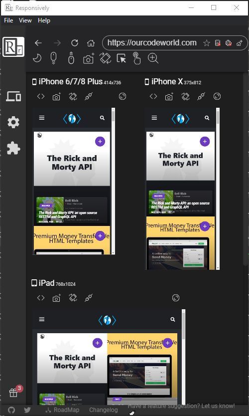
How many times do you receive a call of attention because you forgot to configure correctly the position of a button on small screens in your design? When i started with CSS, i quickly realized that it would be pretty easy to screw things up when working on a small fix on different resolutions, so i personally dreamed of a tool like the one i'm going to share with you today. I'm talking about Responsively App, a desktop application that will help you to develop responsive web apps 5x faster! This application allows you to preview all target screens in a single window side-by-side, which will bring down considerably your development time:
- Mirrored User-interactions across all devices.
- Customizable preview layout to suit all your needs.
- One handy elements inspector for all devices in preview.
- 30+ built-in device profiles with option to add custom devices.
- One-click screenshot all your devices.
- Hot reloading supported for developers.
Features
The application offers a lot of useful features that makes the app a "must-have" of every frontend developer:
Mirrored interactions
Any click, scroll or navigation that you perform in one device will be replicated to all the devices that you have on the app in real-time. Find easily any graphical bug you may have on mobile devices with a larger or smaller size than expected. Just interact with any device you want and the other will behave the same.
Extensive Built-in Device Profiles
The applications has an extensive collection of device profiles, covering most of the devices on the market. You can even design your own profiles or customize the existing ones as you want and need.
Download app
Responsively is available for Mac, Windows and Linux platforms. You can obtain a build of te app in the releases page of the repository at Github here. For more information, visit the official responsively website here or the official repository at Github here.


