Almost every frontend developer is familiar with the grid syntax of Bootstrap because it's pretty easy to use, and everyone knows as well how problematic is to create our own grids for projects that can't have Bootstrap in their code. In case that you want to still use only the Bootstrap Grid, in this article, we'll show you 2 ways to get and use the bootstrap grid in your project without including the entire bootstrap framework.
A. Use Bootstrap Grid Only
If you visit the Bootstrap Grid Only repository by @zirafa, you will find a pretty useful resource for your project. The Repository of Bootstrap Grid Only offers already precompiled grids with different formats namely grid12.css (the default that everybody knows), grid24.css, grid30.css, grid100.css. In short words, this repository contains:
- Standard Bootstrap grid classes: columns, offsets, push and pull classes
- Standard Bootstrap responsive utility classes: .visible-*, .hidden-*
- Clearfix class, * {box-sizing:border-box} declaration, pull-right, pull-left.
- Precompiled stylesheets for 12, 24, 30, and 100 columns. Gutter-width for each is respectively 30px, 15px, 10px, 2px. The 100 column grid yields results similar to Unsemantic and is good if you like semantic class naming (col-md-50 means exactly 50% width) or need extremely granular layout positioning (62 col + 38 col)
- LESS file grid.css.less for building your own bootstrap grid, including variables for the grid ( @grid-columns, and @gutter-width) as well as breakpoint cutoff declarations (@screen-xs, @screen-sm, @screen-md, @screen-lg)
You can use the tipical grid of bootstrap (of 12 columns) either using a free CDN:
<link rel="stylesheet" type="text/css" href="https://cdn.rawgit.com/zirafa/bootstrap-grid-only/94433673/css/grid12.css">Or referencing the copy of grid12.css in your document:
<link rel="stylesheet" type="text/css" href="./css/grid12.css">Then you will be able to use only the grid of bootstrap in your HTML with the established classes:
<div class="row">
    <div class="col-sm-4">.col-sm-4</div>
    <div class="col-sm-4">.col-sm-4</div>
    <div class="col-sm-4">.col-sm-4</div>
</div>
Or more complex structures:
<div class="row">
    <div class="col-xs-6 col-sm-3" style="background-color:lavender;">
        Column 1<br>
        Resize the browser window to see the effect. Also try to remove the div clearfix line and see what happens.
    </div>
    <div class="col-xs-6 col-sm-3" style="background-color:lavenderblush;">Column 2</div>

    <!-- Add clearfix for only the required viewport -->
    <div class="clearfix visible-xs"></div>
    <div class="col-xs-6 col-sm-3" style="background-color:lightcyan;">Column 3</div>
    <div class="col-xs-6 col-sm-3" style="background-color:lightgray;">Column 4</div>
</div>
B. Use the Bootstrap Builder
If you are not willing to use the styles of the previous mentioned repository, then you can use the custom builder of Bootstrap 3 in the official website here. In this form, just let the "Grid" checkbox marker:
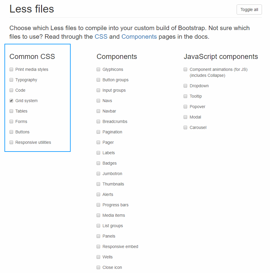
And that's it, download the generated zip and include the bootstrap.min.css file in your document:
<link rel="stylesheet" type="text/css" href="./css/bootstrap.min.css">Then use the grid as usual:
<div class="row">
    <div class="col-sm-4">.col-sm-4</div>
    <div class="col-sm-4">.col-sm-4</div>
    <div class="col-sm-4">.col-sm-4</div>
</div>
As advantage of both approaches is that you will only get the Grid CSS no extra useless styles that can harm your own styles.
Happy coding !