
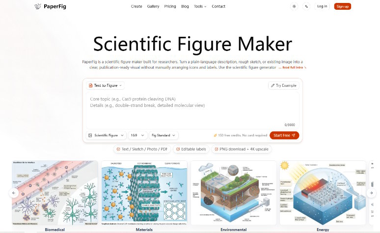
A research group can automate a chart and still make the paper harder to trust. The useful question around PaperFig is therefore not whether it can draw a polished pathway. It is whether a team can turn a rough scientific story into a draft that is easier to inspect, correct, and defend. That distinction matters when a figure has arrows, labels, and implied causal links that may carry more meaning than a full paragraph.
PaperFig accepts five kinds of starting material: text, a sketch, a photo, a PDF, or a reference image. It then provides an editable visual rather than asking the researcher to arrange every icon and label on a blank canvas. For a research software engineer supporting several projects, that changes the first build. It does not remove the need to check the science.
The Real Bottleneck Is Translating Scientific Structure
Most figure requests arrive in an awkward middle state. The scientist knows the mechanism, but the request is spread across a manuscript paragraph, a hand-drawn sketch, and comments from two coauthors. A designer sees visual objects. A researcher sees evidence, uncertainty, and relationships. Rework begins when those two views are compressed into a request such as “make this cleaner.”
A useful figure brief names entities and relationships before it names colors. If molecule A activates pathway B, the arrow needs a defined meaning. If one panel shows a hypothesis rather than an observed result, the wording needs to preserve that boundary. PaperFig can reduce layout work, but the group still needs one accountable interpretation of the study.
Convert Manuscript Claims Into Visible Relationships First
Start by extracting only what the reader must see: the input, the process, the measured outcome, and any supported direction of effect. This is close to turning domain logic into a typed interface. Every node should have a role, and every connection should have a reason. Details that do not change the reading path belong in the caption or manuscript.
That preparation also creates an audit trail. When a label looks wrong later, the team can compare it with a short source sentence instead of reopening twenty pages of notes. A ten-minute structure pass can prevent hours of rework after coauthors begin discussing font sizes while the mechanism itself is still unsettled.
Five Input Paths Serve Different Evidence States
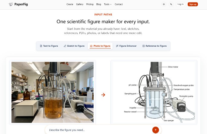
The five input modes are not interchangeable shortcuts. They represent different states of understanding. Text works when the scientific sequence is already clear. A sketch works when spatial arrangement carries part of the idea. A photo can anchor a device or specimen. A PDF may provide context, while a reference image can establish a visual direction.
A small intake rule keeps the tool from hiding ambiguity:
- Use text when relationships can be written as explicit actions.
- Use a sketch when left-to-right order or layered structure matters.
- Use a photo when a real object must stay recognisable.
- Use a PDF only after removing confidential or irrelevant material.
- Use a reference image for composition, not as permission to copy protected work.
Choose Inputs By Uncertainty Not Convenience
A photo-heavy brief can look detailed while saying almost nothing about causality. A long prompt can contain every noun in the paper yet leave the reading order unclear. The input should expose the uncertainty that still needs a decision. If the team disagrees about whether a feedback arrow is justified, no visual reference can settle that scientific question.
This is also where data handling belongs. Uploaded prompts, PDFs, images, and generated figures may pass through third-party AI, storage, and moderation services. Patient identifiers, PHI, confidential unpublished research, proprietary datasets, or grant-review material should not be placed in the workflow. Redaction is an intake step, not a final polish task.
Editable Labels Turn Generation Into An Audit Loop
Image generation often fails in the smallest place with the largest consequence: text. A pathway name can be misspelled, a plus sign can disappear, or a label can drift toward the wrong arrow. A figure may look convincing at slide size while becoming unreadable when checked at the final column width.
PaperFig includes OCR-based label editing, so one word can be corrected without regenerating the whole image. That matters because regeneration changes more than the typo. It can alter object placement, arrow geometry, or visual emphasis and send an approved panel back into review.
Run A Three Pass Render Test
A simple render test can separate scientific review from visual review. Pass one checks whether every entity and relationship matches the source material. Pass two checks whether labels remain readable and attached to the right object. Pass three places the image at its intended manuscript or slide size. A 3/3 result means the same claim survives all three views; anything less goes back before circulation.
When using an AI scientific figure maker, label correction should be treated like a code patch: small, traceable, and followed by a focused regression check. If changing one word leaves an arrow pointing at the wrong compartment, the export is a hard fail even if the rest of the composition looks polished.
Version the accepted brief beside the draft image. A reviewer can then distinguish a generation error from a change in scientific intent. Without that record, a team may correct the picture to match a newer explanation and later forget that the manuscript still contains the older one.
Export Choices Should Follow The Review Stage
Basic PNG is enough for an early discussion draft. Paid plans add 4K output and editable SVG or PPTX label exports, which are more useful when a figure is moving toward a paper or presentation. The important choice is not always maximum resolution. It is whether the next reviewer needs a stable image, editable wording, or a file that can survive layout changes.
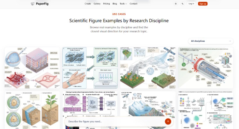
PaperFig also maintains a public library of journal-style examples. Those examples can help a team discuss label density, panel balance, and reading direction without starting from generic AI art. They should remain visual references. They are not evidence, and they do not validate the scientific content of a new figure.
Before export, the owner should be able to answer four questions:
- Does every arrow express a relationship supported by the manuscript?
- Can every label be read at the final placement size?
- Are hypotheses and measured results visually distinguishable?
- Has sensitive or unauthorised source material been kept out?
A discarded draft at this stage is cheaper than a misleading figure in peer review. The visible cost is another edit. The hidden cost is the meeting spent explaining why an attractive image says something the paper does not.
For code-heavy projects, the same discipline used for data pipelines applies here: define the expected output, inspect the transformation, and reject silent changes. The generated image is not reproducible merely because a button can be clicked again. Reproducibility comes from preserving the brief and the reviewed result.
Use Automation To Make Review More Concrete
PaperFig fits teams that already know scientific review cannot be delegated. It can shorten the move from a plain-language mechanism to an editable draft, especially when manual icon placement is blocking the real discussion. It is less useful when the underlying claim is still unsettled or the only available inputs contain material that cannot be shared with third-party AI services.
The strongest outcome is not a figure produced without human work. It is a reviewable object that makes disagreement visible earlier. When the group can point to one label, one arrow, or one unsupported relationship, the conversation becomes specific enough to fix.