
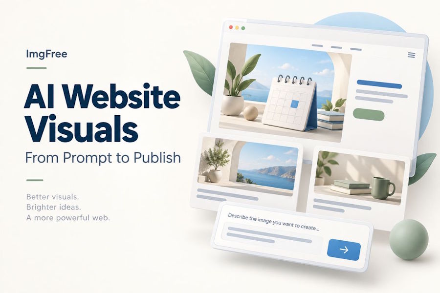
A website can be almost ready to launch and still feel unfinished. The navigation works, the copy is in place, and the signup form behaves properly. Yet the hero section contains a placeholder, while the blog cards use whatever stock photos were easiest to find.
AI image generation offers another way to fill those gaps. The challenge is deciding what belongs on the page. A striking picture can still leave no room for a headline or become unreadable when cropped into a small card.
I would start with the layout, build a short visual brief, and judge each result inside the page where it will appear. Here is a practical workflow for doing that without turning image selection into a separate project.
Define the Image’s Role Before Writing a Prompt
Give each image one job. A landing-page illustration might establish the product’s mood. A blog cover should communicate the article’s subject. A feature image may need to clarify an idea that the adjacent paragraph introduces.
Write down the placement, intended proportions, and space needed for surrounding content. If the headline sits on the left, ask for the visual subject on the right. If the image will appear in a compact card, favor one recognizable object over an elaborate scene.
For example, a scheduling tool could use a calm arrangement of calendar cards and simple geometric shapes. That communicates organization without pretending to show the product’s actual interface. Use a real screenshot wherever visitors need to see how the software works.
Generate a Few Visual Directions Before Choosing One
ImgFree presents itself as an unlimited AI image generator and offers text-to-image creation alongside image-to-image tools. For a website project, the relevant starting point is a short description of the visual you need, followed by a few deliberately different interpretations.
I would compare three directions: an editorial illustration, a restrained three-dimensional scene, and a photographic concept. Keep the subject and intended placement unchanged. This makes the comparison about visual language rather than three unrelated ideas.
Place those candidates in the same rough page mockup. Which one makes the headline easier to understand? Which one fits the existing buttons, spacing, and colors? Choose a direction before spending time correcting small details.
Write Prompts That Fit the Page Layout
A useful prompt describes the composition as clearly as the subject. Include the main objects, their placement, the background, the palette, and the intended level of detail. Describe the space around the subject, too.
For the scheduling-tool example, a starting prompt could be:
Wide website hero illustration for a scheduling application. Three simple calendar cards arranged on the right half of the image, supported by rounded geometric shapes. Warm off-white background, muted blue and sage accents, soft shadows, clean editorial 3D style. Keep the left half quiet and mostly empty for a separate headline. No words, numbers, logos, or interface labels.
The prompt does not ask the model to design the whole website. It asks for an asset with a specific place in that website.
After reviewing a result, change the instruction responsible for the problem. If the image feels crowded, reduce the object count. If the headline disappears against the background, simplify that area. Rewriting everything makes it harder to understand which adjustment helped.
Keep Related Images Visually Consistent
Once a direction works, save a short style note. Record the palette, background treatment, lighting, perspective, and level of detail. Reuse those descriptions when creating the next asset, while changing the subject to match its purpose.
The following brief could guide a small launch:
| Asset | Subject | Composition requirement |
|---|---|---|
| Homepage hero | Calendar cards | Subject on the right; open space on the left |
| Blog cover | A single planning notebook | Clear central subject that survives a thumbnail crop |
| Feature illustration | Three connected task cards | Simple arrangement readable beside a short paragraph |
Shared colors alone will not make the set consistent. A glossy object photographed from above may look out of place beside a flat illustration drawn at eye level. Check the whole group together.
I would also keep the original prompt beside each exported image. If a new page needs artwork a month later, that small record gives the next person a usable starting point.
Prepare Generated Images for the Web
Treat a generated image as a source asset. Keep that original, then make an export for the page. Crop for the intended placement before compressing, so you are not shipping pixels the visitor will never see.
Choose an image format appropriate to the content and compare the export at its actual display size. Smooth backgrounds can reveal compression artifacts; tiny decorative details may disappear completely. Google’s Learn Images course explains image formats, responsive delivery, and compression in more detail.
Where your site supports responsive images, provide suitable source sizes instead of sending the largest version to every device. Specify image dimensions so the browser can reserve space while the file loads. Check what the CMS already handles before adding another optimization layer.
Keep the headline, supporting copy, and button labels in HTML. This lets the page reflow on smaller screens and makes later copy changes straightforward. W3C’s guidance on images of text explains why ordinary text is preferable when the same presentation can be achieved with web technologies.
Accessibility also depends on the image’s purpose. An informative image needs an appropriate text alternative; a purely decorative one may need an empty alt attribute. The W3C alt decision tree helps distinguish those cases. Avoid describing decorative objects simply to squeeze keywords into the page.
Review the Image in the Actual Page
Open the page at a wide desktop size and a narrow mobile size. A composition that works next to a headline may fail when the same image moves above it. Check the crop rather than assuming the desktop version will scale gracefully.
Inspect both the technical presentation and the meaning. Is the subject still visible? Does the image suggest a feature the product does not have? Are shapes malformed, edges awkward, or background details distracting?
A useful review order is:
- Read the headline and look at the image together.
- Check the main subject at mobile and thumbnail sizes.
- Inspect visible details at the intended display size.
- Confirm the image does not compete with the primary action.
- Check loading behavior and the text alternative.
If a picture needs a long explanation to fit the page, reconsider the concept before polishing it further. An attractive asset is still the wrong asset when it introduces a different story.
Publish the Asset That Serves the Page
The strongest website visual is the one that helps the visitor understand what is in front of them. That may be a simple illustration, a carefully framed photograph, or an actual product screenshot.
Use AI to explore suitable artwork, then bring the decision back to the page. A clear brief, a consistent visual direction, and a properly prepared export give the finished site something more useful than another impressive image: a visual that belongs there.