Bootstrap is (and it will be for a lot of time) without a doubt one of the most awesome and known HTML, CSS and JavaScript frameworks that you can use as a basis for creating web sites or web applications. Among other features, it includes base CSS and HTML for typography, icons, forms, buttons, tables, layout grids, and navigation, along with custom-built jquery-plugins and support for responsive layouts.
With the introduction of ReactJS, many developers adopted it as default tool on their daily development process. That means that jQuery was and its being set a side at least for the development of very dynamic web applications. But, what has to do jQuery with Bootstrap? Well, jQuery is required to make the Bootstrap Components works right and that's the other problem, the original Bootstrap library uses the native DOM of the browser and React implements a virtual DOM. That's why, to solve all this inconvenients and to keep the easy tradition of using Bootstrap as a basis for the UI, a React library of bootstrap was written.
This library can help you to work in the React way while using the awesome and easy to use Bootstrap features.
1. Install React Bootstrap
The React Bootstrap module implements all of the Bootstrap 3 components as React components, so they can be easily embedded into your application. It doesn't depend on jQuery, so your code will be kept so clean as possible.
To install it, switch to the directory of your project with the terminal and install it executing the following command:
npm install react-bootstrapAfter the installation, you will be able to require any of the components that the original Bootstrap library has to offer. For more information about this library, please visit the official repository at Github here.
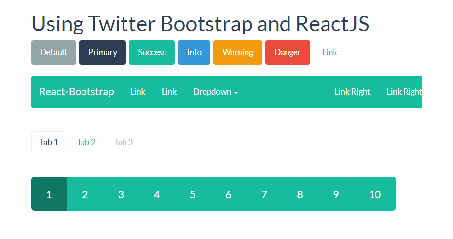
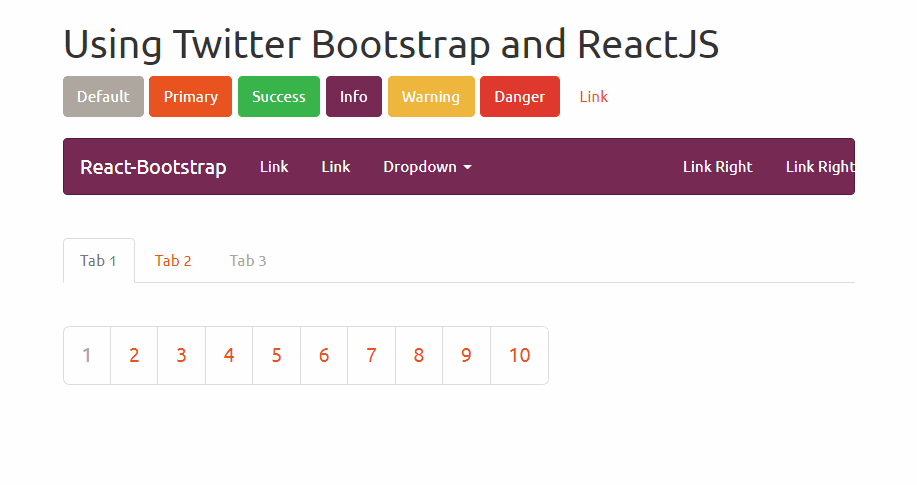
2. Define your Bootstrap theme
As you know, everybody create their own boostrap theme or just use a default theme. Following this simple guideline, React-Bootstrap doesn't depend on any version of Bootstrap CSS nor implements their own version of it. It's obvious that you need to add some CSS to make the Component looks good, however that is totally up to you. The simplest way is to use any version of the Bootstrap CSS from a free CDN (the default and widely known basic bootstrap theme):
<!-- The default CSS of Bootstrap -->
<link href="https://maxcdn.bootstrapcdn.com/bootstrap/3.3.7/css/bootstrap.min.css" rel="stylesheet" integrity="sha384-BVYiiSIFeK1dGmJRAkycuHAHRg32OmUcww7on3RYdg4Va+PmSTsz/K68vbdEjh4u" crossorigin="anonymous">
Or you can use a theme from the awesome free collection of Bootstrap themes by Bootswatch like "United" that looks a lot better than the default theme of Bootstrap:
The procedure is really simple, just include a CSS file inside the head tag of your document and you're ready to go:
<!doctype html>
<html lang="en">
    <head>
        <meta charset="utf-8">
        <title>My Awesome React App</title>
        <meta name="viewport" content="width=device-width, initial-scale=1">

        <!-- Include some Bootstrap CSS Theme -->
        <link href="https://maxcdn.bootstrapcdn.com/bootswatch/3.3.7/united/bootstrap.min.css" rel="stylesheet" integrity="sha384-pVJelSCJ58Og1XDc2E95RVYHZDPb9AVyXsI8NoVpB2xmtxoZKJePbMfE4mlXw7BJ" crossorigin="anonymous">
    </head>

    <body>
        <div class="container">
            <div id="app">Loading...</div>
        </div>

        <script type="text/javascript" src="bundle.js"></script>
    </body>
</html>
With this, now your components in React will look as they should. Alternatively you can configure webpack to include and transpile the SASS source files of bootstrap so you can configure and modify the styles of Bootstrap as you wish.
3. Using Bootstrap Components in React
As a tipical approach in React, every Bootstrap component can be imported from the library:
Layout
One of the most awesome features of Bootstrap, it was its revolutionary layout grid system. Grid systems are used for creating page layouts through a series of rows and columns that house your content. Tipically, every row of bootstrap is wrapped inside a container either normal or container-fluid. In the React version, these components are named as Grid and can be used in the following way:
import Grid from 'react-bootstrap/lib/Grid';

const Container = (
    {/* Normal BS would be: <div class="container"></div>*/}
    <Grid>

    </Grid>
);

const ContainerFluid = (
    {/* Normal BS would be: <div class="container-fluid"></div>*/}
    <Grid fluid={true}>

    </Grid>
);
As next comes the Row component that defines an horizontal div where you can place some columns:
import Row from 'react-bootstrap/lib/Row';

const MyRow = (
    {/* Normal BS would be: <div class="row"></div>*/}
    <Row>

    </Row>
);
And finally the widely known responsive columns of bootstrap
import Grid from 'react-bootstrap/lib/Grid';
import Row from 'react-bootstrap/lib/Row';
import Col from 'react-bootstrap/lib/Col';

const MyAwesomeLayout = (
    <Grid>
        <Row>
            <Col xs={12} md={8}>
                {/* Some content */}
            </Col>
            <Col xs={6} md={4}>
                {/* Some content */}
            </Col>
        </Row>

        <Row>
            <Col xs={6} md={4}>
                {/* Some content */}
            </Col>
            <Col xs={6} md={4}>
                {/* Some content */}
            </Col>
            <Col xsHidden md={4}>
                {/* Some content */}
            </Col>
        </Row>

        <Row>
            <Col xs={6} xsOffset={6}>
                {/* Some content */}
            </Col>
        </Row>

        <Row>
            <Col md={6} mdPush={6}>
                {/* Some content */}
            </Col>
            <Col md={6} mdPull={6}>
                {/* Some content */}
            </Col>
        </Row>
    </Grid>
);
Buttons
Bootstrap provides different styles of buttons that can be used easily in the same way with React. With plain bootstrap, you only needed to provide a class to define the style of the button, now in ReactJS you can set its type with the bsStyle property:
import ButtonToolbar from 'react-bootstrap/lib/ButtonToolbar';
import Button from 'react-bootstrap/lib/Button';

const buttonsInstance = (
    <ButtonToolbar>
        {/* Standard button */}
        <Button>Default</Button>

        {/* Provides extra visual weight and identifies the primary action in a set of buttons */}
        <Button bsStyle="primary">Primary</Button>

        {/* Indicates a successful or positive action */}
        <Button bsStyle="success">Success</Button>

        {/* Contextual button for informational alert messages */}
        <Button bsStyle="info">Info</Button>

        {/* Indicates caution should be taken with this action */}
        <Button bsStyle="warning">Warning</Button>

        {/* Indicates a dangerous or potentially negative action */}
        <Button bsStyle="danger">Danger</Button>

        {/* Deemphasize a button by making it look like a link while maintaining button behavior */}
        <Button bsStyle="link">Link</Button>
    </ButtonToolbar>
);
Modals
The following component creates a button that displays a modal when clicked. Once you click the close button, the dialog will be closed automatically:
import React from 'react';

import Modal from 'react-bootstrap/lib/Modal';
import Button from 'react-bootstrap/lib/Button';

export default class App extends React.Component {
    constructor(props, context) {
        super(props, context);

        // Handle state
        this.state = {
            show: false
        };
    }

    render() {
        // Close the dialog
        let close = () => {
            this.setState({ show: false});
        };

        return (
            <div className="modal-container" style={{ height: 200 }}>
                <Button
                    bsStyle="primary"
                    bsSize="large"
                    onClick={() => this.setState({ show: true })}
                >
                    Launch contained modal
                </Button>

                <Modal
                    show={this.state.show}
                    onHide={close}
                    container={this}
                    aria-labelledby="contained-modal-title"
                >
                    <Modal.Header closeButton>
                        <Modal.Title id="contained-modal-title">Contained Modal</Modal.Title>
                    </Modal.Header>

                    <Modal.Body>
                        Elit est explicabo ipsum eaque dolorem blanditiis doloribus sed id ipsam, beatae, rem fuga id earum? Inventore et facilis obcaecati.
                    </Modal.Body>

                    <Modal.Footer>
                        <Button onClick={close}>Close</Button>
                    </Modal.Footer>
                </Modal>
            </div>
        );
    }
}
As we didn't want to list all the components of bootstrap but the most used, you will find all the components in the documentation on the official React Bootstrap Website here.
Happy coding !