
Data table are (and still will maybe forever) an important part of a HTML document to visualize some information. For some users, is not only the information in the table what matters but the experience by reading it.
If you've already tried to make large data tables work with responsive design, you know what a pain it is, therefore in this article you'll learn how to create a responsive table using plain CSS or even a great implementation with JS.
Creating a responsive table with pure CSS
In order to make a table responsive table, we will focus not in the table itself but the div that will contain our table. In this case we are going to use media queries to modify a class (.table-responsive) according to the screens dimensions. The element that has the .table-responsive class needs to have auto as value in the overflow in the x axis. By using the media query, we'll apply a width of 100% to the div to make it responsive.
.table-responsive {
    min-height: .01%;
    overflow-x: auto;
}

@media screen and (max-width: 767px) {
    .table-responsive {
        width: 100%;
        margin-bottom: 15px;
        overflow-y: hidden;
        -ms-overflow-style: -ms-autohiding-scrollbar;
        border: 1px solid #ddd;
    }
    .table-responsive > .table {
        margin-bottom: 0;
    }
    .table-responsive > .table > thead > tr > th,
    .table-responsive > .table > tbody > tr > th,
    .table-responsive > .table > tfoot > tr > th,
    .table-responsive > .table > thead > tr > td,
    .table-responsive > .table > tbody > tr > td,
    .table-responsive > .table > tfoot > tr > td {
        white-space: nowrap;
    }
}
Then you just need to wrap your table independently of the size, within a div with the table-responsive class as shown in the following example:
<!-- Don't forget to wrap you table inside a div with the table-responsive class -->
<div class="table-responsive">
    <table>
        <thead>
            <tr>
                <th>#</th>
                <th>Field 1</th>
                <th>Field 2</th>
                <th>Field 3</th>
            </tr>
        </thead>
        <tbody>
            <tr>
                <td>1</td>
                <td>Value 1</td>
                <td>Value 2</td>
                <td>Value 3</td>
            </tr>
            <tr>
                <td>2</td>
                <td>Value 1</td>
                <td>Value 2</td>
                <td>Value 3</td>
            </tr>
            <tr>
                <td>3</td>
                <td>Value 1</td>
                <td>Value 2</td>
                <td>Value 3</td>
            </tr>
        </tbody>
    </table>
</div>
However, note that the table width (on screens where the responsive class isn't needed) will be defined by the table data, so if your table is small, you can set a "more responsive" table by setting the width of 100% with css:
<div class="table-responsive">
    <table style="width:100%;">
        <!-- Some content -->
    </table>
</div>
Or by creating a class named table to make this property more obvious:
<style>
    /*Or in an external CSS file*/
    .table{
        width:100%;
    }
</style>
<div class="table-responsive">
    <table class="table">
        <!-- Some content -->
    </table>
</div>
Creating a responsive table with CSS and JS
If you want to create a most functional responsive table working with Javascript too, then we got an interesting solution in case you're able to use JS. We are talking about responsive-tables.js, this simple JS/CSS combination will let your tables adapt to small device screens.
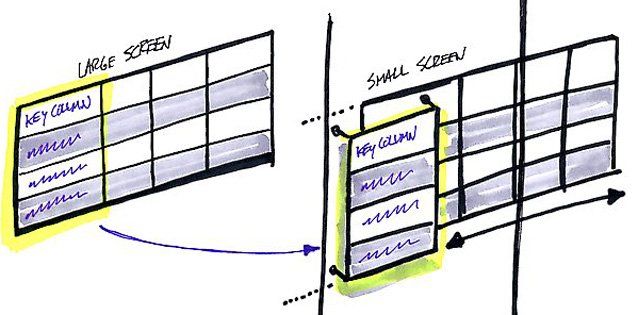
Note: this plugin will be useful, only if the first column is the key of the table and not only the headers as the first column will be always shown and the other content will be scrollable on small devices.
How it Works
If you analize some table designs, you'll realize that most of the time, the first column is the unique key for a table. That provides the reference for the other columns, while the column headers provide the legend for what everything means. With that in mind, this plugin make our responsive tables to have that first column available at all times.
To get started include the required js and css file in your document (visit the homepage of the plugin or the official repository in Github):
<!-- Add the styles -->
<link href="responsive-tables.css" type="text/css" media="screen" rel="stylesheet"/>
<!-- Add the JS plugin -->
<script type="text/javascript" src="responsive-tables.js"></script>
Then, in difference of our first example with only CSS, to make a table responsive with this plugin you'll need to add the responsive class to the table:
<table class="responsive">
    <!-- Information -->
</table>
The Javascript initialization will be automatic applied to all the tables with the responsive class, from there on your tables will be modified client-side when the window is smaller than a regular tablet (so most any smartphone or very small tablets).
Other tricks
Hide irrelevant information
If you have a table with a lot of data and you would like to make it readable on small screen devices there are many other solutions that you can implement, for example hiding some irrelevant fields by adding a simple class that hides the field on low resolution devices, for example:
/* This media query will hide the fields in devices with a resolution of 320px*/
@media screen and (max-width: 320px) {
    .hide-on-mobile {
         display: none;
     }
}
The hide-on-mobile class will hide the element with the specified class on devices with a screen resolution lower than 320px. So now, our table will look like:
<!-- Don't forget to wrap you table inside a div with the table-responsive class -->
<div class="table-responsive">
    <table>
        <thead>
            <tr>
                <th class="hide-on-mobile">#</th>
                <th>Field 1</th>
                <th>Field 2</th>
                <th>Field 3</th>
            </tr>
        </thead>
        <tbody>
            <tr>
                <td class="hide-on-mobile">1</td>
                <td>Value 1</td>
                <td>Value 2</td>
                <td>Value 3</td>
            </tr>
            <tr>
                <td class="hide-on-mobile">2</td>
                <td>Value 1</td>
                <td>Value 2</td>
                <td>Value 3</td>
            </tr>
            <tr>
                <td class="hide-on-mobile">3</td>
                <td>Value 1</td>
                <td>Value 2</td>
                <td>Value 3</td>
            </tr>
        </tbody>
    </table>
</div>
Show charts instead of tables
If you want an optimal user experience, then you may probably want to convert any table on small devices to charts. Almost all the charts plugins work on mobile devices and small screens providing responsive support.
You can use know plugins like HighchartTablePlugin or Chartinator.
Have fun !