
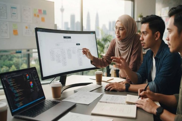
Website navigation is one of the most important elements of a successful online presence. It determines how easily visitors can move from one page to another, locate information, and complete desired actions. A website with clear and organized navigation improves user experience, encourages longer visits, and increases the chances of conversions. Businesses that prioritize navigation often enjoy lower bounce rates and higher customer satisfaction.
Working with web design malaysia experts helps businesses create navigation systems that are simple, intuitive, and visually appealing. These professionals understand user behavior, modern design principles, and industry standards. Their expertise ensures that every visitor can find relevant information quickly, whether they are browsing on a desktop, tablet, or smartphone.
Why Navigation Matters?
Navigation serves as the roadmap of a website. Without a logical structure, visitors may become frustrated and leave before exploring the products or services offered. Effective navigation keeps users engaged by providing a seamless browsing experience.
Good navigation also supports business objectives. Whether the goal is generating leads, increasing online sales, or building brand awareness, a well-designed navigation system helps users complete their journey without unnecessary confusion. Every click should move visitors closer to their intended destination.
Understanding User Behavior
Before designing navigation, it is important to understand how users interact with websites. Visitors generally expect familiar layouts and straightforward menus. When navigation follows common patterns, users can explore the site without needing additional instructions.
Web design malaysia experts analyze visitor behavior through research, usability testing, and analytics. They identify popular pages, user preferences, and browsing habits to build navigation that matches customer expectations. This user-focused approach leads to better engagement and improved website performance.
Simple Menu Structure
A clean menu structure forms the foundation of user-friendly navigation. Overloading the main menu with too many options can overwhelm visitors and make important pages difficult to locate.
A simple navigation menu usually includes:
- Home
- About
- Services
- Products
- Blog
- Contact
Additional pages can be organized into logical dropdown menus when necessary. This keeps the navigation clean while still providing access to detailed information.
Clear Navigation Labels
The wording used in navigation menus significantly impacts usability. Visitors should immediately understand where each menu item will take them. Complicated or creative labels may confuse users and reduce navigation efficiency.
Instead of using vague titles, businesses should choose direct and descriptive names. For example, "Our Services" is much clearer than "What We Do." Straightforward language helps users make quick decisions and improves their overall browsing experience.
Logical Website Hierarchy
A well-organized website hierarchy ensures information is arranged in a logical order. Important pages should always be easy to access, while supporting content can be placed within categories or subcategories.
A typical website hierarchy includes:
1. Primary Pages
These pages are directly accessible from the main menu and contain essential information.
2. Secondary Pages
These pages provide detailed information related to primary sections and are usually accessible through dropdown menus or internal links.
This organized structure allows visitors to navigate naturally without feeling overwhelmed.
Mobile-Friendly Navigation
With more users browsing on smartphones, mobile navigation has become a critical part of website design. Menus must function smoothly on smaller screens while maintaining the same level of usability as desktop versions.
Responsive navigation often includes:
- Collapsible hamburger menus
- Large touch-friendly buttons
- Readable text
- Fast loading menus
- Easy scrolling
Web design malaysia experts ensure that navigation remains consistent across all devices, providing users with a seamless browsing experience regardless of screen size.
Consistent Navigation Design
Consistency builds familiarity and trust. Visitors expect navigation elements to remain in the same location throughout the website. Moving menus or changing layouts between pages can create confusion.
Professional designers maintain consistency by keeping menu placement, fonts, colors, spacing, and button styles uniform. This predictable design helps visitors focus on the content instead of learning new navigation patterns on every page.
Effective Internal Linking
Internal links play a valuable role in improving navigation beyond the main menu. They guide visitors toward related content, helping them discover additional information without returning to the homepage.
Examples of effective internal linking include:
- Related blog articles
- Similar products
- Service recommendations
- Frequently asked questions
- Contact pages
Strategic internal links improve user engagement while also supporting search engine optimization.
Search Functionality
For websites containing extensive content, a search feature becomes an essential navigation tool. Visitors often prefer searching directly rather than browsing through multiple categories.
An effective search function should:
- Deliver accurate results
- Display suggestions while typing
- Correct minor spelling errors
- Load results quickly
By making information easier to locate, businesses can significantly improve user satisfaction.
Visual Design and Navigation
Navigation should not only function well but also complement the overall website design. Colors, typography, spacing, and icons all contribute to a pleasant browsing experience.
Designers carefully balance aesthetics with usability. High contrast between text and background improves readability, while appropriate spacing prevents menus from appearing cluttered. Attractive visuals combined with practical functionality create a professional appearance that encourages visitors to continue exploring.
Improving Accessibility
Accessible navigation ensures that every visitor, including individuals with disabilities, can use the website comfortably. Inclusive design expands audience reach while demonstrating social responsibility.
Accessibility features include:
- Keyboard-friendly navigation
- Clear focus indicators
- Descriptive menu labels
- Sufficient color contrast
- Screen reader compatibility
Web design malaysia Experts incorporate accessibility standards into navigation design, making websites usable for a broader range of visitors.
Navigation and SEO
Search engines evaluate website structure when ranking pages. Clear navigation helps search engine crawlers understand relationships between pages, resulting in better indexing and improved visibility. Businesses that invest in web design kl services often benefit from navigation strategies that support both user experience and search engine performance.
SEO-friendly navigation includes descriptive URLs, logical page organization, optimized internal linking, and structured menus. These elements enhance both user experience and search engine performance, creating long-term digital marketing benefits.
Testing and Continuous Improvement
Even well-designed navigation should be regularly evaluated. User expectations change over time, and businesses frequently add new products, services, or content that may require updates.
Professional designers monitor website performance through analytics, heatmaps, and user feedback. Continuous improvements ensure navigation remains effective as the business grows. Regular testing identifies potential obstacles before they negatively affect user experience.
Benefits of Choosing Inspiren
Inspiren Network Sdn Bhd helps businesses create websites with user-friendly navigation, responsive layouts, and modern designs that enhance the overall browsing experience. Their team focuses on delivering solutions that improve usability, support SEO, and align with each client's business goals.
Benefits of choosing Inspiren include:
- User-friendly website navigation
- Responsive web design
- SEO-friendly website structure
- Fast-loading pages
- Professional and modern designs
- Customized web solutions
- Reliable support and maintenance
With a commitment to quality and customer satisfaction, it delivers web solutions that help businesses strengthen their online presence and achieve long-term success.
Conclusion
Creating user-friendly navigation is essential for delivering an excellent website experience. Visitors should always be able to find information quickly, move between pages effortlessly, and complete their desired actions without confusion. Clear menus, logical organization, responsive design, accessibility, and effective internal linking all contribute to a successful navigation system.
By working with web design malaysia experts, businesses gain access to professional knowledge that transforms complex websites into simple, intuitive digital experiences. Their strategic approach combines user experience, modern design principles, and search engine optimization to build websites that attract visitors, encourage engagement, and support long-term business growth. Investing in user-friendly navigation is not only beneficial for customers but also a powerful strategy for improving online success and strengthening a brand's digital presence.