
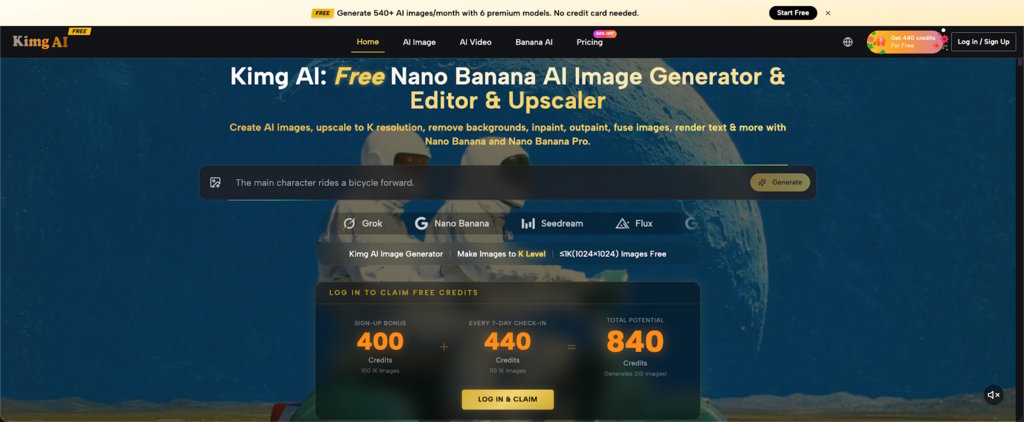
Writers often know exactly what they want to explain but struggle to find an image that matches it. Stock photos may show a smiling student, a laptop, or a notebook without clarifying the actual topic. A custom illustration can be more useful, especially when an article, lesson, or presentation depends on a specific situation. Nano Banana on Kimg AI allows users to generate images from written prompts or transform an uploaded photo with instructions. The challenge is not writing the longest possible prompt. It is translating a paragraph into a visible scene. When the image has one clear purpose, it can help readers understand the text instead of merely filling empty space.
Find the Sentence the Image Must Explain
Before creating an image, select one sentence from your draft that deserves visual support. Do not try to illustrate the entire article at once. Look for a sentence that describes a process, contrast, setting, or difficult idea.
Suppose a student is preparing a presentation about study habits. The key sentence might be, “A clear desk reduces distractions during a short revision session.” That sentence gives the image a subject, environment, and action. A useful visual could show one student reviewing notes at a simple desk with a phone placed out of reach. By contrast, “Education is important for success” is too broad. It invites a generic school image. Strong visual planning begins with a sentence that contains something a viewer can actually see.
Turn the Sentence Into Three Prompt Parts
A clear sentence can be converted into a practical prompt by separating who or what appears, what is happening, and how the scene should be arranged. This structure keeps the instruction readable and makes later corrections easier.
- Name the Main Subject
Start with the person, object, or place that carries the idea. Be specific enough to create a visible scene, but avoid adding details that do not matter. “A university student at a desk” is more useful than “a person learning.” If the article is about food writing, the main subject may be a bowl, a cook, or a market stall. If it is about workplace communication, it may be two colleagues reviewing a document. Choose one primary subject whenever possible. Too many equally important subjects make the image difficult to read.
- Describe the Action
Next, state what the subject is doing. Use a concrete verb: comparing, revising, pointing, arranging, reading, presenting, or correcting. With Nano Banana AI, the published Kimg AI workflow allows a user to enter a prompt or upload an image, describe the desired change, and choose a model. This means the action can be created from text or adjusted in an existing photo. For example, ask to keep a student’s appearance while changing the scene from casual browsing to focused note review. The visible action should match the sentence you selected.
- Arrange the Scene for Reading
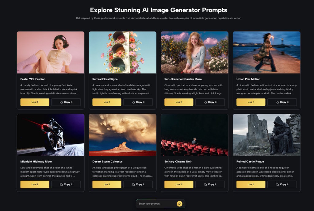
Finally, explain the composition. Decide whether the image needs empty space for a title, a close view of an object, or a wider view that shows context. A presentation cover may need the subject placed to one side. When the presentation itself still needs to be structured, an AI presentation maker can help turn the main ideas into an organized set of slides before you refine the visuals. An article illustration may work better with the main action in the center. Keep the background simple when the educational point depends on a small detail. For the study-habit example, a crowded bedroom would weaken the message. A clean desk, visible notes, and a phone set aside communicate the idea more directly.
Use Contrast to Explain Difficult Ideas
Some topics become clearer when two conditions are shown side by side or through closely matched versions. Contrast works well for grammar lessons, writing advice, productivity topics, and step-by-step explanations. The important rule is to change one meaningful element while keeping the rest similar.
A writing article about vague and precise language might show two scenes based on the same setting. In the first, a sign reads as a confusing block of information. In the second, the information is arranged in a short heading and clear sections. If text rendering is not central to the task, use objects and actions instead: one cluttered desk versus one organized desk, or one speaker reading dense notes versus another using a simple outline. Contrast helps the reader see the lesson before reading a long explanation.
Keep Characters and Style Consistent
A presentation or article series feels more polished when its visuals appear to belong together. Choose a stable style, character, lighting approach, and level of detail before producing several images. Kimg AI states that Nano Banana supports up to four reference images, which may help when a person, object, or visual style needs to remain consistent.
For a three-part lesson about public speaking, use one clear character reference and describe a different stage in each image: preparing notes, practicing alone, and presenting to a small group. Keep the person’s clothing and general room style stable. Do not introduce a new visual style in every slide. Consistency reduces distraction because the audience can focus on what changes in the lesson. It also makes the final presentation look planned rather than assembled from unrelated sources.
Review the Image Against the Paragraph
An image may be attractive and still contradict the writing. Read the paragraph again while looking at the visual. Check whether the subject, action, mood, and sequence match. If the paragraph describes a quiet individual task, an image of a lively group will create confusion even if it looks professional.
Use four review questions: What is the first thing I notice? Does that match the paragraph’s main idea? Is any visible detail misleading? Will the image remain clear at the intended size? A student creating a slide should preview it in presentation mode, not only in the image generator. A blogger should view the image inside the article layout. Context reveals problems such as a covered face, unreadable details, or a focal point that competes with the heading.
Avoid Asking the Image to Carry Every Detail
Visuals should support writing, not replace all explanation. An image crowded with labels, symbols, objects, and actions can be harder to understand than the paragraph it is supposed to help. Decide which part belongs in the picture and which part belongs in the caption or body text.
For example, an article about revising an essay may use an image of a writer comparing two printed drafts. The paragraph can explain checking structure, evidence, grammar, and word choice. There is no need to force all four ideas into the scene. Add a short caption that tells readers what to notice. This division keeps the visual simple while allowing the writing to remain accurate and detailed. The result is clearer than an image trying to behave like an entire lesson.
Conclusion
Clear educational visuals begin with clear writing. Select one sentence, identify the subject and action, then arrange the scene around the place where the image will appear. Use contrast when readers need to compare two conditions, and keep characters or styles stable across a series. Most importantly, review the image against the paragraph rather than judging it alone. These steps help students, teachers, and writers create visuals that explain instead of decorate. Choose one paragraph from your current draft and underline the sentence that is hardest to imagine. Turn that sentence into one simple scene, then let the surrounding text provide the rest of the meaning.