
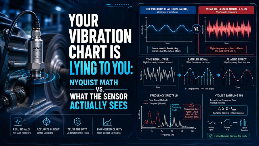
A missed bearing fault on a critical pump can cost a plant six figures before lunch, and the dashboard that missed it usually looked fine right up to the moment things went sideways. Smooth chart, flat trend, no alert.
The failure wasn't in the frontend, the database, or the alerting rule. It was baked into the very first line of the ingest pipeline: the assumption that the number the sensor sent is the number the machine was doing.
That assumption is where developers building industrial IoT dashboards and the engineers who trust physical measurements part company. It’s worth holding those two views side by side.
The Developer View Treats a Sample as a Value
In software, a reading is a row. It has a timestamp, a device ID, a float, and maybe a unit. You chart it. You average it. You compare this hour to last hour. The pipeline is honest about what it does: it moves numbers from A to B and paints them on a screen.
The trouble is that the float in that row isn't a measurement of the physical world. It's a reconstruction of one, built from a sampled, filtered, quantized snapshot of an analog signal that was already noisy before the ADC touched it. Treat the row as ground truth and every downstream calculation inherits an error you can't see.
A peer-reviewed treatment of measurement uncertainty in IoT sensor networks makes the point directly: classical uncertainty theory doesn't cleanly map onto how these systems behave, and pretending otherwise is how dashboards drift away from reality.
The Engineer View Starts With the Signal, Not the Number
Ask a vibration engineer about a peak on a spectrum and the first question back isn't "what does it mean?" It's "what was your sample rate?" That's not gatekeeping. It's the difference between a real fault frequency and an alias that folded down from somewhere above Nyquist and landed on top of your bearing band.
The rule is old and unforgiving. To reconstruct a signal without aliasing, you have to sample at more than twice its highest frequency component, and anything above that Nyquist limit doesn't get discarded politely. It gets mirrored back down into the range you're charting, where it becomes indistinguishable from a real vibration at that lower frequency.
Where the Two Views Collide on Real Dashboards
The collision usually looks like one of these:
- Nyquist as a ceiling, not a floor. A developer sees the highest frequency of interest is 1 kHz and sets the sample rate at 2 kHz. In practice, anti-alias filters roll off gradually, so the usable analysis bandwidth is well below Nyquist. Field practice is to sample at roughly 2.5 to 3 times the highest frequency you care about, not 2.
- Averaging away the evidence. Downsampling to "one point per minute" for a nicer chart throws out the transient content that would have told you a bearing was starting to spall. The line looks calm because you smoothed the alarm out of existence.
- Unit-blind axes. Plotting raw ADC counts, or velocity when the standard for that machine class is acceleration, or peak when the maintenance team reads RMS. The number is right and the meaning is wrong.
- Silent gaps. Missing samples get linearly interpolated by the charting library, and a sensor that stopped reporting for ninety seconds looks like a sensor that reported a straight line. Completeness is a signal in its own right and deserves to be charted alongside the value.
The Sensor Is Not the Machine
Even when the sampling is right, the sensor has its own personality. Thermocouples drift. Accelerometers have a resonance of their own that shows up as a peak nobody put there, and pressure transducers care where they're mounted.
A centrifugal pump running through its curve produces vibration, temperature, and pressure signatures that only make sense if you know what the machine is trying to do at that operating point. When your dashboard is charting one, a short primer on how a centrifugal pump works is a better first stop than a signal-processing textbook.
The engineer's mental model is that the sensor is a lossy, biased, band-limited witness to a physical event. The developer's mental model is often that the sensor is a data source. Those aren't the same thing, and the gap between them is where false alarms and missed failures live.