
You have the backend of a side project working, but the landing page still shows a grey placeholder. The feature is real; the interface is not ready to photograph. A launch post needs a hero image, a demo sequence, and a visual explanation of what the tool does. Marketing need not wait for every component.
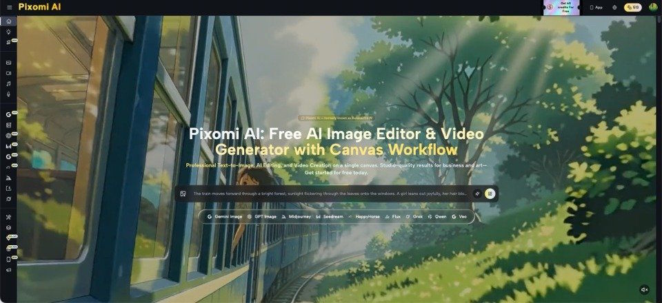
The solution is not to publish a fictional screenshot and hope nobody notices. It is to separate concept visuals from evidence of a working product. Banana Pro AI provides text-based image creation, editing from reference images, and video-generation options that can support the concept stage. Developers still need to decide what is accurate, what is illustrative, and which images must eventually be replaced with captures from the real application. Visuals should make the product easier to understand.
Separate Three Visual Jobs That Teams Often Confuse
A product website may contain a mood-setting illustration, a UI screenshot, and a short demonstration. They are not interchangeable. The illustration tells visitors what problem the product belongs to. The screenshot shows the interface people will use. The demonstration explains what happens when someone performs an action.
Imagine a tool that helps freelancers organise client feedback. An illustration of overlapping comment cards can communicate the frustration of scattered notes. A screenshot should show actual controls and text from the current build. A demo should trace a real journey, such as adding a comment and marking it resolved. Creating one attractive image and stretching it across all three roles makes the product harder to assess.
A practical way to prevent confusion is to label each item in your design file: “concept,” “current UI,” or “recorded behaviour.” The distinction matters when a teammate reuses an image in documentation or a launch thread. It also clarifies where generative imagery belongs: around the product, or in an openly speculative concept, rather than inside invented claims about finished functionality.
Make an Explainer Visual From the User's Actual Problem
Developers often start promotional images with the technology: databases, nodes, dashboards, or glowing code. Those motifs may look familiar, but they rarely explain why someone should care. Start instead with the user action that motivated the project.
For a file-renaming utility, show a chaotic folder becoming understandable. For a meeting-notes tool, show a clear summary emerging from scattered reminders. For a booking product, depict the difference between an unanswered message and a confirmed appointment. These are conceptual scenes, not interface screenshots, so the visual can remain simple.
Write the explanation first: “A freelancer checks one place to see which feedback still needs action.” Then decide whether the image needs a person, an object, or a simplified diagram. Avoid asking an image model to invent long paragraphs of exact interface text. Typeset real labels in your design tool where spelling and alignment matter.
The result should make sense without a developer standing beside it. Show the image to someone unfamiliar with the project, ask what problem it represents, and revise if their answer differs from the product's purpose.
A Three-Stage Demo Plan That Protects Technical Accuracy
- Sketch the story outside the interface
Start with three frames: the problem, the action, and the changed state. A developer building a receipt tracker might show a stack of loose receipts, someone organising them, and a neat collection ready for review. These images communicate a journey without making claims about specific buttons or unsupported integrations.
Generate exploratory illustrations from short, concrete descriptions. Keep a list of what the finished feature really supports. If the tool cannot automatically extract a receipt's currency, do not depict that outcome as an existing capability. An early visual should help shape the demo, not quietly expand the product specification.
- Create a concept image that can evolve
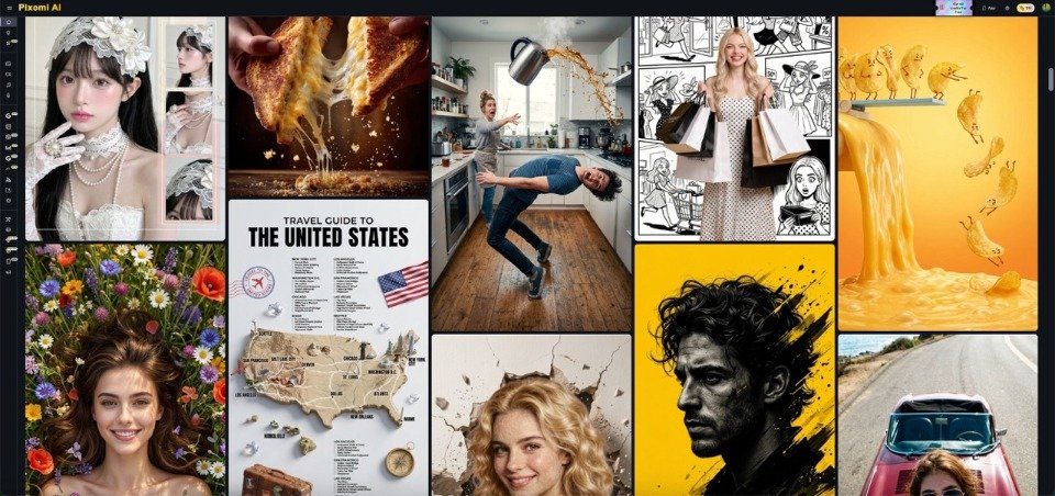
When the direction is clear, refine one concept rather than repeatedly changing the entire scene. Pixomi supports reference-image editing and natural-language instructions, and Nano Banana Pro appears within its image-model offering. Those capabilities can help explore composition or background treatments for an illustrative product scene.
Keep a reference image and a written brief beside each proposed version. Review whether recognisable objects survive editing and whether new elements introduce an unintended promise. A stylised laptop may support an article illustration, but its generated screen should not be passed off as a capture from a released product. Use actual screenshots for that job.
- Replace illustrative claims with captured behaviour
Once the feature works, record the relevant interaction in a test environment. Use representative, non-sensitive sample data and verify that labels match the deployed version. If a short conceptual video helped plan the sequence, it can remain a storyboard reference while a real screen recording becomes the published demonstration.
Check the last frame as carefully as the first. Does the saved state persist? Does the export appear where the viewer expects? Does the screen reflect the product someone can access today? These checks turn a persuasive narrative into an honest explanation. They also reduce the chance that a polished launch asset becomes outdated technical documentation.
Use Generated Motion as a Storyboard, Not a Screen Recording
Image-to-video generation is useful when motion itself is the idea. A floating receipt becoming part of a tidy stack could illustrate organisation in a teaser. It cannot demonstrate that an OCR service correctly parsed the receipt. Animated concepts and captured software behaviour answer different questions.
This distinction is especially important for developer audiences. A short clip showing a cursor clicking an imaginary interface looks like evidence of a feature. A short clip showing objects metaphorically moving into place reads more naturally as an illustration. If the intent is conceptual, make the presentation clearly conceptual.
For a real walkthrough, screen-record the app and cut away unnecessary waiting or typing without changing the sequence of actions. Add captions that describe what the viewer is seeing. If the product requires a manual review step, include it. Removing that step might make the demo cleaner, but it gives users the wrong expectation.
Maintain a Replacement Checklist for Launch Day
Concept visuals have a habit of surviving longer than their original purpose. A hero illustration becomes a social card; a speculative mockup gets copied into a help article. Prevent this with a small inventory of visual assets and their status. Record the image's intended use, owner, last review date, and whether it depicts real behaviour.
Before launch, inspect every place that shows the product: homepage, documentation, product directory listings, onboarding emails, and social previews. Replace outdated UI captures and clarify illustrative images. Check mobile cropping and accessibility descriptions as separate tasks. Neither is solved simply by generating a sharper picture.
You do not need a complex asset-management system to do this. A shared document and a consistent filename convention are enough for a small project. The goal is to prevent a concept that once helped the team think from becoming an accidental promise to customers. That review belongs beside functional testing, not after the launch announcement.
Conclusion
You do not need a finished interface to begin explaining a product. You do need a clear boundary between the idea you are illustrating and the behaviour you are demonstrating. Generative images can help a developer explore a problem scene, plan a visual story, or test the composition of a launch asset. Screenshots and recordings should take over when the audience needs proof of how the product works.
For your next side project, create a three-column list: concepts, current interface captures, and actions to record. Make one visual for each job and label it honestly. As the build changes, update the evidence rather than forcing an old mockup to represent the new product. Start with the user problem, then show the working solution when it is ready.