
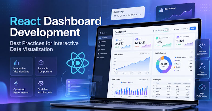
Building the first chart in a React application is usually straightforward. The real challenge starts when that chart becomes part of a dashboard with KPI cards, filters, date ranges, drill-downs, multiple data sources, and frequently changing information.
At that point, React dashboard development is no longer just about rendering charts. Developers need to think about component architecture, data flow, visualization choices, shared state, performance, responsive layouts, and failure states together.
A well-designed dashboard should help users understand data quickly while remaining maintainable as the application grows. The following best practices can help you build React dashboards that stay useful, interactive, and responsive as their complexity increases.
Start With the Decisions the Dashboard Needs to Support
Before choosing a chart type or writing JSX, define what the dashboard needs to help users accomplish.
Start with questions such as:
- Who will use the dashboard?
- What decisions should they make from it?
- Which metrics matter most?
- What information should appear immediately?
- Which details can be revealed through drill-downs or secondary views?
This prevents a common dashboard development problem: adding visualizations simply because data is available.
Instead, establish an information hierarchy. A useful structure might be:
KPIs → trends → comparisons → detailed breakdowns
For example, an ecommerce dashboard could begin with total revenue, orders, and conversion rate. The next section might show revenue trends, followed by comparisons between regions or product categories. A table can then provide individual transaction records.
This creates a logical path through the data instead of forcing users to interpret a collection of unrelated charts.
Build the Dashboard From Reusable React Components
As dashboards grow, keeping the entire interface inside one component becomes difficult to maintain.
A dashboard can instead be divided according to UI and data responsibilities:
Dashboard
├── DashboardHeader
├── FilterBar
├── KPIGrid
├── RevenueChart
├── SalesByRegionChart
├── ActivityTrendChart
└── DataTable
Each component has a clear responsibility. The filter bar manages filter controls, KPI components display summary values, and individual chart components handle specific visualizations.
This structure makes components easier to test and reuse. It also means a visualization can be changed or replaced without rewriting unrelated parts of the dashboard.
However, componentization has another extreme. Turning every heading, label, and small wrapper into a separate component can make the application harder to follow.
Create component boundaries around meaningful responsibilities rather than componentizing every DOM element. A chart with its title, legend, loading state, and visualization logic may form a useful component. A single decorative container probably does not.
Separate Data Fetching, Transformation, and Visualization
One of the most important architectural decisions in React data visualization is keeping raw API data away from visualization-specific code where possible.
A useful data flow looks like this:
- API
- Data fetching layer
- Normalization / transformation
- Dashboard state
- Chart components
Suppose an API returns individual sales records. A revenue chart may need monthly totals rather than individual transactions.
Instead of asking the chart component to fetch the API response, group records, calculate totals, and render the visualization, transform the data first:
- API response
- Revenue grouped by month
- Chart-ready dataset
The chart then receives a predictable structure through props.
This separation has several advantages. API changes are easier to isolate, transformation logic can be tested independently, chart configurations remain easier to read, and processed data can potentially feed multiple visualizations.
Custom hooks can also help organize these responsibilities:
- useDashboardData()
- useSalesData()
- useDashboardFilters()
The goal is not to move every operation into a hook. It is to keep networking, data processing, state, and rendering from becoming tightly coupled inside individual chart components.
Choose the Right Visualization for Each Question
A chart should be selected according to the analytical question it needs to answer, not simply because a particular visualization looks appealing.
| User question | Suitable visualization |
|---|---|
| How is revenue changing over time? | Line or area chart |
| Which region generated the most sales? | Bar or column chart |
| How is revenue divided among a few categories? | Pie, donut, or bar chart |
| How do two variables relate? | Scatter chart |
| What are the headline metrics? | KPI cards |
| What are the individual records? | Table |
For example, a line chart makes changes over time easier to follow, while bar charts are typically easier to compare across categories.
Not everything needs to become a chart either. KPI cards can communicate headline values more efficiently, while tables remain valuable when users need exact records rather than patterns.
A strong data visualization dashboard often combines summary metrics, charts, and tables instead of attempting to visualize every dataset.
Add Interactivity Only When It Helps Users Explore the Data
Interactive data visualization can turn a dashboard from a static report into an analytical interface.
Useful interactions may include:
- tooltips,
- legends,
- date-range selectors,
- filters,
- zoom controls,
- drill-downs,
- cross-filtering,
- highlighting, and
- export controls.
The important question is whether the interaction helps users discover or understand something.
For example, selecting a region in a sales chart could update a second chart to display the products sold in that region. A date selector might update revenue, customer acquisition, and order charts simultaneously.
These interactions provide context without requiring the dashboard to display every possible breakdown on the initial screen.
By contrast, animations, clickable elements, and controls that do not reveal useful information may add complexity without improving analysis.
Interactivity should support exploration, not exist simply because a React chart library makes it available.
Manage Filters and Shared Dashboard State Carefully
An interactive dashboard often has a state that affects multiple components.
For example:
- dateRange
- selectedRegion
- selectedProduct
- comparisonPeriod
If both a revenue chart and sales table depend on selectedRegion, maintaining separate region state inside each component can lead to inconsistent behavior.
Shared filters should usually live high enough in the component hierarchy for every dependent visualization to receive the same value.
For a smaller React dashboard, this may simply mean keeping filter state in the dashboard component and passing values through props.
As complexity increases, React Context or a dedicated state-management solution may become appropriate.
The specific tool is less important than maintaining a predictable flow of state. Users should not encounter situations where one visualization shows data for one period while another still reflects an earlier filter.
Keep Interactive React Dashboards Fast
React dashboards can become expensive to render because they combine data processing, chart rendering, tables, and frequent interactions.
Common performance problems include:
- transforming large datasets during every render,
- repeatedly recreating expensive chart configurations,
- updating unrelated charts after a local state change,
- rendering thousands of points when aggregated data would communicate the same result, and
- polling APIs more frequently than necessary.
Start by reducing unnecessary work rather than immediately adding memoization.
For example, if a chart displays monthly trends, it may not need thousands of individual transaction records. Aggregate the information into the level users actually need to analyze.
Large tables can use pagination or virtualization. Dashboard sections that are not immediately visible may be loaded when needed. High-frequency inputs such as search or range controls may benefit from debouncing.
For genuinely expensive calculations, caching can reduce repeated work when the underlying inputs have not changed. Similarly, preventing unnecessary component updates can help when rendering itself is expensive.
However, avoid wrapping every calculation in useMemo, every function in useCallback, or every component in React.memo automatically. These techniques are performance optimizations, not substitutes for good data flow and component design.
Profile real interactions, identify where work is actually expensive, and optimize those paths.
Design for Responsive Screens, Accessibility, and Failure States
Responsive design
Charts should adapt to changing dashboard layouts rather than simply becoming smaller.
On narrower screens, consider:
- stacking dashboard cards vertically,
- simplifying dense axis labels,
- removing secondary controls,
- adjusting legend placement, and
- allowing large tables to scroll independently.
A visualization that works well at 1,400 pixels wide may require a different presentation on a phone.
Accessibility
Important dashboard information should not depend entirely on color or mouse interactions.
Use descriptive headings and meaningful labels. Make filters and other controls keyboard accessible. Maintain sufficient contrast, and consider text or tabular alternatives when a visualization contains important information that users may otherwise be unable to access.
Loading and error states
Real dashboards also need to handle:
- Loading
- No data
- Partial data
- API error
- Stale data
Avoid leaving an empty chart container on screen when a request fails. Users should be able to distinguish between data that does not exist and data that failed to load.
Use a Charting Library That Fits the Dashboard Requirements
Developers can build visualizations using lower-level browser technologies, but implementing axes, labels, legends, responsiveness, tooltips, event handling, accessibility behavior, and multiple visualization types from scratch can add considerable development and maintenance work.
When evaluating a React-compatible charting library, consider:
- available chart types,
- React integration,
- event APIs,
- responsive behavior,
- accessibility,
- performance with larger datasets,
- customization options,
- documentation, and
- licensing requirements.
The right choice depends on the application rather than a single feature or chart type.
Developers exploring implementation patterns can review this guide to creating interactive React charts with FusionCharts as one example of integrating different visualization types into a React application.
The visualization library should remain one layer of the architecture rather than determining how the entire dashboard is structured.
Test the Dashboard With Real Data Conditions
Dashboards frequently behave well with carefully prepared demo data but fail when production data arrives.
Test conditions such as:
- no results,
- one data point,
- hundreds or thousands of points,
- very large numerical values,
- unusually long category names,
- delayed API responses,
- partial API failures, and
- rapidly changing filters.
Screen size should be part of testing as well. A dashboard that looks balanced on a large development monitor may become difficult to navigate on a laptop, tablet, or mobile device.
Realistic testing exposes issues with label collisions, overflowing layouts, slow transformations, confusing loading behavior, and visualizations that stop being useful when datasets grow.
Frequently Asked Questions
What is the best way to structure a React dashboard?
Divide the dashboard into reusable components for responsibilities such as filters, KPIs, charts, and tables. Keep data fetching and transformation separate from visualization logic so individual components remain easier to maintain, test, and replace.
How do you improve React dashboard performance?
Reduce unnecessary rendering and data processing first. Aggregate large datasets when appropriate, optimize genuinely expensive calculations, debounce frequent interactions, paginate or virtualize large tables, and avoid updating components that are unaffected by a state change.
How do you make a React dashboard interactive?
Useful interactions include filters, tooltips, drill-downs, zooming, date selectors, and linked visualizations. Add interactions when they help users examine or understand the underlying data rather than simply because the functionality is available.
Should React developers build charts from scratch?
Custom visualizations can make sense for specialized requirements. For common dashboard needs, an established React-compatible charting library can reduce the work involved in implementing standard chart types, event handling, responsiveness, and interactive behavior.
Build Dashboards Around Decisions, Not Charts
Effective React dashboard development requires more than placing several charts inside a grid. It combines clear information hierarchy, reusable components, clean data architecture, appropriate visualization choices, purposeful interaction, and careful performance management.
As the amount of data increases, these architectural decisions become even more important. They allow individual visualizations and data sources to change without turning the dashboard into an increasingly difficult application to maintain.
The strongest React dashboards are not necessarily the ones with the most visualizations. They are the ones that make complex data easier to explore without making the underlying application difficult to maintain.