
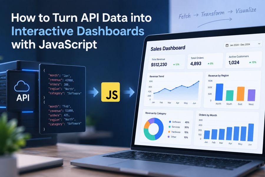
Modern applications rarely keep all their useful data in the browser. Sales figures may come from a CRM, product metrics from an analytics service, operational data from internal APIs, and financial information from a reporting platform.
REST APIs make that data accessible, but retrieving it is only the first step. A useful JavaScript dashboard also needs to validate and reshape the response, choose appropriate visualizations, handle interactions, and keep the interface usable when requests fail or datasets grow.
A practical dashboard pipeline looks like this:
API → Fetch → Validate and Transform → Chart Configuration → Interactive Dashboard
This separation is important. Instead of coupling charts directly to whatever JSON an API happens to return, you create a transformation layer between the API and the visualization. That makes the dashboard easier to maintain when either side changes.
In this tutorial, we'll use a sales API as an example and turn its response into an interactive JavaScript dashboard with charts and a KPI.
TL;DR
To turn API data into an interactive JavaScript dashboard:
- Fetch data from the API and validate the response.
- Transform the raw data into a consistent, chart-ready structure.
- Choose visualizations based on what users need to understand, not simply the API's data structure.
- Render the prepared data using JavaScript charts, keeping API logic separate from visualization configuration.
- Handle loading states, errors, interactions, updates, and larger datasets as the dashboard grows.
The key is to treat the dashboard as a data pipeline rather than connecting raw API responses directly to charts: Fetch → Transform → Visualize → Interact → Update.
How API Data Becomes an Interactive Dashboard
An API-powered dashboard usually has several distinct stages.
First, the application requests data from a REST API or another backend service. The server returns structured data, most commonly JSON.
The application then validates and transforms that response. This might involve converting strings to numbers, normalizing dates, filtering records, calculating totals, or grouping values by category.
The transformed data is then mapped to visualization components:
REST API → JavaScript application → Data transformation → Charting library → Interactive dashboard
For example, imagine an API returns this response:
[
  {
    "month": "Jan",
    "revenue": 42000,
    "orders": 380,
    "region": "North",
    "category": "Software"
  },
  {
    "month": "Feb",
    "revenue": 51000,
    "orders": 425,
    "region": "North",
    "category": "Software"
  }
]
The revenue values could feed a line chart, while the same records could be aggregated by region for a column chart or by category for a doughnut chart.
This is why it is generally better not to make a chart dependent directly on the API's raw response structure. Treat the API response as application data first and visualization data second.
Fetching API Data with JavaScript
For a REST API, the browser's Fetch API provides a straightforward way to retrieve dashboard data asynchronously.
async function loadDashboardData() {
  const response = await fetch("https://api.example.com/sales");

  if (!response.ok) {
    throw new Error(`Request failed: ${response.status}`);
  }

  return response.json();
}
fetch() returns a promise that resolves to a Response. One detail worth remembering is that HTTP errors such as a 404 do not automatically cause fetch() to reject. Checking response.ok therefore prevents the application from treating an unsuccessful HTTP response as valid dashboard data.
In production, the request may need more configuration:
const response = await fetch("https://api.example.com/sales?year=2026", {
  headers: {
    Authorization: `Bearer ${token}`,
    Accept: "application/json"
  }
});
Real applications may also need pagination, request timeouts, authentication refresh logic, caching, or cancellation with AbortController.
Those networking concerns should remain separate from the code responsible for drawing the dashboard.
Transforming API Responses into Chart-Ready Data
Data transformation is often where most of the application-specific work happens.
Suppose the API returns:
const apiData = [
  { month: "Jan", revenue: 42000 },
  { month: "Feb", revenue: 51000 },
  { month: "Mar", revenue: 47500 }
];
A visualization may instead expect objects containing label and value. JavaScript's map() method provides a simple adapter:
const revenueData = apiData.map(item => ({
  label: item.month,
  value: Number(item.revenue)
}));
The result becomes:
[
  { label: "Jan", value: 42000 },
  { label: "Feb", value: 51000 },
  { label: "Mar", value: 47500 }
]
Real API data often requires more work. A transformation layer may need to:
- select only the fields the dashboard needs;
- rename properties to match the visualization model;
- convert numeric strings to numbers;
- normalize timestamps and date formats;
- remove invalid records;
- provide defaults for
nullvalues; - aggregate transactions into daily or monthly totals;
- group records by region, product, or another dimension; and
- sort results before rendering.
For example, you can aggregate revenue by region without changing the underlying API:
function revenueByRegion(records) {
  const totals = records.reduce((result, record) => {
    const region = record.region || "Unknown";
    result[region] =
      (result[region] || 0) + Number(record.revenue || 0);

    return result;
  }, {});

  return Object.entries(totals).map(([region, revenue]) => ({
    label: region,
    value: revenue
  }));
}
The key architectural principle is to keep data retrieval, transformation, and visualization configuration separate.
If the API later changes revenue to totalRevenue, you should ideally update one transformation function rather than every chart that uses the value.
Choosing the Right Charts for API Data
The API's structure should not determine the chart automatically. Start with the question users need the dashboard to answer.
| Data goal | Suitable visualization |
|---|---|
| Compare categories | Column or bar chart |
| Track changes over time | Line or area chart |
| Show composition | Stacked or doughnut chart |
| Display KPI progress | Gauge |
| Identify relationships | Scatter chart |
| Show geographic patterns | Map |
| Analyze hierarchical data | Treemap |
A sales API illustrates why this matters. The same response might contain date, revenue, region, and category.
You could visualize revenue over time with a line chart, compare regions with a column chart, and show category contribution with a doughnut chart. Each visualization answers a different question while working from the same source data.
Before adding another chart, ask what decision or question it supports. A dashboard containing six appropriate visualizations is usually more useful than one containing twelve charts simply because the data was available.
Rendering API Data as Interactive JavaScript Charts
You can build charts directly with SVG, Canvas, and browser APIs. For application dashboards, however, that also means implementing much of the surrounding behavior yourself.
A JavaScript charting library can provide the rendering and interaction layer while your application remains responsible for retrieving and preparing the data.
FusionCharts, for example, accepts JavaScript objects through its dataSource configuration. A transformed API response can therefore be passed into a chart after it has been prepared by the application.
const chart = new FusionCharts({
  type: "line",
  renderAt: "revenue-chart",
  width: "100%",
  height: "350",
  dataFormat: "json",
  dataSource: {
    chart: {
      caption: "Monthly Revenue",
      xAxisName: "Month",
      yAxisName: "Revenue",
      numberPrefix: "$",
      theme: "fusion"
    },
    data: revenueData
  }
});

chart.render();
The visualization layer can then provide features such as tooltips, legends, chart events, zooming on supported chart types, and drill-down behavior without requiring you to implement the basic chart interaction model from scratch.
The more important point is architectural: the chart receives prepared visualization data rather than reaching into the API response itself.
Explore more in this documentation[a].
Conclusion
Turning API data into an interactive JavaScript dashboard is less about connecting an endpoint directly to a chart and more about designing a reliable data pipeline.
The core workflow is:
Fetch → Transform → Visualize → Interact → Update
Retrieve the data and verify the response. Transform it into a stable model designed for visualization. Choose charts according to the questions users need to answer. Then add interactions, error handling, updates, and performance controls as the dashboard grows.
Keeping these responsibilities separate also makes the application easier to change. An API can evolve without forcing you to redesign every visualization, while a different chart or interaction can be introduced without rewriting the networking layer.
A JavaScript visualization library can take care of much of the chart rendering and interaction work. That leaves your application code focused on the parts that are specific to your product: the data, business logic, and experience you want the dashboard to provide.
Frequently Asked Questions
How do I display API data in a JavaScript dashboard?
Use fetch() or another HTTP client to retrieve the API response, validate and transform the returned data into the structure required by your visualizations, and then pass that prepared data to your dashboard components or charting library.
Can JavaScript create real-time dashboards?
Yes. JavaScript applications can update dashboard data using periodic API polling, WebSockets, or Server-Sent Events. New data can then be transformed and passed to existing chart instances without rebuilding the entire dashboard.
Which API format is best for JavaScript dashboards?
JSON is commonly used because browsers and JavaScript applications can parse and manipulate it directly. However, the appropriate format ultimately depends on the API and the application's architecture.
Do I need a charting library to build a JavaScript dashboard?
No. Charts can be built directly with browser technologies such as SVG and Canvas. A charting library can reduce development work by providing existing chart types, configuration APIs, interaction features, and responsive rendering behavior.
How can I improve the performance of an API-driven dashboard?
Avoid unnecessary API requests, aggregate large datasets, render only the detail users need, cache suitable responses, lazy-load expensive dashboard components, and update existing visualizations rather than recreating them for every change.
[a]do-follow