
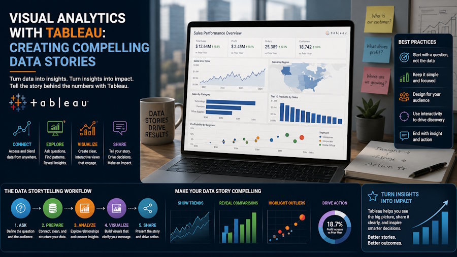
Stakeholders rarely struggle to see numbers; they struggle to interpret them quickly and consistently. A weekly deck may show revenue by zone, but it often fails at the next question: what changed, where did it change, and what should we do next? Tableau supports interactive exploration, so leaders can drill down from region to state, city, or branch without waiting for a new report. Many teams build this capability through data analytics training in Bangalore, where narrative design is taught alongside solid KPI definition and dashboard governance.
What a “data story” means in Tableau
A data story is not decoration. It is a structured path through evidence that moves from context to decision:
- Context: targets, benchmarks, and the time window you are judging
- Overview: whether the business is on track
- Comparison: how regions differ
- Diagnosis: what drivers explain the variance
In Tableau, you can implement this using Story Points (a sequence of views) or one dashboard with guided navigation. The key design rule is simple: each view should answer one question and make the next click obvious.
Designing drill-down that feels natural
Drill-down works only when the exploration path matches how the business thinks. Start by agreeing on a hierarchy such as Region → State → City → Branch, and then design interactions that mirror it.
Use predictable navigation
Create a geographic hierarchy in Tableau and reuse it across the map, comparison chart, and detail table. Add a clear “Back to Summary” control so users can return to the top view in one click.
Prefer actions over cluttered filters
Filter actions let a user click a region on a map or bar chart and update other views instantly. Highlight actions are useful when you want to highlight one region for comparison while still showing the full distribution.
Add a metric selector
Different stakeholders care about different outcomes (revenue, margin, pipeline, NPS, delivery SLA). A parameter-driven metric selector swaps measures while keeping the same layout and drill-down path. This pattern is frequently taught in data analytics training in Bangalore because it reduces dashboard sprawl and lowers maintenance effort.
Building the story: a practical workflow
A compelling Tableau story starts with disciplined metric logic and ends with a clean narrative.
1) Lock definitions before visuals
Confirm how each KPI is calculated: time period, fiscal calendar, currency handling, and returns/cancellations rules. If “margin” is computed at the order-line level, keep it consistent across regions. Add an info icon or tooltip that documents the definition, so trust is built into the dashboard.
2) Create an executive scene setter
Use a compact KPI strip (current value, change vs last period, change vs target), and a trend line. Reference lines for targets allow stakeholders to read the story in a few seconds.
3) Compare regions, then explain the variance
Keep the comparison view stable: same metric, same period, same baseline. Once a region is selected, show driver views that answer “why”, such as product mix, channel split, or operational issues (late deliveries, returns). Use level of detail expressions where needed so driver calculations are done at the right grain and comparisons stay fair.
4) Provide a drill-through detail view for follow-up
Offer a branch-level table with sorting and a small set of columns: metric, variance, volume, and last refreshed time. This turns discussion into action teams can identify the worst-performing branches and validate whether issues are structural or temporary.
Governance and performance so the story survives real use
Even a well-designed story fails if it is slow or unclear about data freshness. Protect adoption with three habits:
- Make freshness visible: show the last refresh timestamp and clarify any regional cut-off differences.
- Optimise for speed: avoid unnecessary heavy calculations, limit high-cardinality quick filters, and use extracts or aggregated sources when appropriate.
- Design for roles: executives need a clean overview; regional managers need drill-down, and analysts need deeper detail. Certified data sources and permissions keep the experience consistent.
These operational choices are a core part of data analytics training in Bangalore because they separate a nice dashboard from a dependable decision system.
Conclusion
Visual analytics with Tableau becomes most valuable when you treat it as a guided data story: define the metric rules, show an overview, compare regions, diagnose drivers, and make actions traceable through drill-down. When stakeholders can explore regional performance metrics confidently, decisions become faster and reporting cycles shrink. If you are building this capability whether on the job or via data analytics training in Bangalore start with one KPI story, iterate with real users, and expand to more metrics and regions.