Six tools that hand you a finished file before they ask who you are. Same numbers in every one, so you can see exactly what each is for.
The chart is never the slow part. What eats the afternoon is the wall in front of it: create an account, confirm the email, choose a plan, dismiss the tour, and then find out the export button belongs to the paid tier. For a chart you need once, that is a terrible trade.
This guide starts from the other end. Every tool below was picked because you can land on it, paste numbers, and leave with a file without typing an email address. The same two datasets went into each one, so the comparison is about the tools and not about the data.
The numbers every tool got
Two small datasets from a fictional museum. Copy them and run the test yourself.
The test dataset drawn as a line chart and a bar strip.
Dataset A - visitors by month, 2025
| Month | Visitors |
|---|---|
| Jan | 1850 |
| Feb | 1920 |
| Mar | 2310 |
| Apr | 2540 |
| May | 2780 |
| Jun | 3120 |
| Jul | 3640 |
| Aug | 3910 |
| Sep | 2870 |
| Oct | 2430 |
| Nov | 2060 |
| Dec | 2650 |
As one line, for pasting:
Jan 1850 Feb 1920 Mar 2310 Apr 2540 May 2780 Jun 3120 Jul 3640 Aug 3910 Sep 2870 Oct 2430 Nov 2060 Dec 2650
Dataset B - the same year by ticket type
| Ticket type | Visitors |
|---|---|
| Adult | 18400 |
| Child | 6200 |
| Senior | 4100 |
| Member | 3380 |
Sample data. Replace with your own numbers if you want.
"No signup" means three different things
Read the fine print on a few dozen tools and the same three patterns keep appearing. Every tool in this guide carries one of the first two labels. The third never appears here, whatever its landing page promises.
Nothing in the way - open and go
The editor loads with no gate. Make the chart, download it, close the tab. Nothing is kept unless you choose to save it.
Half a door - try free, account to publish
You can build and export a static image with no account. Sharing a live, embeddable version asks you to register.
Locked - account for everything
The canvas will not open without registering. Most "free chart maker" search results live here, which is why this guide exists.
01 Graphtelling
Label: free to create, no signup required
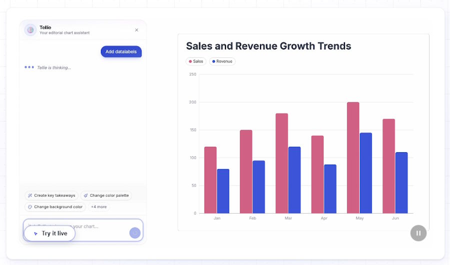
The chart maker that turns spreadsheets and screenshots into a story.
Graphtelling is a free online chart maker for turning raw data into polished charts without spending hours on formatting. Paste numbers, upload an Excel or CSV file, import data from a Google Sheets link, or upload a screenshot. That last option is useful when the numbers you need are sitting in an image rather than a spreadsheet.
You can create bar graphs, line charts, pie charts, and more, then adjust colors and fonts to match your brand. Annotations let you explain a spike, highlight a result, or give readers the context behind the numbers. For Dataset A, that could mean calling out the summer peak rather than leaving readers to interpret it themselves.
Beyond individual charts, Graphtelling lets you embed visuals on your website or combine them into a shareable dashboard. That makes it useful for newsletters, marketing reports, and teams that want several charts together in one place.
Reach for it when you want charts that match your brand, with annotations that help tell the story.
02 RAWGraphs
Label: open and go Speed 2/5 Polish 3/5 Control 4/5 (editorial ratings, out of five)
The one for charts your spreadsheet cannot draw.
RAWGraphs is a free, open source project built by a design research lab, and it behaves like one. There is no login, no dashboard and no gallery of your past work. You paste or upload data, choose one of almost thirty visual models, map your columns onto the chart, and export a vector or raster image. Your data never leaves the browser, which makes it the easy answer when the numbers are confidential.
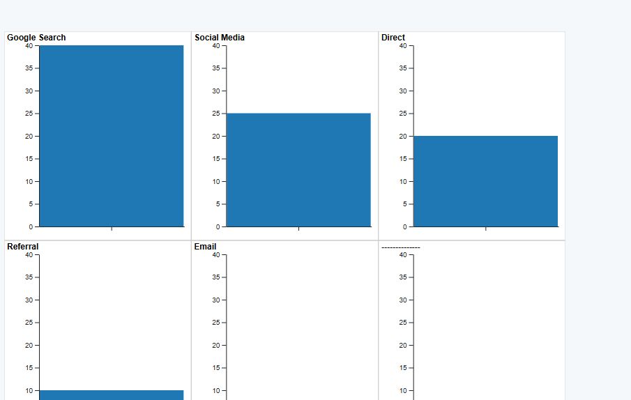
The thirty models are the point. Alongside bars and lines you get alluvial diagrams, treemaps, beeswarms, streamgraphs, sunbursts and circle packing, the kinds of charts that usually need a designer or a Python session. If your data has hierarchy or flow in it, this is where to start.
The catch is that RAWGraphs assumes you know what you want. It will not suggest a chart type, and the styling options are deliberately thin, because the intended workflow is to export an SVG and finish it in a design tool. For a quick bar chart it is more steps than the tools further down.
Reach for it when the data has flow or hierarchy in it.
03 Datawrapper
Label: try free, account to publish Speed 4/5 Polish 5/5 Safe 83/100
The newsroom tool that leaves the side door open.
Datawrapper is what a lot of the charts you see in major newspapers are made with, and the company is unusually generous about letting strangers in. Its own FAQ says you can create a chart or a map right now with no need to sign up, and it means it. The link on the home page drops you straight into the four step editor.
- Paste Dataset A into the upload box. Datawrapper reads the headers, recognises the first column as dates, and shows the parsed table so you can catch mistakes before they become a chart.
- Choose from nineteen chart types, three map types or a table. The defaults are already good: a sensible palette, a zero baseline where it belongs, and annotations you can drag onto the chart.
- Hit publish. This is where the door narrows. Exporting a PNG is free with no account. Publishing an embeddable version asks you to create a free account, and SVG and PDF export sit on paid plans.
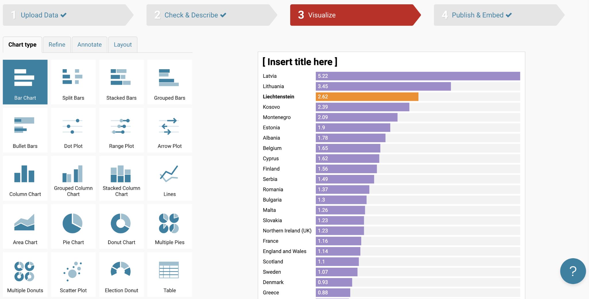
So the honest label is the middle one. If a PNG for a slide is the goal, Datawrapper is open and go. If you want the interactive version that resizes on a phone, you will make an account, though it is still free and the free plan has no limit on how many charts you publish. What you get for that step is the most polished output in this guide.
Reach for it when the chart has to look finished without any fiddling.
04 ChartGo
Label: open and go Speed 5/5 Polish 2/5 Control 2/5 (editorial ratings, out of five)
Seventeen years old and it still does exactly what it says.
ChartGo has been online since 2009 and does not ask anyone to register. You pick bar, line, combo, pie, area, barbell or XY line, type or paste your values, or upload an Excel or CSV file, choose colours, and download. The site says it is fully free and supported by the display ads on the page, and there is no paid plan to upsell you into.
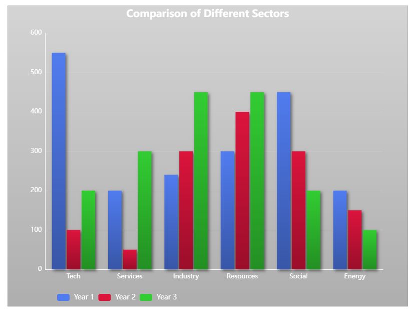
Dataset B is the obvious job for it. Four ticket types become four bars, the export comes down as an image, SVG or CSV, and the whole exercise is a minute of work. There is a template gallery if you want a starting point and a chart type guide if you are not sure which shape fits.
It looks its age. The interface is dense, the default charts are plain, and there is no help choosing a chart type unless you go and read the guide. But plain and instant is sometimes exactly the order.
Where it lands
Best for a bar or pie chart you need now and will never touch again.
Skip it if the chart is going anywhere with a design standard, or if you want the tool to choose the chart type for you.
Reach for it when you need a plain chart in the next five minutes.
05 ChartGPT
Label: open and go, 15 a month Speed 5/5 Polish 4/5 Control 1/5 (editorial ratings, out of five)
The one where you describe the chart instead of building it.
ChartGPT approaches the same job from the other direction. Instead of an editor with panels and settings, it gives you a text box and a canvas. You paste a table or type a sentence with the numbers in it, add a note about what the chart is for, and it reads the data, chooses a chart type if you have not named one, and draws it. Time on the horizontal axis gets a line, categories get bars, and shares of a total get a donut, which is the same rule of thumb a careful analyst would apply by hand.
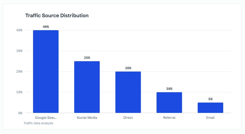
The free tier covers 15 charts a month with no account and no card, and all nine chart types are included: bar, grouped bar, stacked bar, horizontal bar, line, area, pie, donut and scatter. Switching between types redraws the data you already pasted without using another chart from the allowance. Exports come out as PNG, SVG or PDF, and the chart specification can be copied as JSON. Nothing you paste is stored; the chart lives in the tab until you export it.
Two limits are worth knowing before you start. Data goes in by paste only, up to 500 rows, with no file upload yet, so a CSV has to be opened and copied rather than dropped in. And the palette is fixed on every plan, so if brand colours matter this is not the tool. The trade is a set of defaults that lean on good chart practice: bars start at zero, a single series gets a single colour, and if you say what the chart is for, the title states the finding rather than naming the columns. For Dataset A that means the busy summer becomes the headline, not the words "visitors by month".
06 LiveGap Charts
Label: open and go Speed 3/5 Polish 3/5 Control 5/5 (editorial ratings, out of five)
The one with the most knobs, and a live preview for every one of them.
LiveGap is the opposite of ChartGPT. Where ChartGPT hides every setting, LiveGap shows you all of them, and the preview redraws the instant you touch one. It offers more than fifty templates across line, bar, stacked bar, radar, polar area, pie, doughnut, step and icon matrix charts, and it will build multi-chart layouts if you want a small dashboard rather than a single chart.
What you can change: colours, margins, fonts, gradients, borders, backgrounds, line styles, axes, legends, icons, hide rows, hide columns.
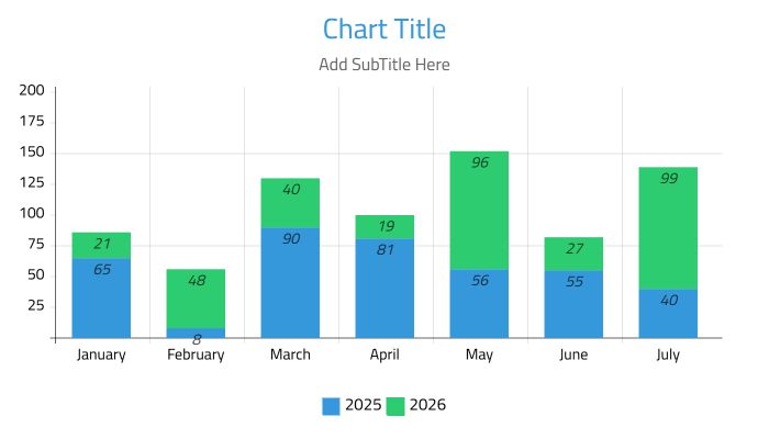
Data comes in by typing, pasting from a spreadsheet, or importing CSV and XLSX files, including workbooks with more than one sheet. There is no registration at any point, and the interface is available in more than twenty five languages.
The export list is the longest here. Static images and SVG are the usual suspects, but LiveGap also exports animated chart files, which is the easiest route to a chart that draws itself in a social post, and HTML pages you can drop into a site. Dataset A can come out as a short animation of the line growing through the year with a couple of minutes spent in the settings. The trade is that all those knobs are visible whether you want them or not, and the defaults are less refined than Datawrapper's.
Reach for it when you want a hand on every setting, or a chart that moves.
07 QuickChart
Label: open and go Speed 2/5 Polish 3/5 Control 4/5 (editorial ratings, out of five)
The chart that is a web address.
QuickChart is built for a problem the others ignore: a chart that has to appear somewhere images cannot be uploaded, like an email template, a Slack message, or a report that regenerates every week. You describe the chart in a Chart.js configuration, put that configuration in a URL, and the URL is the image. Change a number in the address and the picture changes.
That sounds like a developer tool, and it is one, but there is a no-code Chart Maker that builds the configuration with menus, and the site says it has rendered more than four billion charts. It is open source, free without any account, and there are no watermarks on the free tier. The only constraint is a rate limit you will not notice unless something automated is hitting it.
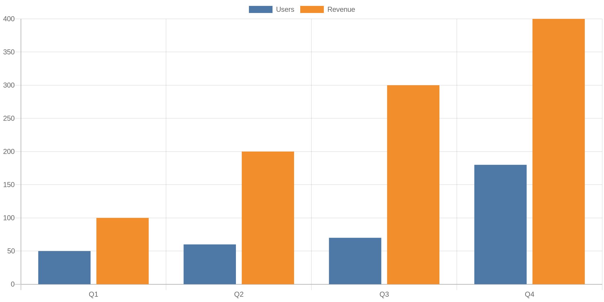
That single line is Dataset B as a bar chart. Paste it into a browser and the PNG appears; put it in an image tag and it appears in your newsletter. For a one-off chart it is more typing than the tools above. For the fortieth copy of the same chart with fresh numbers, it is the only one of the six that does not make you start over.
Reach for it when the same chart has to regenerate with new numbers.
Where they part ways
Six tools that all clear the no-signup bar still pull in different directions. Three differences decide most choices.
Difference 1 - Getting numbers in
Every tool accepts a paste from a spreadsheet, and for twelve numbers that is all anyone needs. The differences start when the data is bigger or messier. RAWGraphs, ChartGo, LiveGap and Datawrapper all take a file upload, and LiveGap will read a workbook with several sheets. Datawrapper can also point at a Google Sheet or an external link, so the chart refreshes when the source does.
ChartGPT is paste only and capped at 500 rows, but it is the one tool here that reads a plain sentence, so a handful of values typed into a message counts as input. QuickChart wants the numbers inside a web address, which is awkward to do by hand and ideal for anything a script produces.
Difference 2 - What comes out the other side
PNG is universal. Past that the export lists diverge in ways that matter for print and for the web. RAWGraphs, ChartGo, ChartGPT and LiveGap all hand over an SVG without an account, which is what you want for anything that will be projected or printed large. Datawrapper keeps SVG and PDF for paid plans and gives free users a PNG or, with a free account, a responsive embed.
LiveGap is alone in exporting animated files and complete HTML pages. QuickChart does not export in the usual sense at all: the image is the address, and it is drawn fresh every time something loads it. None of the six stamps a watermark across a free chart, though Datawrapper adds a small "created with" line under the chart on the free plan.
Difference 3 - How much say you get
This is the axis that separates them most clearly. At one end, LiveGap exposes every setting it has and Datawrapper lets you drag annotations straight onto the chart. In the middle, ChartGo and RAWGraphs give you the basics and expect you to finish the styling somewhere else. At the far end, ChartGPT deliberately takes control away: the palette cannot be changed on any plan, and adjustments are made by rewording the request rather than opening a panel.
Which end is right depends on whether you want to make decisions or avoid them. A chart for a one-off email is better with fewer decisions in the way. A chart that has to sit inside a brand guide needs the knobs, and needs them to be visible.
Same job, six answers
The whole guide compressed. Read down a column for one tool, or across a row to compare all six on one question.
| RAWGraphs | Datawrapper | ChartGo | ChartGPT | LiveGap | QuickChart | |
|---|---|---|---|---|---|---|
| Account | Never | To publish or embed | Never | Never, 15 a month | Never | Never |
| Free ceiling | None | Unlimited charts and PNGs. SVG and PDF paid | None, ad supported | 15 charts a month, 500 rows per paste | None | Rate limit on the free tier |
| Data in | Paste, upload, URL | Paste, upload, Google Sheets link | Type, paste, Excel or CSV upload | Paste or a typed sentence | Type, paste, CSV or XLSX upload | A config in the URL, or the no-code maker |
| File out | SVG, PNG, project file | PNG free. Embed with account | Image, SVG, CSV | PNG, SVG, PDF, JSON spec | Image, animated file, SVG, HTML | PNG at a URL |
| Chart types | Almost 30, many unusual | 19 charts, 3 maps, tables | 7 everyday types | 9 everyday types | 50+ templates | Anything Chart.js draws |
| Strongest at | Flow and hierarchy | Finished, publishable output | Instant, plain charts | Typing instead of clicking | Control and animation | Charts that update themselves |
Checked against each tool's own site, September 2026. Free tiers change without notice; treat the ceilings as a snapshot.
Pick one for me
Find your data shape in the first column and what matters most along the top.
| What does your data look like? | Speed | Polish | Control |
|---|---|---|---|
| A series over time | ChartGPT Paste the numbers as a sentence and let it choose the chart. Fifteen a month is plenty for this. |
Datawrapper Build it without an account and export the PNG. Register only if you want the live embed. |
LiveGap Charts A control for everything, animated export included. Budget a few extra minutes. |
| A handful of categories | ChartGo Paste, pick bar, download. Nothing to configure and nothing to sign. |
Datawrapper The best defaults in the guide. Export a PNG with no account, or register for the embed. |
LiveGap Charts Fifty templates and every setting exposed, with a preview that keeps up. |
| Flows or hierarchies | RAWGraphs Alluvial, treemap, sunburst and beeswarm are all in the model list, and the data stays in your browser. |
||
| Same chart, new numbers every week | QuickChart Put the data in the URL once and change the numbers forever. No account, no watermark. |
||
Free is easy to claim. Free without a gate is the part worth checking.
Every tool here clears the same bar: land on the page, paste the numbers, leave with a file, and never type an email address. That is a lower bar than it sounds, and most of the results for "free chart maker" fail it. Bookmark the two or three that match the charts you actually make and you will not need the other search results again.