
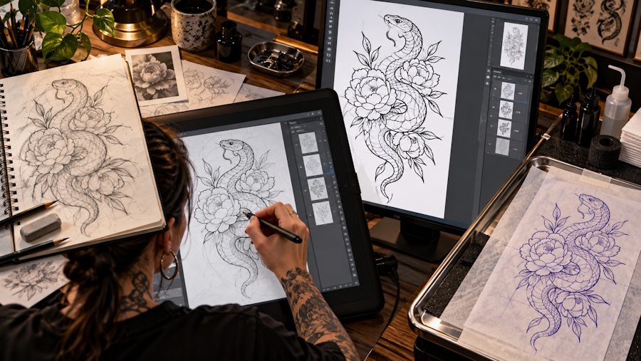
A strong tattoo rarely begins with a perfect sketch. It begins with a useful conversation between an idea, a visual system, and the limitations of the human body as a canvas. A phrase may sound powerful when spoken but become cramped when placed on a wrist. A detailed illustration may look impressive on a screen but lose its character when reduced to a small stencil. The most reliable results come from treating tattoo design as a process rather than a single burst of inspiration.
This workflow is useful for first-time clients, artists developing custom concepts, and creators who want to test variations before committing to permanent ink. It combines lettering decisions, line quality, composition, and communication. Digital tools can accelerate the early stages, but they work best when the designer still makes deliberate choices about meaning, scale, contrast, and longevity.
1. Begin With Meaning, Not Decoration
Before opening a design app, write a short creative brief. The brief does not need to be formal. Three or four sentences are enough to clarify the intended feeling, subject, placement, and style.
Define the emotional center
Ask what the tattoo should communicate in one sentence. Is it a memorial, a personal motto, a symbol of change, a reminder of family, or simply an image that feels beautiful? This sentence becomes a filter. If a decorative element does not support the central idea, it may be unnecessary.
Record the practical constraints
Note the body location, approximate size, preferred orientation, and whether the design must work around a curve. A forearm, rib, shoulder, and ankle each impose different visual requirements. A design that reads clearly from a flat front view may look distorted when wrapped around a limb.
Collect references responsibly
Reference images are useful for mood, texture, and proportion, but copying another person’s tattoo is rarely a good starting point. Collect several references and describe what you like about each: the spacing, the weight of the lines, the balance of empty space, or the way the lettering follows a shape.
2. Build Lettering That Survives Real-World Conditions
Text-based tattoos are deceptively difficult. A phrase must be legible immediately, remain readable as the ink ages, and fit the natural movement of the body. The lettering style should serve the words rather than compete with them.
Choose a readable structure
Start with the width and height of the phrase. Short words can support expressive lettering, while long sentences usually need a simpler structure. Consider all-capital, lowercase, script, serif, or monoline treatments, then test the phrase at the actual intended size.
When exploring options, a tattoo lettering generator can help create fast visual directions for different moods. Use generated variations as a brainstorming tool, not as a final substitute for an artist’s adjustments. Letter spacing, joins, stroke endings, and the relationship between letters often need manual refinement.
Treat spacing as part of the design
Evenly spaced letters are not always visually even. Rounded characters may need slightly different spacing from vertical ones. Script letters can collide at small sizes, while thin serif details can disappear after healing. Print or view the phrase at several scales and check it from a normal reading distance.
Consider aging and skin movement
Ink spreads subtly over time. Extremely tight counters, hairline strokes, and tiny enclosed spaces can become muddy. Ask whether the phrase will still be recognizable after years of sunlight and normal skin changes. A slightly simpler design often has greater longevity than a highly intricate one.
3. Develop Images With Controlled Line Work
Illustrative tattoos depend on the relationship between contour, internal detail, and negative space. The goal is not to include every visible detail from a reference image. The goal is to preserve the most important information with the fewest necessary marks.
Separate the visual layers
Think in three layers: the outer silhouette, the key internal contours, and optional texture. The silhouette should remain recognizable even if the tattoo is viewed from a distance. Internal lines explain form. Texture should be used sparingly because it is the first information to become noisy at a small scale.
Use a line art converter for early exploration
When a client has a meaningful photograph or a rough visual reference, a line art converter can help produce a simplified starting point. This is especially useful for comparing different levels of detail before an artist redraws the concept for skin. The converted image should be treated as a study. A professional tattoo artist still needs to correct anatomy, remove fragile marks, and adapt the design to placement.
Protect negative space
Negative space is not an empty leftover. It separates forms, creates hierarchy, and gives the eye a place to rest. When every area is filled with marks, the design can lose clarity. Leave breathing room around small details and between adjacent elements.
4. Match Composition to Body Placement
The body is three-dimensional, constantly moving, and rarely viewed from only one angle. Placement should influence the composition from the beginning.
Work with natural direction
Long designs often read better when their major axis follows the limb or muscle flow. Circular designs can support shoulders, upper arms, and calves. A horizontal phrase may work across the chest or collarbone but become awkward on a narrow forearm.
Test the design in context
Create a simple placement mockup. It does not need to be photorealistic. A rough photograph with the design overlaid at the intended scale can reveal problems that are invisible on a white artboard. Check how the design looks while the arm is relaxed, bent, and rotated.
Plan for neighboring tattoos
If the client already has tattoos nearby, examine line weight, density, and visual temperature. A new fine-line design may need a transition element if it sits beside a bold traditional piece. Cohesion does not require every tattoo to use the same style, but the spacing and overall rhythm should feel intentional.
5. Prepare a Clear Handoff for the Tattoo Artist
A digital concept becomes valuable when another professional can understand it quickly. Include the final reference, placement, approximate dimensions, preferred line quality, and any elements that must remain unchanged.
Explain what is flexible
Tell the artist which details are essential and which are suggestions. For example, the subject and phrase may be fixed while the artist can adjust the border, line thickness, or spacing. This gives the artist room to solve technical problems without losing the design’s meaning.
Ask for a stencil-minded revision
Before booking, ask how the concept will translate into a stencil. Some visual details need to be removed, enlarged, or separated. A stencil-minded review catches fragile areas before the appointment rather than during the transfer.
Respect professional judgment
A tattoo artist understands needle groupings, skin type, placement, healing, and long-term readability. Digital previews are valuable, but they cannot fully predict how ink will behave on a particular body. Good collaboration means bringing a clear idea while staying open to necessary changes.
6. Review the Design With a Simple Quality Checklist
Before finalizing, ask six questions:
- Can the main idea be understood in a few seconds?
- Is the lettering readable at the intended size?
- Does the silhouette work without tiny details?
- Is there enough negative space between important forms?
- Does the design follow the body’s shape and movement?
- Has a tattoo artist reviewed the concept for technical feasibility?
If the answer to several questions is no, simplify before adding more decoration. Strong tattoo design is often an editing exercise. Removing a weak line can improve the whole composition.
Conclusion
The best digital tattoo workflow connects personal meaning with practical design decisions. Start with a clear brief, test lettering at real size, simplify images into durable line structures, and use digital generators or converters to explore possibilities rather than to bypass professional craft. Most importantly, design for skin, movement, distance, and time.
When the concept is ready, give the tattoo artist enough information to understand the intention while leaving room for expert adaptation. That balance produces artwork that feels personal on the day of the appointment and remains legible and meaningful long afterward.