
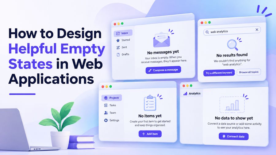
A project dashboard looks straightforward when it contains cards, charts, and recent activity. Remove the data, however, and the design problem changes. A blank panel may mean the account is new, a search returned nothing, or a request failed. If every situation produces the same cheerful illustration and generic message, users have to guess what happened and what to do next.
Useful empty states combine accurate explanations, an appropriate action, and sometimes a small visual cue. The illustration is often the difficult part for teams without dedicated designers: it needs to suit the interface without looking like an error warning or distracting from the button. A browser-based ChatGPT image generator can provide candidate artwork from a written brief, while the product team remains responsible for the message and behavior. Here's how to design and test the complete state.
Treat Empty Screens as Distinct States
Start by naming why the content is absent. A new account with no projects is different from an established account whose current filters hide every project. An offline request is different again. These conditions need separate text and actions because the user has different levels of control over each one. Design the state from actual application data rather than checking whether an array happens to be empty.
For a project list, define at least four cases: no projects created, no matching search results, a loading operation still in progress, and a failed fetch. Loading should have its own progress treatment; a server error should not invite someone to create an item that might already exist. If permission rules hide records, explain the access limitation without revealing private information. This state inventory becomes an explicit part of component logic and testing.
Write the Message Before the Artwork
An empty-state message has three jobs: identify the condition, explain it briefly, and offer a next step when one exists. Compare “Nothing here yet” with “No projects match ‘archived’ — clear the filter to see all projects.” The second version tells users what the application knows and provides a reversible action. Avoid blaming users or promising that a refresh will fix an issue you have not diagnosed.
Button labels should describe their actual behavior. Use “Create project” only when the action opens a working creation flow; use “Clear filters” when it removes the applied constraints. If the system cannot recover immediately, say so and offer a retry only if another request is appropriate. Keep important instructions in real interface text, not baked into an illustration, so they remain selectable, translatable, and accessible.
Generate Art That Supports the Task
Illustrations work best when they reinforce a condition without pretending to represent live data. A small empty folder might suit an unused workspace; a magnifying glass over simple shapes can suggest an unsuccessful search. A dramatic broken-server scene may make a harmless filter result feel alarming. Choose a visual metaphor only after the state and accompanying copy are settled, and avoid inventing screenshots of the application's actual controls.
For a first draft, write a concise brief: “Minimal flat illustration of an empty folder with two neutral-colored cards, quiet background, no words, centered composition, ample margin, suitable for a small dashboard panel.” In the ChatGPT image workflow, enter that description in text-to-image mode and select an available aspect ratio. If you already have approved art, use image-to-image with the source and specify what may change. Review each result at the component's actual size before choosing one.
Do not ask the image to carry button text, status details, or essential instructions. Generated artwork can distort symbols or introduce elements that resemble real features. Check the silhouette, contrast, and unwanted objects against the brief. If a variation looks attractive but suggests deleted files rather than a new workspace, reject it. Revisit the prompt only for a named problem; changing color, subject, and layout together makes comparisons less useful.
Implement the State as a Working Component
Keep the visual separate from the controls in the markup. The following simplified example represents a filtered list with no results; its button needs an application handler that actually clears the filters. It is not a substitute for the loading, error, and first-use branches described earlier.

No matching projects
Try a broader search or remove your filters.
The empty alt value is intentional when the illustration adds no information beyond the heading and message. If an image communicates something essential, give it a meaningful alternative instead. Reserve layout space for the image to avoid shifting the button during loading. When a filter changes the results dynamically, consider how to announce the updated status to assistive technology without repeatedly interrupting users as they type.
Test the Cases That Usually Get Missed
Check the design with keyboard navigation, a narrow viewport, enlarged text, and a deliberately slow connection. The empty state should not flash briefly before actual data arrives; distinguish an unresolved request from a confirmed empty response. Make sure the button remains reachable when text wraps and that the illustration does not push the action below an awkward fold on mobile screens.
Next, test a transition: apply a filter that returns no records, activate “Clear filters,” and confirm that records reappear without losing unrelated preferences. Simulate a failed request and verify that the interface presents an error rather than the first-use state. Finally, ask someone unfamiliar with the feature what happened and what they would click. If their answer differs from the intended action, revise the copy or behavior before polishing the artwork.
Keep the Path Forward Visible
Empty states are part of the normal user journey, not decorative gaps to fill. Start with the application condition, give it an accurate message, and make the next action work. Add imagery only when it helps people recognize the situation without competing with the explanation. A useful review question is simple: could someone understand and recover from this screen if the illustration failed to load? If the answer is yes, the interface has a sound foundation. For teams looking to add warmth and consistency, a ChatGPT image generator can help create supporting visuals while keeping accessible text and reliable application logic at the center of the experience.