Data is everywhere—but raw numbers alone don’t tell a story. Whether you're running a blog, a business website, or a dashboard, charts help transform complex data into clear, engaging visuals that people actually understand.
The good news? You no longer need to write code or use heavy libraries to create professional charts. In this guide, you’ll learn how to create beautiful charts for your website quickly and easily—without touching a single line of code.
Why Charts Matter
Charts are more than just decoration—they improve how users interact with your content:
- Simplify complex data into easy-to-read visuals
- Increase engagement and time spent on your page
- Make content more shareable
- Improve decision-making for your audience
A well-designed chart can communicate in seconds what would take paragraphs to explain.
What Makes a Chart “Beautiful”?
Before jumping into tools, it’s important to understand what separates a basic chart from a great one.
1. Clear Purpose
Every chart should answer a specific question. Avoid adding charts just for the sake of it.
2. Clean Design
- Use simple layouts
- Avoid clutter
- Remove unnecessary gridlines and labels
3. Good Color Choices
- Use consistent color palettes
- Highlight important data points
- Avoid overly bright or clashing colors
4. Readability
- Use clear fonts
- Ensure labels are easy to understand
- Keep spacing balanced
Common Chart Types (and When to Use Them)
Choosing the right chart is just as important as the design.
- Bar Charts → Compare categories
- Line Charts → Show trends over time
- Pie / Doughnut Charts → Show proportions
- Radar Charts → Compare multiple variables
- Stacked Charts → Show composition
The No-Code Approach
Traditionally, creating charts required libraries like Chart.js or D3.js. While powerful, they come with:
- Setup complexity
- Coding knowledge
- Maintenance overhead
Today, no-code tools let you skip all of that.
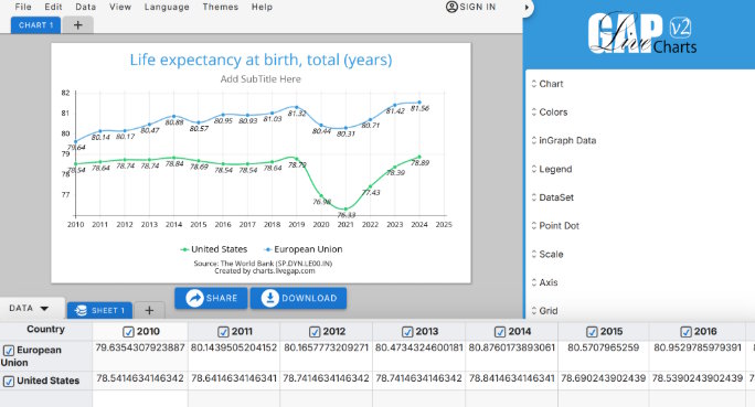
One of the simplest options is Livegap Charts, a browser-based chart generator that works instantly—no installation required.
Step-by-Step: Create a Chart Without Coding
Here’s how you can create a chart in minutes:
1. Enter or Import Your Data
You have multiple easy options:
- Type your data manually
- Paste directly from Excel or Google Sheets
- Import datasets from sources like World Bank
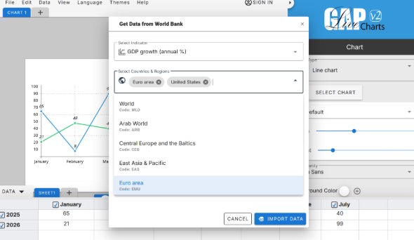
With Livegap Charts, you can go even further—you can generate and use datasets directly inside the tool. Instead of downloading data manually, you can quickly pull structured data (like population, GDP, or other public datasets), preview it, and instantly convert it into a chart—all in one place.
This removes extra steps and makes the process much faster, especially if you’re working with public or statistical data.
2. Choose a Chart Type
Pick the format that best fits your data (bar, line, pie, etc.).
3. Customize the Design
- Change colors
- Adjust fonts
- Add labels and legends
- Fine-tune spacing
4. Preview in Real Time
See updates instantly as you modify your chart.
5. Export Your Chart
Download as:
- PNG
- SVG
Or embed it as HTML directly into your website.
Tips for Better Results
Even with no-code tools, a few best practices go a long way:
Keep It Simple
Don’t overload your chart with too much data.
Use Contrast Wisely
Highlight key insights using color or size differences.
Be Consistent
If you’re using multiple charts, keep styles uniform across your site.
Optimize for Mobile
Make sure your charts look good on smaller screens.
When to Use No-Code vs Code
Use no-code tools when:
- You need fast results
- You’re not a developer
- You want easy customization
Use code-based solutions when:
- You need advanced interactivity
- You’re building complex dashboards
- You require deep integrations
For most websites, no-code tools are more than enough.
Final Thoughts
Creating beautiful charts doesn’t have to be complicated. With the right approach and tools, you can turn raw data into compelling visuals in just a few minutes.
Focus on clarity, design, and purpose—and let tools like Livegap Charts handle the technical side.
In the end, the best chart is the one your audience understands instantly.
If you’re not already using charts in your content, now is a good time to start. Your data deserves to be seen—not just read.