

Your architecture diagram is lying to you. It shows a message queue that got ripped out three sprints ago, a service that was renamed, and an arrow pointing at a database nobody uses anymore. You know this, so you stopped trusting it. And once one person stops trusting the diagram, everyone does. That's how a documentation effort dies: not with a decision to abandon it, but with quiet, collective neglect.
The problem is rarely that engineers don't value diagrams. It's that the diagram lives somewhere the code doesn't, updates on a schedule the code doesn't follow, and answers questions nobody is asking. Fixing that is less about drawing skill and more about picking the right diagram for the right question and wiring its maintenance into work you already do.
Why Architecture Docs Rot
Most stale diagrams share a root cause: they were built in a tool disconnected from the codebase. Someone opened a canvas app, dragged boxes around for an afternoon, exported a PNG, and pasted it into a wiki. That PNG is now a fossil. There is no diff, no review, no CI check that fails when reality drifts. The diagram and the system it describes have no shared fate, so they diverge the moment the export finishes.
The second cause is scope. A single diagram that tries to show every service, every queue, every table, and every external dependency is unreadable on day one and impossible to keep current. Nobody can hold it in their head, so nobody can spot when it's wrong. Big diagrams don't just fail to help — they actively teach people to ignore diagrams.
Pick the Diagram That Answers a Specific Question
Stop asking "what does our system look like" and start asking "what does a new hire need to see this week." Different questions need different diagrams, and mixing them into one picture is where readability goes to die.
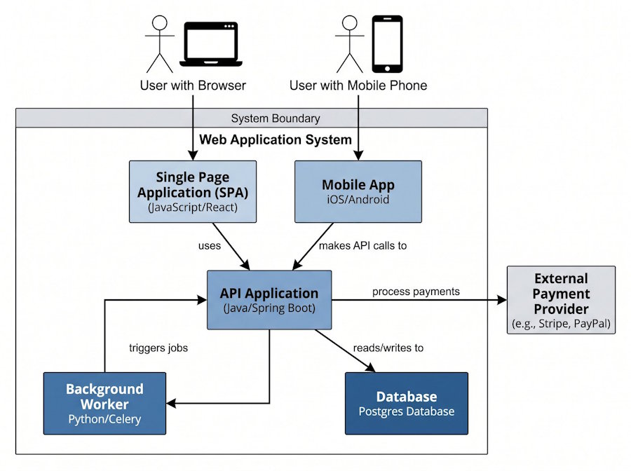
The C4 model is the most practical framework here because it forces you to separate zoom levels. You get a context diagram (your system as one box, surrounded by users and external systems), a container diagram (the deployable units — your API, your SPA, your database, your worker), and a component diagram (the major pieces inside one container). Most teams only ever need the first two, and that's fine. The discipline is refusing to cram three zoom levels into one canvas.
Beyond structure, two other diagram types earn their keep. Sequence diagrams answer "how does this flow actually work" — the order of calls when a user checks out, when a webhook fires, when a token refreshes. They're the fastest way to explain an async or multi-service interaction that would take three paragraphs of prose. Entity-relationship diagrams answer "how is the data shaped" — tables, keys, cardinality. Reach for an ER diagram when someone needs to understand the schema before writing a migration, not to document every column.
The test for whether you need a diagram at all: if you can't name the question it answers in one sentence, don't draw it.
Keep Diagrams Alive by Treating Them as Code
Here's the shift that actually fixes staleness: your diagram should be a text file in the repo, not an image in a wiki. This is diagram-as-code, and it changes everything about maintenance.
When your architecture lives in a .mmd, .puml, or .d2 file next to the code, it inherits every good habit your codebase already has. It's versioned, so you can see how the architecture evolved. It shows up in diffs, so a reviewer looking at a PR that adds a new service can see the diagram gain a box in the same review. It renders in your Git host, so the picture is always generated fresh from the current source of truth.
Mermaid is the low-friction default because GitHub, GitLab, and most wikis render it inline — you write a fenced code block and the platform draws it. PlantUML and D2 give you more control and better layouts for bigger diagrams if you're willing to add a render step. For the first-draft sketch or when you want to hand a description to a tool and get a clean layout back without fiddling with syntax, this free diagram tool will turn a plain-English description of your services into an editable diagram you can drop into the repo and refine.
The workflow that makes it stick is boring and that's the point: put the diagram in the PR. When you change the architecture, you change the diagram file in the same commit. Make it a review expectation — the same way you'd flag a missing test, flag a missing diagram update. Some teams add a CI job that re-renders diagrams and fails if the committed PNG is out of date with the source; even without that, the social norm of "update the diagram in the PR" does most of the work. A diagram that changes in lockstep with the code can't drift, because drifting would require a PR that lies, and lying PRs get caught in review.
Common Mistakes That Quietly Ruin Your Diagrams
Documenting the Aspiration Instead of the Reality
Show what runs in production today, not the clean architecture you wish you had. An idealized diagram is worse than none, because it sends people looking for services that don't exist.
Encoding Detail That Changes Faster Than You'll Update It
Method names, exact ports, specific instance counts — that belongs in code and config. Draw the stable shape, not the volatile specifics.
No Legend, No Consistency
If a solid arrow means a synchronous call in one diagram and "depends on" in another, readers can't trust any of it. Pick a small visual vocabulary and reuse it everywhere.
One Giant Diagram
If it doesn't fit on a screen without zooming, split it by zoom level or bounded context. Five focused diagrams beat one exhaustive one.
The teams whose diagrams stay useful aren't more disciplined than yours. They've just removed the friction: the diagram is text, it lives with the code, and updating it is part of shipping the change rather than a separate chore nobody signs up for. Tools like ConceptViz help with the drawing, but the durable win is structural — put the picture where the code is, scope each diagram to one question, and let your existing review process keep it honest. Start with a single container diagram for your most-onboarded service, commit it next to the code, and update it in the next PR that touches that service. That's the whole trick.