
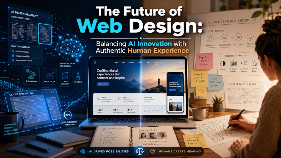
The digital playground looks entirely different than it did even a couple of years ago. We have fully entered an era where generic templates, uninspired layouts, and cookie-cutter interfaces no longer cut it. With AI tools now capable of generating functional landing pages in seconds, the baseline for what makes a website "acceptable" has shifted dramatically.
Today, the real challenge isn’t just building a website that works; it is crafting a digital destination that genuinely resonates with real people. Standing out requires an intentional blend of cutting-edge technology, striking aesthetic trends, and highly empathetic, human-centric user experience (UX) design.
1. The Rise of Hyper-Personalization and Intention-Based UX
For years, personalization on the web meant dynamic tags that greeted a user by their first name or tracked their basic browsing history to suggest a product. Today, web development has moved toward micro-interactions driven by deep user intent.
Websites are transitioning into living systems that adapt to how an individual navigates. If a visitor scrolls rapidly through text-heavy blocks but pauses on visual galleries, the interface can dynamically emphasize visual information or change layout priority. Similarly, dark and light modes are evolving past a manual toggle; sites can shift their color spaces based on the user's ambient lighting data or system fatigue settings to ease eye strain.
When you prioritize this level of responsiveness, you are no longer forcing users to navigate your internal business structure. Instead, you are molding the environment to match their behavioral psychology in real time.
2. Structural Evolution: The Bento Grid Layout
Visually, the structure of the web has broken free from traditional horizontal banners. One of the most significant design trends shaping modern interfaces is the Bento Grid layout. Inspired by the neat, compartmentalized style of Japanese bento boxes, this structure organizes complex information into individual, rounded rectangular modules of varying sizes.
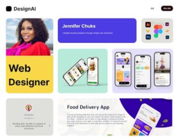
The bento box design style is highly effective because it mirrors the cognitive patterns of modern web users, who tend to scan pages rather than read them chronologically. It allows a business to display a diverse mix of media—such as short text summaries, micro-animations, product metrics, and direct calls to action—side-by-side without creating visual clutter. Furthermore, its block-based geometry translates seamlessly across desktop monitors, tablets, and smartphones, solving mobile responsiveness layout problems before they even start.
3. Immersive Interaction and Spatial UI
The integration of lighter, web-optimized 3D assets has changed how users engage with physical products online. Thanks to frameworks like WebGL and Three.js running effortlessly on modern browsers, immersive interfaces are no longer exclusive to high-budget enterprise spaces.
Instead of static image carousels, consumers expect interactive 3D models they can rotate, open, customize, and explore. This concept, known as Spatial UI, brings tactile physics into a two-dimensional screen. When a user scrolls down a page, elements shouldn't simply slide vertically; they should reveal depth through parallax layers, smart blurring, or subtle geometric scaling. These tiny details hold user attention long enough to reduce bounce rates and measurably boost conversion metrics.
4. Accessibility and Semantic Compliance are Non-Negotiable
Designing a visually breathtaking website means very little if a significant portion of your audience cannot navigate it. Global digital accessibility compliance guidelines have evolved from an afterthought into a foundational development framework.
True accessibility means going far beyond basic image alt text. Modern web development demands:
- Keyboard-Only Navigation: Ensuring all menus, interactive widgets, and forms can be fully operated without a mouse.
- Aria-Labels and Semantic HTML: Structuring code so screen readers can interpret screen transitions or pop-ups accurately.
- Contrast Ratios: Intentionally testing text color overlays against backgrounds to serve users with low-vision or color vision deficiencies.
When a website is built cleanly from the ground up, search engine crawlers find it highly readable as well. Exceptional accessibility directly powers exceptional search engine optimization (SEO), ensuring your business ranks better organically.
5. Finding the Sweet Spot: Technology Guided by Human Heart
With so many automated site-building tools hitting the market, anyone can deploy code. But automation lacks strategic empathy. It does not understand why a local service provider needs to evoke immediate trust, nor does it comprehend the subtle emotional nuances of a target audience in a specific geographic market.
This is exactly where specialized expertise makes all the difference. Designing a truly remarkable web ecosystem demands a professional team that views your website not just as an online brochure, but as the literal digital core of your business entity. If you are ready to move past generic code and build a secure, breathtaking, and high-performing platform tailored specifically to your organizational goals, working with a dedicated partner like Ankit Designs ensures your vision is executed flawlessly. From deep UX research to custom WordPress architecture and performance optimization, having an award-winning team handles the technical heavy lifting so you can focus entirely on growing your operations.
Strategic Checklist for a Website Refresh
If you are evaluating your current digital platform to see how it stacks up against current industry standards, keep these core metrics in mind:
|
Performance Indicator |
Optimal Target |
Why It Matters |
|
Core Web Vitals (LCP) |
Under 2.5 seconds |
Determines how quickly your main page content renders for a visiting user. |
|
Mobile Responsiveness |
100% Fluid Breakpoints |
Over 60% of global traffic originates on mobile devices; layouts must adapt seamlessly. |
|
Accessibility Compliance |
WCAG 2.2 AA Standard |
Protects your business legally while ensuring an inclusive environment for all users. |
|
Code Efficiency |
Minimal third-party scripts |
Prevents background bloat, keeping interactions snappy and saving data bandwidth. |
The 3-Second Golden Rule: If a first-time visitor cannot identify exactly what your business does and what action they should take next within three seconds of landing on your homepage, your current interface architecture is leaking potential revenue.
Building a meaningful presence online requires a balance of visual artistry, technical engineering, and profound empathy for the end user. By leaning into modular design architectures like the bento grid, optimizing for flawless interactive speed, and building accessible pathways for every single person who clicks through, you transform a simple URL into an invaluable, conversion-driving business asset.