
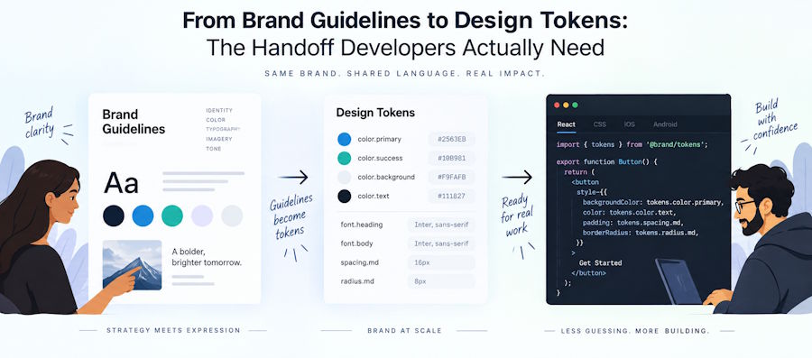
A brand handoff is implementable when it ships values, not pictures. That means resolvable color definitions with tested contrast, vector logo files that survive a build step, an icon set that maps to real rel values, and font files you are licensed to self-host. A 60-page PDF with swatches in it does not qualify.
Most developers meet a brand identity the same way: a Dropbox link lands in Slack, it contains Brand_Guidelines_FINAL_v4.pdf, one logo.ai file nobody can open, and a folder of PNGs at whatever size the designer happened to export. Then you are asked to "apply the new brand" to a product with a light mode, a dark mode, four button states, an email template and a marketing site.
This article covers what has to be in that folder before the work is buildable, the accessibility rules that quietly invalidate a lot of signed-off color palettes, and how to convert the result into tokens your codebase can consume.
What a usable brand handoff contains
The handoff is complete when a developer can build every surface without asking a follow-up question. In practice that is six things.
| Deliverable | Minimum viable version | What goes wrong without it |
|---|---|---|
| Color definitions | Every value plus the surface it sits on, with measured contrast ratios | Buttons and form borders fail accessibility audits after launch |
| Logo files | SVG with outlined text, plus horizontal, stacked and mark-only variants in light and dark | Someone rasterizes a PNG at 2x and ships a blurry header |
| Icon and app icons | One SVG, one ICO, one 180px PNG, two manifest PNGs | Broken tab icon, missing home screen icon on iOS |
| Typography | Font files, weights actually used, and the license permitting self-hosting | Legal risk, or a CDN dependency you cannot remove |
| Spacing and radius scale | A numeric scale, not "generous padding" | Every developer invents their own spacing |
| Editable source files | AI, SVG and layered originals, not flattened exports | Any future change needs the original designer |
The rest of this article deals with the two that cause the most rework: color and logo files.
Color: hex codes are the start, not the deliverable
A color palette is only usable once you know what each value sits on and whether that pairing passes contrast. A hex code on its own tells you nothing about whether it can be a button.
Two rules from WCAG 2.2 govern this, and they apply to different things.
Text is covered by Success Criterion 1.4.3, which sets 4.5:1 for normal text and 3:1 for large text at Level AA. Everything else is covered by Success Criterion 1.4.11, Non-text Contrast, which requires 3:1 against adjacent colors for the visual information needed to identify a user interface component and its states, and for parts of a graphic required to understand it. That covers input borders, checkbox ticks, toggle positions, focus rings and chart lines.
Two details from the W3C guidance that catch teams out.
3:1 is a threshold, not a target to round to. The W3C notes explicitly that computed values should not be rounded, so 2.999:1 fails. If your brand accent lands at 2.98:1 on white, it cannot be the only thing identifying a control.
The logo exemption is narrower than people assume. Logos are exempt from contrast requirements on the assumption that their colors are mandated by brand guidelines. But the W3C guidance adds that this becomes a problem when a logo acts as a user interface component, such as a link, and that if low contrast was an author's choice rather than something the brand mandated, the presentation is not "essential" and the logo is not exempt. The worked example in the W3C documentation is a wall of client logos rendered near-invisible against a dark background, lighting up only on hover. That pattern is on a very large number of SaaS marketing sites, and it fails.
So the deliverable you want is not #4F46E5. It is a table: value, the background it is approved against, the measured ratio, and the light and dark variants. In code that becomes something you can actually reason about:
:root {
  color-scheme: light dark;
  --color-brand: #4f46e5;
  --color-surface: #ffffff;
  --color-on-surface: #111827;
  /* 3.1:1 against --color-surface, passes 1.4.11 for borders */
  --color-border: #767676;
}
@media (prefers-color-scheme: dark) {
  :root {
    --color-brand: #a5b4fc; /* lightened; the 500 fails on dark */
    --color-surface: #0b1020;
    --color-on-surface: #e5e7eb;
    --color-border: #9ca3af;
  }
}
The comment matters. Six months later nobody remembers why the border is #767676 instead of the prettier #cccccc, and someone changes it.
The logo files that survive contact with a codebase
Ask for SVG, and be specific about what has to be true inside it. "SVG" alone is not a guarantee of anything.
- Text converted to outlines. If the wordmark still references a font by name, it renders in whatever the machine has. Usually Times New Roman.
- A viewBox, and no hardcoded width/height. Without a viewBox the file will not scale. With fixed dimensions in the file, CSS sizing fights the markup.
- No embedded raster. Designers sometimes export a PNG wrapped in SVG packaging. Open the file in a text editor and search for base64. If it is there, send it back.
- fill="currentColor" on single-color marks. This is the single most useful thing a designer can do for you. It lets the mark inherit color from CSS, so one file covers light mode, dark mode, hover and disabled.
You also want the variants named for their use, not for their appearance: horizontal for the site header, stacked for square placements, mark-only for the avatar and the icon set, and a monochrome version for cases where the full-color logo will not sit on the background. Clear space should come as a ratio tied to something in the mark, not as "24px", because 24px is wrong at every size except the one it was measured at.
Icons: fewer files than the old tutorials tell you
You do not need twenty icon files. You need about five, and two of them are optional.
MDN's reference for the <link> tag is the source worth reading here. A few things it settles:
- sizes="any" signals a vector icon such as image/svg+xml, so a single SVG covers every browser size.
- ICO can hold several icon sizes in one file, and it has better browser support than Apple's ICNS, so that is the format to use where multiple sizes in one file are needed.
- Browsers request /favicon.ico from the site root automatically, and Apple automatically requests /apple-touch-icon.png and its sized variants. Declaring the links explicitly protects you if those conventions change.
- MDN's guidance is that providing one large image such as 192x192 and letting the browser scale it down is usually sufficient.
A working set:
<link rel="icon" href="/favicon.ico" sizes="32x32" />
<link rel="icon" href="/icon.svg" type="image/svg+xml" sizes="any" />
<link rel="apple-touch-icon" href="/apple-touch-icon.png" /><!-- 180x180 -->
<link rel="manifest" href="/manifest.webmanifest" />
One gotcha worth knowing before you spend an afternoon on it: MDN notes that a site's Content Security Policy applies to the favicon. If your icon is not loading and the files are definitely deployed, check the img-src directive before you check anything else.
Note what the designer has to supply for all of this: a mark that stays legible at 32 pixels. Most logos do not. A wordmark that reads beautifully in a header becomes four grey smudges in a browser tab. That is why the mark-only variant is a required deliverable rather than a nice-to-have.
Turning the handoff into design tokens
Design tokens are name and value pairs that express design decisions in a platform-agnostic way, so the same source can generate CSS, Swift, Kotlin or anything else. If you have ever maintained the same palette by hand in a stylesheet, an iOS app and an email template, you already know the problem they solve.
There is a specification for the interchange format, published by the Design Tokens Community Group at the W3C. Its Third Editors' Draft, dated 20 July 2025, defines a JSON format where a token is any object with a $value, typed with $type, optionally described, grouped and aliased with a {group.token} reference syntax. Files use the .tokens or .tokens.json extension and the application/design-tokens+json media type.
{
  "brand": {
    "$type": "color",
    "primary": {
      "$value": { "colorSpace": "srgb", "components": [0.31, 0.275, 0.898] },
      "$description": "Passes 4.5:1 on white for text 18px and above"
    }
  },
  "button": {
    "background": { "$value": "{brand.primary}" }
  }
}
Now the part most articles about design tokens leave out. The specification is not a W3C Standard and is not on the W3C Standards Track, and its own status section states that it is considered unstable and should not be implemented. The preview draft is blunter still, telling readers not to attempt to implement that version or reference it as authoritative.
Read that as a planning constraint rather than a reason to avoid tokens. The concept is sound and the tooling is real: the spec itself names Style Dictionary and Terrazzo as translation tools that convert token files into platform-specific code. What you should not do is build a pipeline that assumes the JSON shape is frozen. Keep your source of truth simple, keep the transform layer thin, and expect to migrate.
For most teams shipping a web product, the pragmatic stack is CSS custom properties as the runtime layer, a JSON token file as the source, and a build step that generates the CSS. That gives you the theming and cascade behavior CSS gives you for free without betting the codebase on a draft format.
The handoff checklist
Send this to whoever is producing the identity, before they start.
- Every color as a value, plus the background it is approved on and the measured contrast ratio.
- Light and dark variants for every color that appears in the product UI.
- Logo as SVG with outlined text, a viewBox, no embedded raster, and currentColor on single-color marks.
- Horizontal, stacked, mark-only and monochrome logo variants.
- A mark that stays legible at 32 pixels, tested at that size rather than assumed.
- Icon set: SVG, ICO, 180px Apple touch icon, 192px and 512px manifest PNGs.
- Font files for the weights actually in use, plus the license text confirming self-hosting is permitted.
- A numeric spacing and radius scale.
- Editable source files, not flattened exports.
- Written rules for the cases the guidelines will otherwise leave you guessing on: logo on a photo, logo at small sizes, accent color on a dark surface.
Where the assets come from when there is no designer
Most small product teams do not have a designer, and this is the point where the handoff stalls.
The options are the usual four, and the trade-offs are predictable. Hiring in-house gives you the most control and takes the longest. Freelancers start quickly but availability is inconsistent, and identity work that comes back in three separate bursts tends not to hold together. Traditional branding agencies do the deepest strategic work and bill accordingly, usually as a large one-off project. Subscription design services sit between the last two: a flat monthly fee, a request queue, and a designer who stays on your account.
Design Cloud runs branding services on that last model, with UK-based in-house designers, flat pricing from £1,099 per month, unlimited requests and revisions, and setup inside about one business day. Identity projects typically run one to two weeks depending on how fast you give feedback, and deliverables come back as AI, SVG, PNG and JPG source files, which is the part that matters for everything above. Worth knowing before you assume it covers everything: they execute the visual side and state plainly that they do not do naming or messaging strategy, and requests are worked one at a time from the queue. If you need positioning work done first, that is a separate conversation.
Whichever route you take, put the checklist in the brief. A designer who knows you need currentColor and a 32-pixel-legible mark will produce those things. One who is never told will hand you a PDF, and you will spend a week rebuilding assets you already paid for.
Frequently asked questions
Do I need design tokens for a small project?
No. Below roughly one platform and one theme, CSS custom properties in a single file are enough, and adding a token pipeline is overhead you will not recoup. Tokens start paying off when the same values have to exist in more than one place: a web app plus a native app, a product plus a marketing site on a different stack, or a light and dark theme that keep drifting apart.
Can I just use the DTCG token format now?
You can author files in that shape, and plenty of teams do. Be aware that the specification's own status section says it is unstable and should not be implemented, so treat your token JSON as something you will migrate rather than as a stable contract. Keep transformations in one place so a format change is a single rewrite.
What is the minimum viable brand handoff for a side project?
An SVG mark with currentColor, three colors with contrast checked against white and against your dark surface, one typeface with a license you have read, and a 32-pixel test of the mark. That is an afternoon of work and covers about 80% of what you will need.
How do I check contrast without a designer?
Any contrast checker will compute the ratio, and browser devtools show it inline in the color picker. The judgment is knowing which threshold applies: 4.5:1 for body text, 3:1 for large text, and 3:1 for the visual information that identifies a control or a meaningful graphic. Check states as well as the default, because a focus ring that fails is still a failure.
Should logos be inline SVG or an <img> tag?
Inline when you need it to respond to CSS, which is the case for any single-color mark that changes with theme or state. An <img> tag when the logo is full-color and static, since it caches separately and keeps your markup smaller. Do not inline a 40KB full-color logo into every page render.
Does any of this affect search?
Indirectly. Descriptive filenames and alt text on logo images help, and the icon set affects how your site appears in tabs and search results. It is a small part of a wider technical SEO picture rather than a ranking lever on its own.
Where to start
The gap between a brand identity and a shipped implementation is a file format problem and a contrast problem, in that order. Solve both in the brief and the build takes days instead of weeks.
If you have already been handed a PDF and a folder of PNGs, start with an audit rather than a rebuild. Open the logo SVG in a text editor and check for base64 and font references. Run your three main brand colors through a contrast checker against your actual surfaces, including your dark theme. Load your site on a phone and add it to the home screen to see what the icon looks like. Those three checks take under an hour and will tell you exactly how much of the handoff is real and how much still needs producing.
Sources
- W3C Web Accessibility Initiative, Understanding Success Criterion 1.4.11: Non-text Contrast (updated 2026-06-15): https://www.w3.org/WAI/WCAG21/Understanding/non-text-contrast.html
- Design Tokens Community Group, Design Tokens Format Module, Third Editors' Draft (2025-07-20): https://www.designtokens.org/TR/third-editors-draft/format
- MDN Web Docs, <link> HTML external resource link element (updated 2026-05-20): https://developer.mozilla.org/en-US/docs/Web/HTML/Reference/Elements/link