
Developers spend weeks removing friction inside an app, then give the store listing a few rushed screenshots just before release. That is a strange place to stop caring about the user journey.
The screenshots are part of that journey. They sit between discovery and installation, where a visitor is asking three quick questions: What does this app help me do? Can I see evidence that it really does that? Is it relevant enough to download now?
App store screenshots improve conversion when the opening images answer those questions clearly. The first screenshot should state the strongest user outcome, the next should show real interface proof, and the third should add another compelling reason to install. Everything after that can deepen the story.
AppScreens is an app store screenshot design platform for turning real app screens into editable, localized, store-ready assets and controlled variants for Apple Product Page Optimization and Google Play Store Listing Experiments. The stores run the experiments and report conversion; AppScreens prepares the creative.
This is not about decorating raw captures. It is about designing the pre-install interface with the same care as the product itself.
Why do app store screenshots affect downloads?
Screenshots reduce uncertainty. Before installation, people cannot explore the navigation, try a workflow or judge how quickly the app will solve their problem. The listing has to make that value understandable without the interaction the product normally relies on.
A screenshot set can fail even when every image is sharp and technically valid. Common reasons include:
- The opening image names a feature but never explains the benefit.
- The interface is shown so small that it cannot prove the claim.
- Every screenshot looks like a separate idea instead of one ordered story.
- The most useful capability appears late in the gallery.
- The app screen, caption or device presentation is outdated.
- The visitor sees English copy and examples that do not fit their market.
The store already delivered a potential user to the listing. Unclear screenshots waste that opportunity. Clear screenshots help the visitor decide whether the app fits their intent.
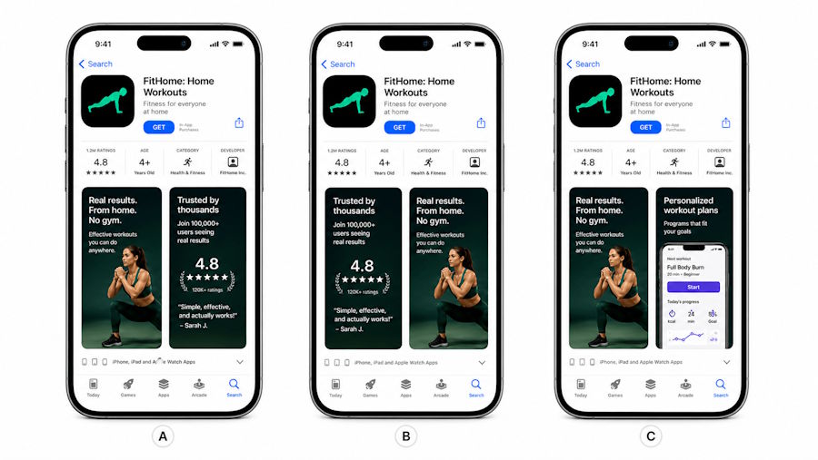
The order changes the story. Put the strongest promise and proof where visitors are most likely to see them. Illustration: AppScreens.
What should the first three screenshots show?
A useful starting structure is promise, proof and second reason.
Screenshot 1: the promise
Lead with the clearest outcome for the audience you want. “Advanced budget dashboard” describes a feature. “Know where your money goes” explains why the feature matters.
The app UI should support that promise rather than act as a decorative background. If the caption is about understanding spending, show the screen where categories, trends or alerts make spending understandable.
Screenshot 2: the proof
Show how the user reaches the outcome. The second screenshot might demonstrate automatic categorisation, a weekly summary or a clear setup step. It should make the first claim feel credible.
Screenshot 3: another reason to install
Add a second benefit, trust cue or objection handler. For a budgeting app, that might be shared household planning, privacy controls or bill reminders. Do not use the third image to repeat the first caption in different words.
The rest of the gallery can explain supporting workflows, integrations, personalisation and more specialised use cases. The opening three should still make sense if the visitor never swipes further.
Build the screenshot story before opening a design tool
Start with one audience and one job the app helps them complete. A broad statement such as “for everyone who wants to be productive” is difficult to turn into specific creative. “For freelancers who need to turn time into accurate invoices” gives the screenshots something useful to say.
Write a one-line brief for each frame before choosing colours or device frames:
- Main outcome
- Product proof
- Second benefit
- How the workflow starts
- Time-saving or trust evidence
- Advanced or differentiating feature
- Closing reason to install
This sequence is a draft, not a fixed rule. A game, subscription app and developer tool will tell different stories. The point is to make the order intentional.
Capture app screens that prove the message
The best marketing caption cannot rescue an irrelevant product screen. Capture the exact moment that demonstrates the benefit.
Before using a screen in store creative, check it for:
- Current production UI
- Realistic but fictional content
- No personal names, email addresses or account information
- No debug menus, test banners or broken states
- No notifications or status details that distract from the feature
- Enough visual contrast to remain readable inside the store image
Avoid showing a splash screen simply because it is visually clean. A visitor already has the icon and app name. The screenshots should spend their limited attention on product value.
Turn the captures into a store-ready sequence
Raw app captures are evidence, but they are not always complete store creative. A caption can tell the visitor what to notice, while layout and scale make the relevant part of the interface legible.
Keep each frame focused on one idea. Use short benefit-led captions, show the important UI at a useful size, and keep typography consistent across the set. Decorative elements should guide attention rather than compete with the product.
In AppScreens, that production work stays in one repeatable app store screenshot optimization workflow, with editable captions and layouts, iOS and Google Play outputs, localization and controlled variants that do not need to be rebuilt by hand.
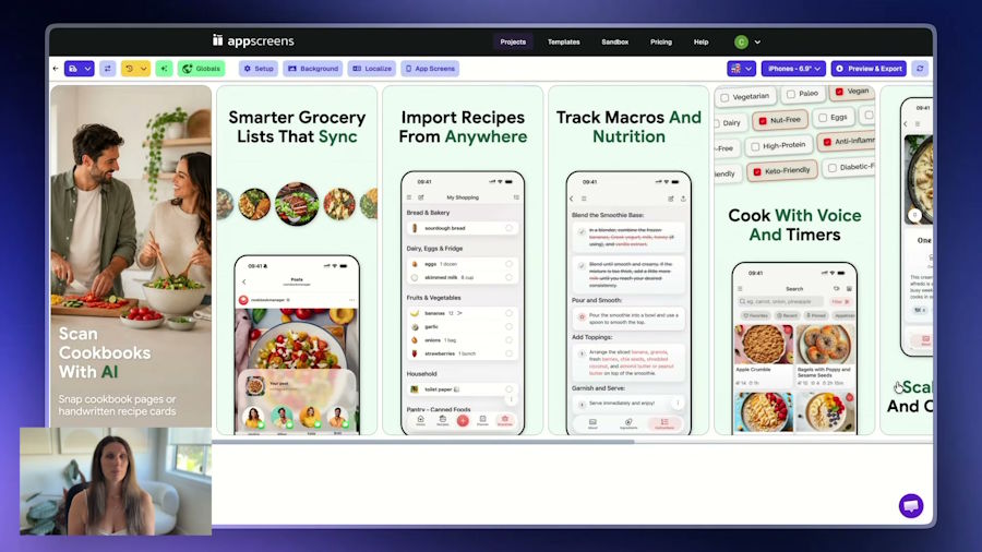
Keep the source project editable so a new caption, image or screenshot order can become the next controlled variant. Product screenshot: AppScreens.
How much can better screenshot conversion change downloads?
The effect depends on the listing's traffic and the measured conversion difference. There is no universal uplift that applies to every app.
Consider a simple illustration. A store listing receives 10,000 comparable visits and converts 20 percent of them into downloads. That produces 2,000 downloads. If a tested screenshot set converts 24 percent of comparable traffic, the same 10,000 visits produce 2,400 downloads.
That is 400 additional downloads without increasing traffic. The figures are arithmetic, not a benchmark or forecast. A real result needs a controlled store experiment with enough relevant traffic.
This distinction matters for engineering and growth teams. Acquisition work is not only about getting more people to the page. It is also about helping more of the right visitors understand the app once they arrive.
Test one meaningful screenshot hypothesis
A useful test starts with a question, not a redesign.
Examples include:
- Does an outcome-led first caption outperform a feature-led caption?
- Does showing the finished result before the setup steps improve conversion?
- Does moving the most popular feature into the first three screenshots help?
- Does a market-specific screenshot set perform better for that language?
- Does product UI at a larger scale make the value easier to understand?
Change one clear idea when possible. If the caption, order, colours, imagery and device treatment all change together, the test may identify a better set but will not explain which change mattered.
Apple Product Page Optimization can compare the original product page with up to three treatments using alternate screenshots, app previews or icons. Google Play Store Listing Experiments can compare screenshot and other listing variants, including localized experiments. The stores allocate traffic and report the result. AppScreens prepares the creative variants used in those tests.
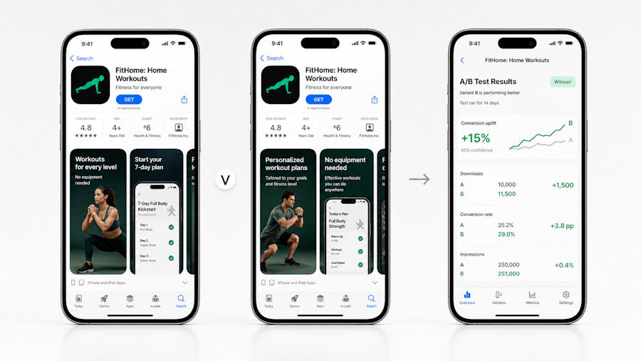
Write the hypothesis first, prepare a controlled variant, and let the store experiment measure the result. Illustration: AppScreens.
Do not declare a winner from a few good days or a before-and-after comparison with different traffic. Wait for the experiment result, record what changed and keep an inconclusive outcome as a valid result.
Use different outputs for iOS and Google Play
The core story can stay aligned across both stores, but the files and presentation should not be treated as identical exports.
Apple supports up to ten screenshots and notes that the first one to three may appear in search when no app preview is present. Google Play supports up to eight screenshots for each supported device type and uses screenshots across the store listing and other promotional contexts.
Check each platform's current dimensions, device groups, media order and policy requirements before export. Preview the set at actual store scale, not only on a large design canvas.
Localize the message, not only the words
Translation is the minimum. Strong localization may also change app UI language, currencies, names, examples, imagery and even which benefit appears first.
A screenshot about splitting a restaurant bill may need different currency and number formatting. A calendar app may need week conventions that match the market. Right-to-left languages need layout review, not merely a text replacement.
Start with markets that already receive relevant traffic or show product demand. Then keep the localized set connected to the same editable source so product updates do not leave one market with old UI.
A practical screenshot conversion checklist
Before shipping or testing the set, ask:
- Can someone explain the app's main benefit after seeing the first screenshot?
- Does the second screenshot prove the first claim with real product UI?
- Does the third add a new reason to install?
- Are captions readable at store size?
- Is every visible screen current, accurate and free of private data?
- Do iOS and Google Play outputs meet their own requirements?
- Are priority markets localized beyond a word-for-word translation?
- Does the test change one meaningful idea?
- Is the result being judged with the store's experiment data?
Developers already optimise onboarding screens, API latency and checkout steps because friction costs users. The store screenshot gallery deserves the same attention. It is the interface immediately before installation, and its job is to make the right product value understandable before the app gets a chance to speak for itself.
Frequently asked questions
Do app store screenshots really affect downloads?
Yes. Screenshots help visitors understand the app before installing. If the opening images hide the main benefit, use unreadable captions or show irrelevant UI, visitors can leave even when the app itself is strong. Measure the effect with Product Page Optimization or Google Play Store Listing Experiments rather than assuming a redesign worked.
What makes an app store screenshot convert?
A strong screenshot combines a clear user benefit with visible product proof. The caption explains what the user gets, while the real app screen shows how the product delivers it. The first three screenshots should form a coherent story rather than three unrelated feature cards.
What should the first app store screenshot show?
Show the strongest outcome for the intended audience and enough real UI to make the claim believable. Avoid splash screens, vague slogans and tiny interface captures that do not explain why the app is worth installing.
How many app store screenshots should an app use?
Use enough screenshots to tell a complete story, not simply the maximum. Apple currently permits up to ten screenshots, while Google Play permits up to eight for each supported device type. Many effective sets use the opening frames for the main promise and proof, then cover supporting benefits and objections.
Should iOS and Android use the same screenshots?
They can share the same positioning, but the final assets should account for each store's sizes, device groups, media presentation and testing tools. Keep one creative system, then generate and review store-specific outputs.
How should developers A/B test app screenshots?
Write one hypothesis, keep the current set as the control and create one meaningful challenger. Change one idea when possible, run the comparison through the store's native experiment tool and wait for its reported result before applying a winner.
Are raw app screenshots enough for an app store listing?
They can satisfy the file requirement when they use accepted dimensions, but they may not explain the product clearly. A short benefit-led caption, readable UI scale and intentional sequence can turn raw captures into a persuasive store story.
What is AppScreens used for?
AppScreens is used to create, localize, resize and manage App Store and Google Play screenshot sets, including controlled variants for native store experiments. Apple and Google allocate experiment traffic and report the results; AppScreens supplies the creative assets.